Watercolor Project: Dancing Boots Week 2
Watercolor Plus notes will follow this post for the boots. Scroll down.
Last week we got our boots and cactus under painted, this week we start adding some detail. I started with the cactus because it is just too easy to get lost doing the boots because they really are the stars of the show, however, you can't forget the supporting cast members because they make the star shine.
I was using my 1/2" angle brush, Hooker's green and the ultramarine blue to make a dark color. LOOK AT YOUR REFERENCE PHOTO so you can see where the light and dark are on the cactus and to see that the edges aren't smooth but scalloped, you create the scallops with this dark color.
I put the color down where I see in the photo the dark shadows, then I rinsed my brush and with a damp brush, I went along the edges of that color to soften those edges that were on the sides of the ribs, if the color was shaping the scalloped tops I left the lines hard to define those edges. This was my first pass over the shadows.
Around the flowers on the top, I used the dark paint to define the petals of the flowers. This is called negative painting and it is something we do a lot of in watercolor because we have to leave the lighter colors.
This is what my painting looked like after I put the first round of shadows on the cactus. I haven't touched the boots yet.
Next I focused on increasing the intensity of the color by doing more washes of color like I did the previous week, but this time I had to remember to leave light areas alone where I needed highlights.
Again I was using my angle brush and thalo blue. I would put some color down, rinse my brush and move the paint with a damp brush. I did this to most of the boots but not all so I had highlights. When I got to the darker shadows, I added a little alizarin crimson to the thalo blue to purple it up, applied it and softened the edges with a clean damp brush. The dark cast shadow of the front boot onto the second boot is this thalo/crimson mix applied a couple of times.
The soles of the boots were under painted with a mix of blue and sienna, keep it on the blue side, I let it dry before adding another layer OF THE SAME COLOR to darken the sole. You may need to do this several times to get it dark enough.
The detail on the boots is optional, if you don't want to do it, don't, but if you do, pay attention to how the seams and stitching follows the curves and contours of the boots, they are not straight lines because the boots have wrinkles and folds. I lifted the highlight in the shadow on the second boot with the edges of my brush.
I did go back to my cactus and darkened some of the darker areas, especially around the flowers. To make something look lighter you must increase the value (darkness) of what is around the thing you want to look light. I added another layer of the dark blue/green painting around the petals. I also added one of the dead flowers in the back to, again, define some of the flower petals. I used burnt sienna and a little blue for the dead flower.
The centers of the flowers had several colors: Yellow with a little touch of orange. Orange with a little napthol red for the darker orange color and the napthol red and/or crimson for the center. You can used a small round brush or use the edge of a flat or angle brush like I did.
This is where I left off in class, try to get to this point in your painting if you can. I will probably be finishing this in our next class, working on and detail I want to add, putting in the background and the shadows under the boots.
Keep painting.
Watercolor Plus: Review of Textures
In our last class we learned how to create different textures in watercolor using many different things to create them. I will review them here but you should have your own samples labeled and saved for future reference.
These 4 are samples of using salt. These two are rock salt, from a grinder (1) on damp paint and just chunks of rock salt (2) on very wet paint.
These are both on damp paint: regular table salt (1) and popcorn salt (2).
These need very wet paper - just water - to work. 1 is tea 2 is coffee.
Some of you experimented with adding to a color and that is okay to. Save it for reference.
The first one is turmeric on wet paper. The second one I spritzed water with my spray bottle into damp paint.
Into damp paint using a tooth brush on both: 1- rubbing alcohol 2- water.
 The first one was using masking tape as a stencil and painting over it. You can use other things like masking fluid, dollies, things cut from card stock, etc. The next group of textures requires damaging the paper so only do this if you are sure. The leaves I scratched veins in before I added paint. The brown square I used a comb - a fork would work. The gray lines I used a pocket knife, my name I used an Exacto blade. the second set of leaves I used the exacto blade after I put paint down, scratching into wet paint. The gray and the end is what happens to the paper when it gets rubbed, I used sand paper but this can happen if you are putting your wet paper into and out of your bag. Be careful.
 This is splattering with a tooth brush. Great way to make small pebbles and sand.
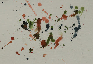
This is splattering by throwing and dripping paint from a brush.
Somehow I missed my favorite texture so I will have one more in our next class, then we will move on to brush strokes.
Keep painting.
Watercolor Class Project: Dancing Boots Week 1
(Wednesday's Watercolor Plus, your blog will follow below the "Boots" post, just scroll down. - LP)
I transferred my design onto my watercolor paper using non-waxy graphite transfer paper. You can use a light box, or a window in place of the light box, or use a #3B or #4B pencil to broadly scribble along the lines of the design on the back side as, what I call, "poor man's graphite paper" or if you are brave, you can draw it freehand as I did for the design.
Watercolor is s series of layers of washes or glazes. We work from light to dark with watercolor so we want to start light, which means adding a lot of water to our paint to dilute the color before we apply it to the paper.
This is an under painting or where we start. the cactus was done wet on dry paper using very diluted Hooker's green, the flowers were very diluted, yellow with a touch of orange with very thin napthol red or alizarin crimson.
The boots were dilute (p)thalo blue and water. The interior of the boots was dilute sienna a little blue. Remember these mixtures because we will be adding more of these same colors for the next couple of layers.
Close up of the boots after the first wash of color. The lighter areas I just used water to move a little of the thalo into the area.
Let it dry before doing the next layer.
 On the boots only (I will get to the cactus later), I added another 2 layers of the same color and strength to the boots. Adding into the darker areas - look at the reference photo to see the folds and shadows on the boots - then with water only,moved the paint into lighter areas the strengthen the color but still keep it lighter than the shadowed areas.
I like some of the blooms or back runs I got as I worked on the boots because they add to the texture of the boots.
I will be working on the cactus next week as well as getting to some of the darker shadows on the boots and the soles of the shoes so try to get your painting as close to this level as you can and I will pick up from here.
Keep painting and I will see you in class.
Watercolor Plus Week 1: Basics
There is a lot to learn about watercolor about how paints, brushes, paper and water all work together to create the unique look of watercolor. This first week we started with some basic techniques to understand how the paint works on dry and wet paper. Learning to control the water when you paint is an essential part of watercolor and it is a good habit to get into to watch how your paint reacts in each situation. Knowing what results you should be getting will build your relationship with the watercolor rather than being constantly surprised and frustrated, though sometimes the watercolor will surprise you anyway but it will be a good surprise.
Sorry I didn't take photos before using what I had to demonstrate a new technique, if you were in class you should remember, I can go over it again for those who missed or are lost.
The first swatch of paint I did wet paint on dry paper (wet on dry). First I put a fairly strong swatch of paint on the paper, then I rinsed my brush and with a damp brush I started down about the last third of the color and started painting the water down the page. Because the color is still wet and I have the top of my paper elevated so gravity can help me, the color will flood into to new wet area. I rinse my brush often and repeat until the color fades out to nothing.
In the second example I wet the paper first BEFORE I added the color and because my paper is elevated at the top the paint will naturally flow into and down the wet paper. Not as controlled but sometimes you want that look.
BTW, the brown spots (demo for spots on a banana) I wet the paper first but let it dry just a little so it wasn't real wet, more like damp, then just touched the paper with my brush with color on it. The paint spread out like the other wet into wet but because the paper was a bit dryer it didn't spread as fast or as far. Take note of this because how wet your paper is, is very important in watercolor.
We did a similar thing with these two circles. The top one was wet on dry,moving the paint across the circle with a damp brush.
The second circle started out wet and wet paint was added and helped along with a clean damp brush.
The top circle also has a demo for creating texture for an orange by doing a series of over-lapping marks leaving some of the lighter under painting showing through. this was wet on dry.
The bottom circle was again wet on wet but the paper was almost dry so the paint didn't spread.
In between the above exercises we were painting our fruit using what we were learning about how paint moves.
I started my tomato with a yellow orange under painting for my tomato, then let it dry. Then I did a series of washes or glazes of red with a touch of orange to bring up the values (light and dark) as well as intensify the color (how vibrant it appears), each time leaving a bit of the previous layer to create my values. Finally for the shadows on the tomato and where it is sitting I used a mix of blue and purple to create a shadow color.
Since you were all doing different fruit, you will be using different colors but the process is the same and no matter what color your fruit was, the shadows are always cool visually so they need blues and purples so they look like shadows,
I know that was a lot to remember, just keep practicing and studying your paint, next time we will be doing textures and brush strokes so have your tablet of paper with you, this should be a fun class. Keep painting.
Watercolor Project: Marsh Madness Week 4
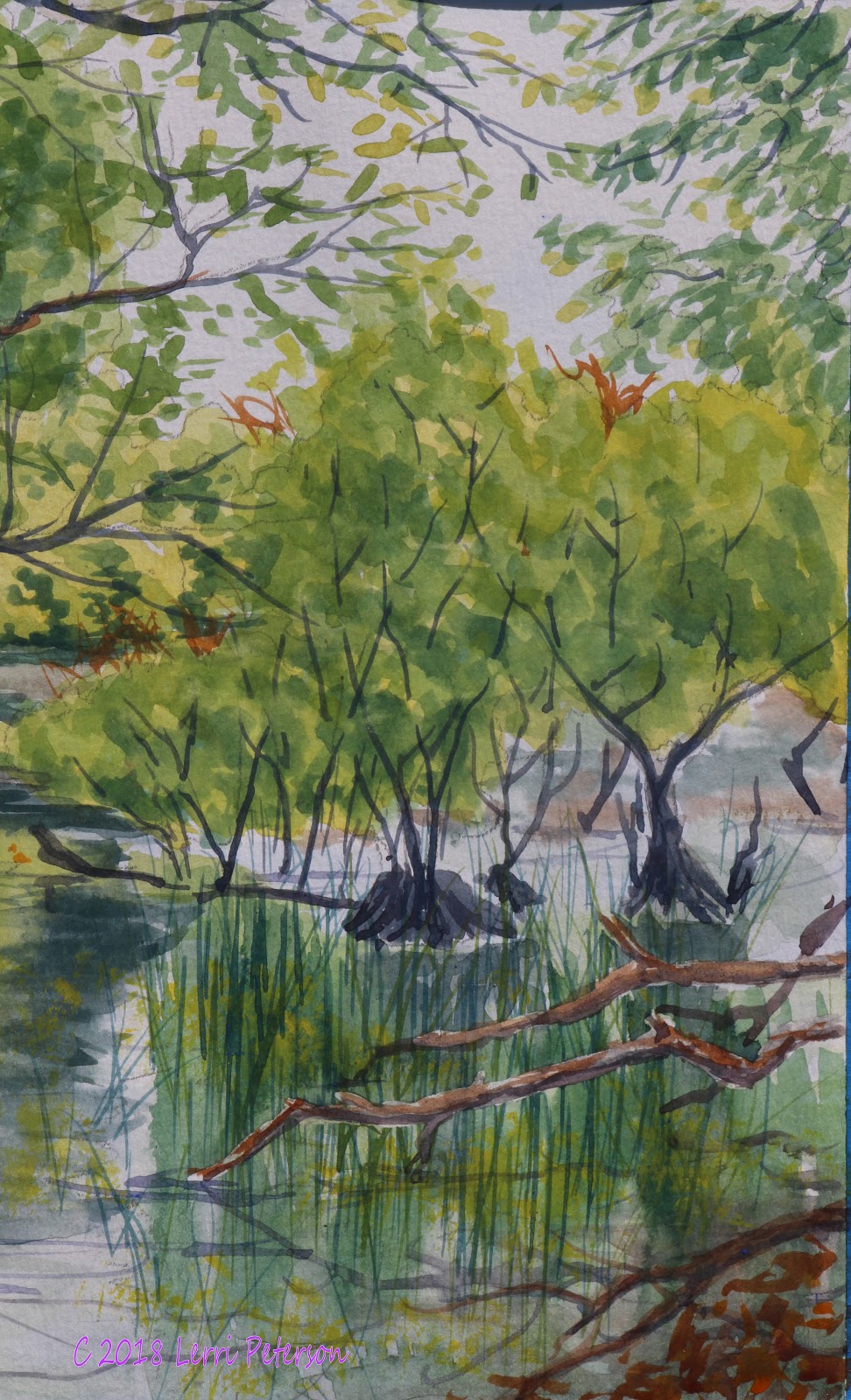
This turned out to be the final week of this project. yes, I could do more If I want, as could you, but for all intents and purposes we did what we set out to do.
These trees on the left we gave them texture by making a darker color with burnt sienna, blue and a touch of purple (remember, if it is in shadow, it needs blue and purple to make it look like a shadow), then using the edge of my 1/4" flat, angle brush I made a series of marks on the tree trunks to create the texture of the bark. You MUST remember to leave some of the previous color as you do this, that previous color becomes the highlights to the shadows you are putting in. Watercolor is light to dark so you must remember to save your highlights.
As I walked around I saw that most people do not believe me when I say that the liner brush needs to be practiced with BEFORE you get to your painting. Some were even blaming the brush because it was too fat rather than practice. Most of you have a #3 or smaller, mine is also a #3 and it can make so hair-fine lines, but it takes practice. (See image)
First you want to fill the bristles to the metal ferrule by wiggling it around in the ink-like paint. As you lift off your palette, roll the brush in your fingers so it comes to a point. Hold the brush at the very end and slightly down so the paint will flow from the bristles. If you press the bristles to the paper it will leave a fatter mark, as you drag your brush across your paper gradually lift it up to the tip of the brush until it lifts off. You should have created a line that starts thick and tapers to nothing, that is your first branch. To create branches, and if you loaded your brush correctly you should still have paint for several branches, start back in the fatter part of the branch you just painted and as you pull and lift, go off in a different direction. Yes, I make it look easy because I have been doing this for decades but I also did a lot of practice when I was learning how to use this brush and I watched others use this brush, it will come IF you take the time to practice.

I had some of my branches go all the way into the light area at the top to break up the negative space, then I added some leave shapes off of some of the branches and twigs but I didn't cover the entire light area so you can see the sky through the leaves.
On the right hand side, I had masked out the two branches coming in from the side so I could add more reflections from the bushes in the water (wet the area and added a sap green and blue and letting the paint run on the paper) and when it was dry, I added reeds sticking out of the water. I used several shades of green for the reeds from light (yellow and sap green) to a dark green (sap green, blue and a tiny touch of purple) and used my liner brush.
Once that area was dry, I finished the branches and added another in the corner and the suggestion of dead leaves as well.
I also took some of the dark green from the leaves to suggest reflections from the branches.
As I was finishing up the painting, someone said "All it needs are some ducks swimming through." good suggestion, so I added a family of ducks with just a few quick simple strokes: a ball for the head, a flat "U" for the body and a tiny touch of orange for the bill, the babies were just the round head and a tiny egg- shape for the body. These critters are way too small for much if any detail so don't try to paint feathers on these things. I also added some wake lines using the dark blue/green.
This is the finished project, if you need more time to finish yours we have 4 weeks left in the semester so there is time to get it done. If you have finished or tied of the project please be sure to have something you want to paint with you next class. I will be doing demos as needed because if one person is struggling with a technique, they probably are not alone. I do take requests as well.
P.S. I did a wash over the entire painting with a color called Quinacridone Gold, several manufactures have their version of this color, it looks like burnt umber when you put it out but add a bit of water and it is a beautiful golden color. I will sometimes do a wash over a painting to warm it up, you don't have to but just wanted to show you some options.
So until next time, keep painting and I will see you in class.
Watercolor Project: Marsh Madness Week 3
This week I got into more of the detail adding the darker trees on the left using a mix of burnt sienna and blue, just don't go for the final dark, remember we work from light to dark so this color will become highlights and texture. I also added more dark colors into the lower parts of the trees and the water. It gets very dark in these areas but you need to sneak up on the dark rather than going straight for it, if you do your colors will become muddy and lose the transparency of watercolor. Have the actual reference photo of the scene in front of you and refer to it often.
Notice how I keep most of the darker areas near the base of the trees? That is because there are a lot of leaves and branches blocking out the light so it is always a bit darker at the bottoms or under trees.
I also added some middle tone greens to suggest the leaves that get some light but aren't in the direct sunlight. Keep your greens purer by adding yellow to brighten them and blue to cool them, stay away from anything with red in it or it will gray your greens.
This clump of leaves falls into the mid tone range because they are not in direct sunlight, these are growing from the closer trees. Add yellow to the sap green and dab on irregular shaped clumps of leaves going over some of the twigs and branches you did last week.
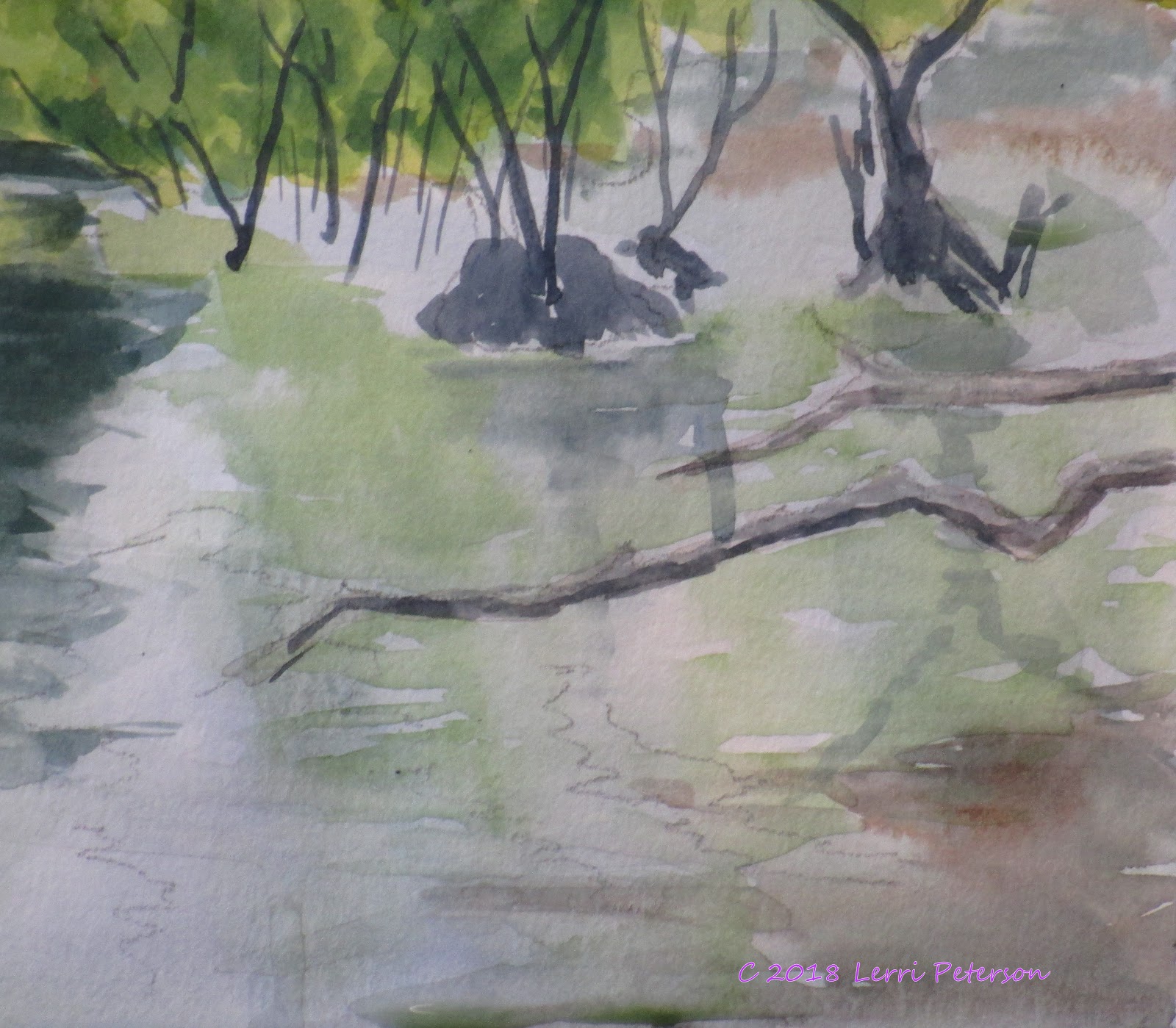
I wanted to intensify the lighter green that is in the reflection of the background big tree, so I carefully wet the ENTIRE AREA with water, then touched the paper with my brush with a mix of yellow and sap green and let the paint do it's thing in the wet paper. Be sure to work on a bit of an angle so that gravity will work with you, not against you.
When that area was still a bit damp, I added yet more dark into the darker reflection.
I was also increasing the dark under the trees but remember to leave some of what was there before because that color becomes ripples in the water. You can wet the area if you want but it should only be damp so the paint doesn't travel too far from where you put is down. And always remember if you are painting water keep your strokes parallel to the top and bottom of your paper so you water will look flat.
On the right side under the bushes, I wet the paper all the way down then added some of the yellow/green for reflections of the leaves, just touch the paper and let the paint do it's magic and when I was a damp, I added the start of the reflections of the larger bases of the bushes. I did skip over the 2 horizontal branches come in from the right, I might add masking fluid to them because I do have more to do in that area before getting to those branches.
This is where I left off last class, I hope that you can get your own project close to this point so we can continue next class. We should be winding this up in the next week or two so keep painting and I will see you in class.
Watercolor Project: Marsh Madness Week 2
This week we slowed down a bit as we got into more detail, that is a normal evolution once you have your under painting done and you start to develop the painting.
We worked on both the larger and the smaller tree trunks and branches. The lighter tree trunk color on the larger trees to the left and the 2 branches on the right was a mix of burnt sienna, ultramarine blue and water to make it thin or you can use burnt umber instead of the sienna. Under paint them and let it dry.
One thing I did because that area is a bit confused was to lift out some of the leaves I put in last week so I could see where my tree trunks connected. This painting which is the class project is a bit different from the one I did to get last week's steps for the blog, and I had lost parts of the trunks. In the end, I may end up going over it with leaves but for now it is trunk.
Closer view of the tree trunks' under painting.
I also started working on the reflections in the water. I use my flat angle brushes for most of the painting but either a regular flat or a round brush will work.
I didn't want to lose the some of the back runs or some of the color from last time so I was careful to work around them.
When you are working in water and reflections, it is important to keep your brush strokes parallel to the top and bottom of your paper. I made a series of over lapping parallel strokes around some of the light green on the left and the light green back run near the center with a mix or Hooker's green and blue with the occasional touch of purple to create a dark color but thinned it with water so it wasn't too dark yet. Remember we work from light to dark and the layers we are putting on now become the highlights and texture of the finished painting, so don't get too dark too soon or cover up all that went before.
We also got started on the smaller branches using the liner brush. The liner is a round brush with very long bristles to hold a lot of paint and water. It can be a fun brush to use but it does take practice. Some of you did practice others didn't, and I could see the difference.
Use the back of an old painting or even just some drawing paper, the point is to get the feel of the brush. Hold it and the very back end of the brush, roll it around in the paint all the way up to the metal ferrule and roll it between your fingers as you lift from your palette. The paint should be the consistency of India ink.
To get a wider line press down and as you pull the brush, lift up until you are on the tip. Don'e worry about shakes, this is actually a good thing when doing branches. When you want to make a branch or twig, follow the branch you want to branch off from for a little ways, the take the new branch off in a new direction, it will create a more natural transition from one to another.
Don't stop your branches too soon, let them flow. Look at how trees grow and how the branches and twigs will kinda flow to an end rather than come to an abrupt stop. Also don't be afraid to over lap or change direction. Look at trees for your inspiration.
In the above image and below notice how I used the ends of the branches to break up the light sky (a negative space) into a more interesting shape.
I will come back and add some leaves to parts of these branches so they won't look like dead sticks, though you will find dead trees in all parts of a natural landscape.
The little clump of trees on the right have branches and twigs that come out of the water and also out of mounds of dirt or debris and those stems and twigs go up into the existing leaves we already painted in so when you add the branches, stems and twigs be sure to skip over some of the existing green so it appears that the stems and twigs are coming in and out of the leaves. We will reflect this area next time, until then keep painting and I will see you in class.
Summer Watercolor Project: Marsh Madness Week 1
(Note: Apparently Google has added some kind of notice regarding the collecting of information, cookies and things of that nature, I only add links to the picture pages, if any other info is collected it is Google, not me, because I wouldn't know how to do it in the first place, let alone use it. Just an FYI.)
We started our watercolor project of the marsh this week and we got a lot done, I was surprised and pleased with what you were all doing, however, when I sat down to write the blog, I realized that I forgot to take photo of each step and without those steps you would be lost, so I did it again at home and photographed each step. It is a little different from the one I did in class but very similar and you will see how the painting developed.
The first thing we did was paint in the sky and start the water.
First I wet the sky area all the way down to the bottom of the treeline, then I mixed a very thin mix of ultramarine blue and a tiny touch of burnt sienna to get a soft blue/gray then added this color to the wet paper. I was using my 2" wash brush to get it on quickly so use the largest brush you have for this first part.
When the sky was done, I wet the water area and used a slightly stronger mix of the blue and sienna applying that color in the areas of the water where I see the sky reflecting. (You will need to work fast because you don't want the paper to dry before you have your water completely in, spritz with your spray bottle if you need to but blend the spray in with your brush.) I then mixed a darker gray/green with the Hooker's green, blue and sienna to under paint some of the darker areas, I did this by just touching the brush to the wet paper and letting the color spread and do it's thing, you should also be working with a slight elevation to the back of your paper so gravity can help you otherwise you will have to stand your paper up so the colors will run together. The light green was sap green and yellow I just touched to the paper and let it run.

When the sky and water areas were dry I then under painted the the background trees. In watercolor we work from light to dark so I used thin washes of color for the first wash and I was using my 3/4" brush.
The lighter color was sap green, yellow and a touch of orange, the orange is to gray the color slightly because it is in the background, as things go into the distance they get lighter in value (dark to light), grayer in color and less detail. Plus water to thin it down. then let it dry for a couple minutes before painting in the tall tree. This time I used Hooker's green, yellow and orange, a little less water so it wasn't quite as thin and where the lighter trees and the big tree meet, I used the darker color to create the top of the lighter trees in front of it.
Another note: I was working on dry paper and was taping the color on rather than using a single direction to my strokes, this will create texture and you won't get strange streaks in your trees.
These next few images were done the same way as the above, with the same colors and techniques using just a little more color and a little less water but these layers should still be transparent and yo leave some of the previous lighter color as the highlights in the trees.
In the darker shadows of the big tree, I did add blue to make the color a bit darker. I also let them dry completely in between washes of color.
This is a closer look at the detail of the big tree an the lighter trees in front. See how I use the dark to create the top of the front trees? That is negative painting, I am painting around the areas I want to keep light.
Next layer, same as the last layer, this time I am using the dark color from the big tree to create the over hanging branches near the water, again, that is negative painting.
I added just a little water to the dark color and started to create some of the closer over hanging leaves. Because they are close I can make them look more like leaves but these are just quick marks to suggest leaves and clumps of leaves, you do not have to get out a one haired brush to create the perfect leaf.
Look closely, the marks go in all directions, sometimes I mad a blob of color and pulled leaf shapes out from it, then look at the photo and you will see practically the same things: just shapes.
The background, for all intents and purposes, is done, I may go back when I am close to finish to fine tune it but not my focus is on the foreground trees.
The trees on the left were filled in with the Hooker's green, blue and water but NO orange. These trees are closer so their colors will be truer. I used this color also in the water in the back ground being sure that the edges were soft by slightly going along the edge of the light streaks with a damp brush.
The trees on the right are a lighter color so I used sap green and yellow and while it was still wet, I just touched pure yellow along the top edge and let the color blend themselves. I also used this color to add to the water on the left to suggest some of the moss and duck weed in the water.
Close up of the tops of the near trees. Note the sky holes near the top of the trees.
Notice how as the green gets closer to the ground it becomes denser and darker. I also negative painted around some of the sticks.
Close up of the lighter trees on the right. I want you to note the shape of these trees, sort of a wedge, not good, I went back in and lifted out some of the background tree color and re-shaped the foreground tree.
Along with re-shaping the top edge of the tree I added some darker leaf shapes into the tree leaving the lighter areas as highlights.
This is where we left off in the one I was doing in class (see below) so I have stopped here so I don't get ahead of you.
This is the one I started in class, you can see they are similar but different.
I hope this helps you get caught up, keep painting and I will see you in class.




 This is splattering with a tooth brush. Great way to make small pebbles and sand.