Watercolor Study: Desert Values
The first day we worked on this desert scene we established our distant mountains, desert valley and the under painting for the foreground.
The distant mountains were made with a series of light washes on damp paper. This is the tricky part because you want the paper damp enough that you have soft edges but not so wet they blur out completely or so dry that you had a hard edge to deal with it is best to practice this first.
The "rule" about creating distance in a painting is: "As things go into the distance they become softer and grayer in color, less intense in color, less detail and closer together" keep this in mind as you create this background and keep your reference photo in front of you.
I first wet my paper from the top down to about half way then I did the sky in a wash of yellow. Your sky can be any color you want, with or without clouds just remember to keep everything light at this point, then let it dry enough so the shine has gone off the paper but the paper still feels damp, the with a light wash of blue and sienna with water to thin it - you want a color that is just a bit darker than the sky - you form the top edge of the distant mountain. Hint: If you start on the edge and the paint spreads to quickly, wait a minute and let the paper dry a bit more before trying again. Remember how the paper feels so you will know for your next layer how long to wait.
Paint this wash down to the bottom of the mountains, then wait until the paper has dried to the damp state you want before you add the next layer of mountains. Each layer is just a bit darker that the previous layer, just add a bit more blue and sienna to darken.
The desert valley between the distant mountains and the foreground still needs to have a grayed color because it is still in the distance but because it is closer than the mountains, you can add a bit of color to the blue/gray such as Hooker's or sap green and a touch more sienna.
If you painted the original yellow color all the way down to where the foreground starts, this is good, you may need to re-wet this area so that it is damp, this way you can just touch and drag your brush with the gray/green on your brush and leave the lighter sand wash as the yellow. If you didn't paint this area with yellow, you may need to add the sand color which is a thin was of sienna and any "mud" you have on your brush to gray the color. When the valley is done, let your painting dry completely before starting on the foreground.
Remember as a watercolorist, you work from light to dark which means that you will start out with what will end up being your highlights.
Also, the same rule as above applies when things are closer to you even in something like a still life, while things may have more color, the things in the background need to be just a bit grayer in color and softer or out of focus.
I used a similar color for the back part of the foreground bushes to what I used for the valley behind, but just a shade darker. I created an interesting shape to the top of these bushes by making somethings taller, others shorter; somethings wider others thinner. keep in mind that this is not a hedge that the gardeners prune every week, it is a wild landscape.
The distant cactus need to be a similar value as the surrounding bushes but you can under paint the closer cactus with what is on your brush because you will need to go over them again.
If you are doing the shadows and the twigs in the background, do not make them as dark as you will when you get to the foreground.
You may want to wait between layers of bushes before you add the next and with each layer while you are keeping it light, the color can become more intense, less gray.
Desert greens tend to be a bit on the blue gray side to begin with but to that you can add a bit of yellow or orange to brighten the color.
I added in the occatillo because someone who was not going to be able to get to the last class asked me how I was going to put it in,which I did with my liner brush. If I were painting this on my own and not in class, I would have waited until I had the cactus behind it done but if I am careful and I don't keep going over the cactus when it is wet, this shouldn't be a problem.
I also had a chance before class ended to start adding shadows and using the negative painting technique, I used the shadow color to create details such as the top edges of the layers of the bushes, some of the grasses and weeds, branches and twigs by painting AROUND these things with my shadow color, which, by-the-way, is a light wash of blue and green, I will make it darker in layers and will leave some of this color as an intermediate color. This is where I left off in class, I did do some work at home that follows.
I added a couple of layers of a darker wash over my closer cactus and let it dry in between each wash. As you can see, the lines of the occatillo can still be seen and I did not go over them again.
I added more shadow color to the shadows in the foreground but not in the back. Remember that the background color needs to be less intense because it is in the background. I did leave some of the previous color which now becomes detail in the shadows.
I added the cholla in the corner and deepened shadows. I am not going to put all the branches that are coming in from the side otherwise I would have used masking fluid to protect that area.
This is where I started when we had our last class. Notice that the furthest bushes and cactus are softer, grayer and less detailed than the foreground.
In class I kept working on adding shadows and creating details. There is a lot of negative painting going on here.
The darkest shadows are at the bottoms of the bushes. Look at the reference photo and you will see what I am talking about.
 I added some red to the ends of the occatillo branches to suggest flowers even though they were not in the photo, I have seen them bloom and wanted to add a touch of color. This is just pure red to the edge of my 1/4" angle brush and ti just touched it to the paper or I used the point to make little dots. Nothing fancy.
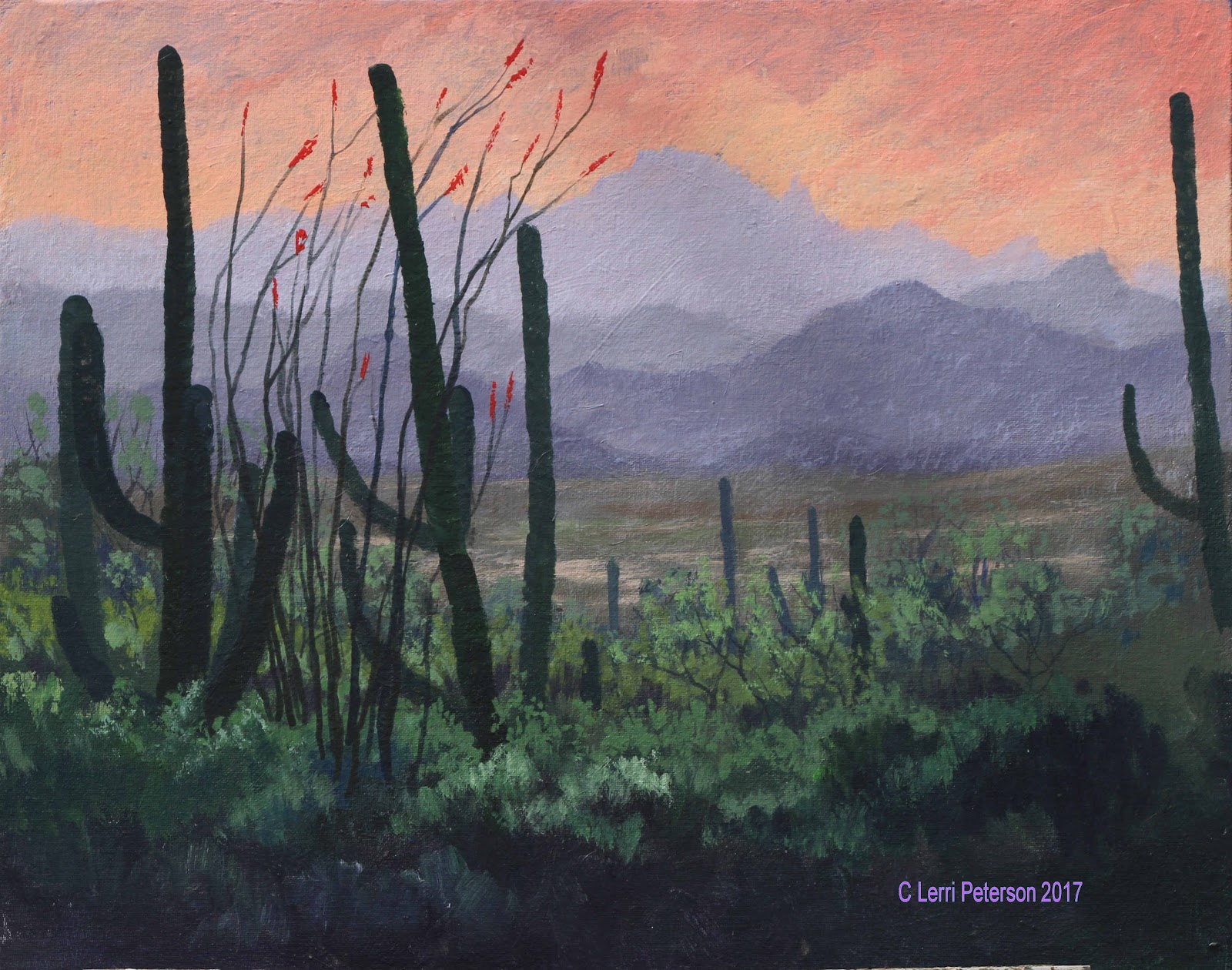
I added another occatillo on the other side rather than the branches in the photo and I am calling this one done.
Remember that all of the things we did this semester were studies and studies are there so you can learn different techniques, try something you haven't done before, explore your subject before you include it in a "masterpiece", this give you confidence so you know what you are doing when you do get to your painting because now it isn't something foreign, it is something you know.
Keep painting and I will see you in class!
Acrylic Study: Desert Values
I started in the sky area covering almost 2/3s of the area first spritzing it with a little water then with a thin coat of gesso to help the colors blend. Since this was wet into wet you need to work quickly while the gesso is still wet to add your other colors and to blend. I was using my #12 flat bristle but you could also use your 2" blending brush.
I double loaded my brush with yellow and orange and started at the bottom of the gessoed area and with long flat "X" strokes blended these colors up about half way adding color as needed. Then I picked up some napthol red and blended this starting about an into the top of the previous color and blended this up about half of what was left of the area. Then I rinsed my brush. The reason I added red in this area is because I am going to use blue and purple next and depending on how strong your yellow or orange is you can mix green or brown in the transition area, if the blue or purple mix with red, you get a more violet color which looks more natural in the sky.
Still working quickly, I double loaded my brush with blue and a touch of purple and streaked these colors across the top of the canvas blending them in to the gesso and almost down to the warmer colors to where they are just touching, then rinse your brush again.
With a clean brush and VERY LIGHT long "X" strokes, start in the warmer area and blend up into the blue colors first then lightly blend down until that division line disappears.
A side note here: In theory, my distant mountains should be just a shade darker than the sky but when I got home I realized my sky was too dark to start, how I solved this problem is coming up. A problem can always be fixed in acrylic, first you have to figure out what it is.
I am still working wet into wet as I start making the distant mountains. Using some of that grey I made at the start of the semester (blue, senna and gesso), I added a bit more blue and a touch of sienna to slightly darken the color, it should be a light blue/gray. Still using the #12 bristle brush, I used the flat edge to shape the top edges of the mountain by pulling down, the interior of the mountain can be scumbled in, just don't paint a solid hard line for the top edge of the mountains.
Each mountain range was done the same way except each range was just a bit darker than the previous one - more blue and sienna. Be sure to give the tops of the mountains an interesting profile so it doesn't look like a bunch of "m's" marching across your canvas.
The desert valley was just a bit darker but this time I added a bit more sienna and a touch of Hooker's or sap green, also note that there is a dry wash which is sienna and a touch of that light gray and whatever mud is in your brush, it just needs to be a bit lighter.
I let the painting dry at this point before adding haze but I am skipping over the haze part until later since I had to do it again after my corrections.
The line of bushes starting at the back need to follow the same "rules" and the mountains which is: As things go into the distance they be come softer and grayer in color, lighter in value, closer together and less detail. Keeping that in mind and switching to a #10 bristle brush, I mixed a medium gray/green using the gray I have been using with green (sap or Hooker's) with a touch of sienna and/or purple in it, this is for the under painting of the bushes in the back. This isn't your darkest dark but it should be a bit darker than the desert valley. I used the corner of my brush to shape the top edges or the bushes and made sure to have a lot of ups and downs, sizes and shapes as I created each layer of brush. This isn't a bunch or manicured hedge rows so don't make them flat across the top.

Each layer of brush becomes more intense in color (less gray) and darker in value. This is just the under painting for the foreground so anything can and will be changed. This is where we stopped in class.
When I got home, I wasn't happy with what I saw, I thought it was the mountains and tried to correct them, but the more I fiddled with the mountains, the worse it got so I stopped and analyzed what was wrong.
Since this was supposed to be a lesson on value, I started there and right off the bat I realized that my sky had been too dark to start making the mountains look strange so I was trying to correct the wrong thing and had to rework starting with the sky. Since the sky is the furthest thing away from the viewer it is going to be lighter than any of the mountains so the following was what I did at home to fix what I didn't like.
I did not paint out the sky with gesso and start over, I just used gesso, yellow, orange and red and went over what was there and if I went over the mountains, so what? I had to fix them anyway. I worked my way down from the sky to the mountains (I shaped them better I think), even to the valley between. I liked it a lot better when I got done.
When that was dry I added the haze in the air which also helps to push the mountains back. This was a mix of gesso, blue and a touch of purple to make a light blue/violet color and I added enough water to it to make a thin glaze of color. Still using my #10 bristle brush and wiping out most of the moisture and paint, I use small circles and very light pressure on the brush and covered all of the desert valley and mountains with this haze. You can actually see it in the reference photo, it is just all the dust and stuff in the air that we see thought when we can look out over these kinds of distances.
You can see the haze a bit better in this image.
I sketched in the placement of my cactus with my vine charcoal so I could play with their placement if necessary, to erase something i don't like I use a wet paper towel and it is gone.
The cactus in the back area of the bushes need to be the same value as the rest of the bushes that are around them, I used blue, Hooker's green and that gray I still have to get the color and value I needed, I switched to a #4 flat SABLE brush to paint in the cactus because it gives me more control. Be sure not to get these distant cactus too fat.
As I came into the foreground, the cactus got darker and more intense in color so I could create distance in this closer area.
Note that even these closer cactus have different values so that one looks like it is closer than the other.
I made each arm of the cactus with a series of small "U" shapes using the #4 sable brush and pulling in from the side to create one side of the arm, then turned the canvas so it would be easier to add the other side to create the outside edges of the cactus and their width.
 In class, I added the last cactus and the occatillo to the foreground, nestling it into the brush in front of the cactus.
Even though they were in the photo, I added some red flowers to the tops of the branches of the occatillo, these were simple to make using red on my brush and just touching the canvas, nothing fancy.
I highlighted the bushes and added sticks and twigs.
The highlight colors are similar to the darker colors but I added either/or or both yellow and gesso to lighten and brighten and used my #6 bristle brush to create the layers of brush,leaving and sometimes adding more dark for the shadows and mid tones.
PLEASE, if you are working in a shadow area, you need to use blues and purple to make the shadow look like a shadow.
Unfortunately, we ran out of time in class for me to finish my painting but since it was a study and I think I have given you enough information, you can finish yours however you want. If I get time, I will try to finish mine and I will post it here.
Keep painting and I will see you in class.