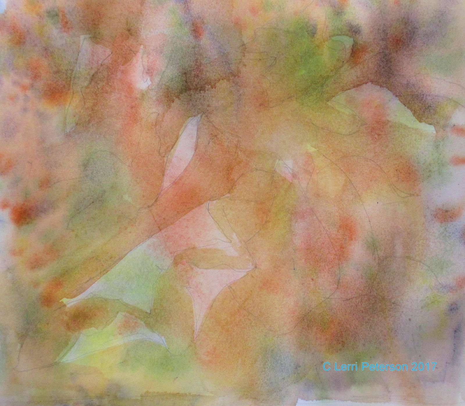
Watercolor Plus - Leaves and Berries Week 1
This week are are going to put together things we have been practicing to create an actual painting. We started out the same way but this time we are following a photo I took at the nursery and created a drawing from it.

You can put the drawing on before or after the first step, the choice is yours.
I started this painting much the same what I started the leaf washes we did a couple of weeks ago but this time before I splattered paint I wet the paper because I wanted the colors to spread and blend. Then I let it dry completely.
Remember not to get this step too dark or you won't have any place to go as you put on more layers.
Before I did the first wash of sap green I had to determine which leaves were the lightest and/or brightest. This is not always easy, one way that helps is squinting at the photo, it will help you see light and darker areas better. This isn't a science, just do your best better to error on the side of the light because you can always go back in and darken something up which is easier than trying to make something lighter.
You will want to paint around stems and berries with this wash because we will be doing their their washes separately. Yes, you could use masking on the berries and stems if you want but they are large enough that you can paint around them.
Remember to paint over EVERYTHING ELSE besides the bright leaves, berries and stems that includes all the background leaves because they will be much darker than the foreground leaves.
While the background is still damp - not wet - you can take your brush with some orange and sienna on it and under paint some of the background stems. Because the paper is still wet it will cause the paint you put down to spread a little creating soft edges. It is important that the paper is only damp, if you still see shine it is too wet wait a few seconds until you see the shine go away then add your stems.
Once the back ground is dry you can start with the first wash of color on the berries. Even though the berries are blue in the photo, they do have some red in them in the lighter areas so I am under painting with my alizarin crimson and doing like I did with the pumpkins: I put the color in the darkest area then with just a damp brush going along the inside edge, I tease the color up leaving a lighter area for the highlight. I will go over these berries several time to get the color and the darkness I want, this is just where I start.
I also under painted the stems with a mix of orange and sienna just be sure that areas that you are painting next to are dry or you could get blooms if wet touches drying.
Try to get as much of this done as you can and we will continue on with this probably until the end of the semester. If you don't get it done, no worries, I would rather you take your time and get the techniques down then have you rush through this and not know what you are doing or why, remember you are learning and no one dies if you don't finish or if it isn't perfect, those masterpieces may be a ways down the line, for now concentrate on learning.
Keep painting I will see you in class.
Advanced Watercolor Class Project: A Fall Proposal Week 5
Before I started class, I had to really look at the painting to see where I needed to start because I wasn't happy with how it looked and something just seemed off. I decided that the first thing I needed to so was to get another wash of color and shading into the fabric background and foreground and also get a wash on the paper around the bouquet.
The background wash was mostly the napthol red and alizarin, in the shadow areas I added some blue to create a shadow color and touches of orange around the box and the front of the bouquet. Then I let it dry before I painted the paper and reassessed my painting.
When the background was dry, I did another wash of color on the paper using napthol red (you can use cad red light) with a touch of orange and went over everything that is paper including the part behind the wine bottle.
Once I had done those two things and my painting had dried, I looked at my painting again and those washes made all the difference in the world! The reason for this is now all parts of my painting were at the same point of completion and the bouquet looked like it fit in, this is an important thing to remember because sometimes we are concentrating so much on one thing because it doesn't look right and we end up overworking that area, when all along if didn't look right because it was far more complete than the rest of the painting, so yeah, in comparison it was out of place but it was the rest of the painting that needed work not the thing you thought had the problem. Work in, around and through you painting bring all aspect up at the same time so you finish it all at the same time and you won't get areas that are over or under worked.
I added more shadows around the flower petals and created the tips of leaves sticking out by negative painting the shadow underneath the leaf.
I also suggested some flower petals in the hydrangea using blue with a touch of alizarin to create a lavender color. If you look closely, there are only a couple of actual flowers in that cluster the rest are just shapes. You don't need to spell out everything for the view, you just need to suggest.
I also went around to deepened shadows around the other flowers and leaves sometimes creating more leaves if I saw the need. Again, if you look closely the shapes only suggest leaves for the most part there really aren't any actual leaves just suggestions.
Next week I will be working on finishing up this painting, I may not get it all done but I will be close. I will take off the masking on the ring and work on that as well.
So keep painting and I will see you in class.
Watercolor Plus - Using Washes and Shading
The following are the instructions for the past 2 weeks of class starting with the second phase of the Fall Leaves followed by 2 kinds of shading round objects.
I do want you to note that even though these subjects are very different - leaves and pumpkins - the technique is the same: A series of washes or layers of color to achieve a goal. The techniques may be few but their applications are limited only by the artist.
Starting where I left off leaving more and more leaves leaves unpainted, I added 2 more layers of wash each time leaving more leaves unpainted. I stopped here only because I wanted to move on but wanted to show that once you got your own leaves to a level where you wanted to stop, then you could start adding detail.
I also did some lifting when I added the 2 new layers by using a clean damp brush to lift out leaf and twig shapes (I was using my angle brush), rinse and dry often when doing this technique or you will just move paint from one place to another. I let each new layer dry completely before adding the next, this is important or you could end up mixing mud when you stir up previous layers of color.
I looked for places like the curls on the leaves to add more color to make them darker or to suggest one leaf over the other.
Basically at this point I am starting detail and I am looking to see where I need to add shadows and color and textures. This, for me, is the fun part because if you stick with it and increase depth with shadow, color and detail the painting starts to come alive. Depending on how much detail you want to put into a painting will determine the amount of time it will take, if you are detail oriented you must be patient with this process.
Adding color to the leaves will give them character adding things like bug bites, holes and cracks just adds to that character of the leaf. The holes and bug bites were made with just a darker color (sienna and blue), which represents the bottom of the leaf that is in shadow.
Go out and look at leaves on the ground and see how they are decaying and changing color and shape. Take photos and keep a reference file either on your computer or a physical file of photos (you may end up with many files if you do this right). The more you see as an artists the more you will understand what you need to do to accomplish your goals for your paintings. Doing studies and drawings will also hope you along your artistic path, don't overlook doing studies or drawing because you "just want to paint" they are all connected.
This is where I stopped in class because we ran out of time. If I get a chance I will do some more work to make it look a bit more finished. I could make this look very realistic from this point, we will see.
Like I said, do as much as you personally feel like doing, this is an exercise to show you how to use washes to create depths and values in your painting, the detail is the fun stuff but you will learn a lot from doing it.
Shading Pumpkins
This Pumpkin actually has 2 washes of color. the first wash is the light orange you see near the top where the pumpkin will receive the most light, the yellow will be the highlight for this pumpkin. The second wash is the darker orange, leaving part of the first wash on the pumpkin the light orange
On the stem, the first wash is the light green was the first wash, the darker green was the second wash.
Note the little mark of orange on the side of the pumpkin, both the first AND the second wash were that value. The second wash appears darker because of the layers of color.
It is important to let the layers dry between washes.
The second pumpkin was done a different way using washes of grey to just do the values of the pumpkin first and later we add the color.
Note: the orange on the stem is because I had some orange on my brush at the time. It doesn't hurt anything.
The grey I use is usually a mix or ultramarine blue and burnt sienna, leaning more to the blue side. this time I was using that mix along with the "pallet" grey I get from adding water to all the paint in the cool section of my pallet, so it may have had a bit of everything to start.
Again, this is a couple of layers of the grey, I started with a bit darker mix (see the dark mark on the side) starting in the darkest area of the pumpkin which will be the bottom and the side away from the light source, then I took a damp brush and moved the color up the sides of the pumpkin, rinsing often until I had just a faint wash of color at the top. I left an area unpainted for the highlight. I repeat this process until I get the value in all areas that I am looking for.
Several layers later and adding a bit of blue to the final wash for the shadows, this is the result for the first pumpkin. I also used a dark mix of UM blue, a touch of sienna and alizarin crimson with enough water so it would flow (still needs to be transparent) to create the shadow on the ground and the shadow of the stem on the pumpkin.
I also use that color with a bit more water to suggest the ribs of the pumpkin.
This is the second pumpkin with a wash or two of orange and yellow for the highlight. Let it dry between washes, you may not need to add more than one layer if you did the under painting correctly and use a wash of orange that is a bit stronger than the washes on the other pumpkin, remember the water to keep it transparent.
I used the same mix as before for the shadows on the table and from the stem, but lifted the highlights on the ribs of the pumpkin. Where it goes darker on those rib lines was just the color from my brush.
Below is a comparison to the 2 techniques.
A Fall Proposal Weeks 3 and 4
In week 3 of this project I worked to start defining the leaves in the bouquet by adding color to the ends of the leaves and shadows where they go under other leaves or the paper or just into the bulk of the bouquet. Remember you are just suggesting leaves, if you make some general leaf shapes you will be giving your viewer enough info to understand what it is, you don't need to spell it out.
You will be doing both positive painting (painting the thing) and negative painting when you do shadows. Please look at the photo and look at things around you to see how one object casts a shadow on another before you start painting, it will help you understand what you are to be doing.
I also started working on the flowers. The red flower has darker reds near the center, I used alizarin and UM blue so it was a very cool red color. Also notice the darker shadows I added around the flower and how I used a shadow color (the alizarin and blue but more blue this time) to create leaves with negative painting.
Finally, I did a wash of that same shadow color to create the shadows of the folds in the fabric. It looks more purple because I had a wash of red on there before but it is actually more to the blue side before it went on the paper.
PLEASE!!! Look at the folds in the photo or take some cloth and LOOK at how the folds and creases are soft, different shapes, sizes and widths you will need to blend the edges of your strokes after you put them down, use a damp large brush to blend both sides of the color you just put down or you can wet the area first so the brush strokes will soften as you go, THIS IS IMPORTANT so you material looks soft.
This was the end of week 3.
On week 4 I did more of what I had started with the leaves but I also went into the fabric again this time with an overall (the fabric area) wash of alizarin and napthol red. In the shadowed part of the fabric after a couple of washes of the red, I added some UM blue so the color was a bit more purple. It will all get a lot darker than it is now if I have time.
(I think it was the camera exposure that makes the box look lighter, it could also be comparison to the previous lighter background and the now darker background, FYI)
I lifted out the suggestion of wrinkles in the shadow while the darker bluish wash was still damp.
You can use the darker background color to define the edges of your flowers or to leave bits of the lighter background color as highlights on the edges of flowers.
While it is hard to see, I did put a pale wash of yellow on the white flowers. this is just a tint so it was more water than color. I want the sparkle of the diamond to be the whitest thing in my painting so I needed to bring down the whiteness of the flowers and still make them look white.
Finally, I added color to the bottle. In the darker areas I used a strong mix of UM Blue, and alizarin crimson occasionally adding more of the crimson where it might be picking up light and more blue in the shadowed side. Noticed that along the bottom and the side, I left a little of the green under painting showing to suggest the bottle's glass.
Where the light is hitting the bottle, I used a damp brush with just water to blend out the edges, a bit of Hooker's green where the glass is in the light but leaving the original under painting for the highlight. Again I used a clean damp brush to blend the to blend the highlights into the other areas . Do this just around the edges of the color so the center stays light.
That is where we ended on week 4 and should catch us up for the past 2 weeks. We will continue on this painting and I think we may get it done in the next 2 weeks, at least that is what I am hoping.
Keep painting and I will see you in class.
P.S. If you are in the intermediate class on Monday, you might want to read through the first blog to catch up on basic watercolor techniques. We are using them all in this painting.
As I mentioned last week the first post will be for the Watercolor Plus class followed by the Intermediate class project.
Watercolor Plus - Learning Washes
Learning how to add layers of color by using thin layers of washes or glazes is very important to the watercolor artists, this is how we work. We build our paintings from the white paper to our darkest dark by adding several layers of washes. This is something you need to remember as a beginner because each layer of wash we lay down on our paper has an effect on the next layer we add on top of it. This is how we build value and intensify color and still keep the transparent quality of the watercolor.
In this exercise we gathered leaves to create a design then we laid down our first wash of many colors. First I wet the paper so that it was very wet, I want the colors to spread and bleed together, the water helps this process, this is called wet into wet painting (wet paper with wet paint).
Next I literally dropped different colors of paint onto my paper or just lightly touch the paper with my brush. the top of my paper was slightly elevated to that gravity could help me. When I got something I liked, I let it dry completely.
When the paper was dry, I looked at my sketch to determine which things in my design I thought should be the lightest because I will NOT be painting these areas.
I mixed a thin wash of burnt sienna - though color is not important her but the thinness of the color is - and water and - this IS important - I painted EVERYTHING EXCEPT THE AREAS I WANTED TO STAY LIGHT. That includes all the leaves AND the back ground EVERYTHING. I was working wet paint onto dry paper.
Then I let it dry. This is also important other wise you will get blooms and muddy colors.
Close up on one of the first areas I left without painting.
I have numbered these so you can see the difference. Some of the variation in the lightness of the 1st area is because what was underneath was a bit darker. Remember: Watercolor is a transparent medium.
I chose the areas I wanted to leave unpainted with my second wash (2) then mixed a similar color of sienna with touches or orange. Again working on dry paper with wet paint.
The next was was the same consistency as the first, it was a very thin wash but because I am building up the color and the value with each wash, it looks darker.
Close-up after the second wash.
This is where we ended for the day, we will continue on this in the next class so I hope that you have a chance to practice this and have your study to this point for class.
Don't get frustrated with yourself, watercolor is a challenging medium but it is also a very rewarding medium once you understand it. Be patient with the process and yourself, it will come.
A Fall Proposal Watercolor Project Week 2
We left off with our paper under painted and we have masked off the roses and the ring. This week we start adding in more color to the bouquet.
Using the photo as a guide, I added blocks of color where the leaves will be and where flowers and berries might be.
You can think about the general shape of the leaves but at this point you don't need to PAINT individual leaves just yet, just color and shape.
I got my colors a bit too dark so if yours are lighter than this you did better than I did.
BTW, I removed the masking from the roses at the end of the day when I was finished adding colors because after this point I will be a bit more careful in how I apply the paint. I did leave it on the ring area though.
I started adding color to the sunflowers and tried to get the general shape of the petals but I know that I can - and will - shape them better when I get into the darker background and shadows down the line.
I used my cad yellow light with just a little touch of orange for the petals and orange for the darker color.
The red sunflowers were all the same red, alizarin and napthol, the color was changed by adding more water.
The "flowers" of the hydrangea are just shapes that give the impression of flower petals only a couple actually look like flowers, the rest are just shapes. Let the viewer fill in the missing pieces with just a few clues.
This is where I left off in class last time, I will start working on the white roses and the bottle this next class and I hope to start working on the drape and paper around the bouquet as well. A lot to do so I hope you have your painting near this point.
Keep painting and I will see you in class.