Watercolor Class - Negative Painting Leaves
(Watercolor Plus' post will follow, scroll down though you might want to read the leaf post.)
Sorry I forgot to take pictures of the first couple of steps of this process and can't find the photos a student sent me so I hope a description will suffice.
First, and this is an optional thing, I did not have a drawing on my paper before I started this I waited until I have put my first colors down then drew my sketch in so I could see where colors landed and make my leaves accordingly. If you want to have a drawing on there, by all means do the drawing first.
I had my paper just slightly elevated at the back so gravity would help me and I wet the entire sheet of paper so it was very wet, even drippy. I wanted the paint to not only spread out but I also wanted it to thin down to keep it light when it dried.
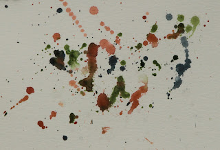
Next, using almost all my colors, I dripped and splattered colors all over my paper. I did have the photo so I could kind of see where there might be lighter or darker leaves but it didn't really matter for this stage of the painting. I also added some plastic wrap near the bottom for some added texture then let it dry completely, probably about 40 minutes, because it was a warm day and I set it outside for 15 minutes. Cooler, moister days it will take longer for it to dry under the plastic wrap.
When the paper was dry, I added my drawing using the photo for reference but not drawing it exactly like the photo. As I was drawing, I was determining which leaves were the lightest, those would be the first leaves I would paint around with the negative painting.
Now comes the fun part and the part that can be confusing for students new to water: Negative painting.
Negative painting is essential to learn if you are going to be a watercolor painter because you must save your lighter colors one way or another. On this painting I am painting around the areas I don't want darker and each time I will leave a next layer or the next lightest leaves and twigs.
This image has 2 layers of color on it. You can see the lightest colors I first left unpainted and when it dried I left those and added more to the unpainted. Also notice at the top I have painted around some leaves and twigs. I let it dry between layers.
Each layer of wash I added was about the same strength as far as value (light or dark) is concerned, the reason it gets darker isn't necessarily because I am using darker paint, because I'm not, it is because of the transparency of the watercolor and each layer of color you put down influences the next layer you put down. Each layer increases the value (lightness or darkness) and it also increases the color intensity (how strong the color looks: Pale to vibrant.).
This is where I left off last class, it has several layers of washes each time leaving more areas unpainted creating shapes of leaves and twigs that are deeper into the bush.
Here is the top again. By continuing to add layers of color creating darker leaves each time it gives depth to the bush.
I add this here because someone asked if I was just going to leave the leaves the way they were, the answer to that is no, this is just the under painting. I will come back when I have done as much of the layers as I want and detail out many, but probably not all, of the leaves.
This is a great exercise to learn about negative painting. It may be confusing at first but as the painting develops you will begin to see how you bring watercolor to life. I hope you try it.
Watercolor Plus Project: Missing Her Partner Week 2
I started out by under painting the flowers at the top of the cactus. I used the cad. yellow light with lots of water to under paint the petals. Notice that I wasn't real careful with the paint, the reason for that is the yellow is going to be the lightest thing there and I will be using a darker color to negative paint (see the post above) to petals in later.Also,while the flowers were still wet in the center, I added some crimson very watered down. Any red will work if you don't have crimson, just be sure you use enough water so the color is pale.
This next part it is important for you to have the reference photo so you can see where the light and dark is on the boot.
I was still using just the thalo blue and water but this time I was very specific as to where I added the color and how I blended it out. I need to save the lighter colors for the highlights so I was rinsing my brush often and sometimes lifting out color from the highlight areas with a clean damp brush as I painted.
First I added the thalo blue to the area I needed darker. then I quickly rinsed and dried my brush and pulled the edge of that color into lighter areas to create an almost invisible transition. This does take practice, so take your time. LOOK BEFORE you paint so you know where you need a darker, more intense color and where it needs to stay lighter. Work your way around the boot adding color, rinsing your brush and moving color to soften edges. Remember to rinse your brush often.
I also added another coat of the same color for the soles of the boot, leaving a lighter edge. The outside of the heal has 3 coats of the gray color and the inside has 4 coats of the same gray. Let the layers dry between washes.
I did start to work on the cactus a bit but mostly worked on the boot. If you have time,you can add more color to the cactus just like you did before, starting in the dips between the ribs and moving paint to soften the edges. Remember to leave the lighter color at the top of the ribs because that is the highlight.
Keep painting and I will see you in class.
Watercolor Project: Dancing Boots Week 3
This is the final week of the Monday Watercolor project.
Watercolor Plus, your blog will follow, scroll down.
This week was all about finishing the project, I started with the background.
I was using all different colors in medium washes. They weren't real light (thin) but they were still transparent with applied though they were more colorful than I normally work.
I also didn't finish painting to all the edges, this was my preference, you may do what you wish with yours.
I waited for the dirt to dry before adding the shadows for the boots and cactus. The dark color in the background is ultramarine blue, sienna and a little purple (very little purple). It is also the color I used for the shadows for the boots and cactus.
I used my liner brush to make the thorns on my cactus after the back ground was dry. They are a mix of orange and a little red and they come out of the tops of the bumps of the cactus ribs.
I also took my knife and scraped out some brighter highlights, just know what you want to do because there is no going back once you damage your paper.
I didn't put in all of the dead flowers but I did put some in to get some darker colors around the flowers and used that darker color to negative paint the petals of the flowers (painting the spaces between the petals to the will show up better).
If you are going to add detail to the boots like the stitching, LOOK AT THE REFERENCE PHOTO FIRST. The stitching must follow the ins and outs of the boots same as the cast shadow. The sides of the boots are wavy so your stitching must also follow the waves of the leather. In the shadow of the back boot, I lifted out the seam edge.
Notice the shadows of the boots, they also need to follow the dirt they sit on as well as follow the shape from the boot casting the shadow. REALLY LOOK at the shadow and see how it get smaller and closer to the boot back by the heal and has a gap up by the toes where the toes curve up. the back boot is leaning slightly so it has more of a shadow as the front part of the boot is off the ground.
You will also see that I did some splattering with my toothbrush to create the idea of little stones and gravel.
Do as much or as little as you want to finish up your project. There is always something more to do, you need to figure out what your needs are.
Just keep painting and I will see you in class.
Watercolor Plus Project: Missing Her Partner
With this project we are going to be putting everything we have been learning together to create an actual painting. It is not to say that you have learned everything, no, that journey has just begun, this is to show you that you can paint in watercolor and it isn't that scary.
The first thing we did after we got our drawing on the paper was to under paint the cactus. When you start your watercolor you need to look for the lightest color of the thing you are painting and that is where you start. The lightest part of the cactus was the top of the ribs so we used sap green and a little yellow with lots of water to create a very thin wash for the whole cactus.
Because it is the lightest color and all the rest of the colors will be darker it is just easier to paint the whole thing with the lightest color because it doesn't hurt anything and it needs to be there.
When that color was dry, we started on the shadows between the ribs. You should have your reference photo out so you can look at the cactus and study what you will be doing and see the shapes within the cactus such as the scalloped tops of the ribs.
The shadow color is Hooker's green and ultramarine blue and less water than the first time but enough so the color is transparent. Yes,we will have to do at least one more wash after this one to build up the dark value of the shadows, this will keep the watercolor transparent. If you only have sap green add more blue.
You may want to work a little at a time so your paint will stay wet and as you get more confident you can work longer sections.
Starting in what would be the bottom of the space between the ribs, paint a line following the curve of the cactus. RINSE YOUR BRUSH. With a damp brush while the paint is still wet pull some of that paint up the side of the rib of the cactus.The ribs that you are seeing straight on you will need to do this to both sides of the line you painted, as the ribs go away, use the dark paint to create the scalloped edges to the rib in front, this is negative painting because you are creating one thing by painting something else (yeah I know it is confusing but that is how watercolor works). RINSE YOUR BRUSH OFTEN as you move the paint up the side of the rib and be sure to leave the light color at the top. Check your reference photo often.
Here is another example of where you will need to do negative painting on the cactus. You need to leave the space for the light flowers unpainted so you will need to paint in between the petals of the flowers.
We also under painted the boot. I used thalo blue and a LOT of water to get a very thin wash of color. This will end up being your brightest highlight when you are done so you just want to tint the boot with color.
The inside of the boot and the under painting for the soles are the same color one just has more water in it.
The color I used was burnt sienna with a little touch of blue to make a warm gray color. Again, this is not dark, there is a lot of water in it to thin down, it will get darker as we work on this but this is where it starts.
The interior of the boot, add the color you have for the sole towards the bottom of the opening rinse you brush and dry bush the color up the side just like you did with the cactus.
This is what we got done on the first day. I suggest that if you are unsure as to what to do next that you don't paint ahead of me, we will get there. It is more of a problem to fix a watercolor than other mediums so be patient and I will see you in class.
Watercolor Project: Dancing Boots Week 2
Watercolor Plus notes will follow this post for the boots. Scroll down.
Last week we got our boots and cactus under painted, this week we start adding some detail. I started with the cactus because it is just too easy to get lost doing the boots because they really are the stars of the show, however, you can't forget the supporting cast members because they make the star shine.
I was using my 1/2" angle brush, Hooker's green and the ultramarine blue to make a dark color. LOOK AT YOUR REFERENCE PHOTO so you can see where the light and dark are on the cactus and to see that the edges aren't smooth but scalloped, you create the scallops with this dark color.
I put the color down where I see in the photo the dark shadows, then I rinsed my brush and with a damp brush, I went along the edges of that color to soften those edges that were on the sides of the ribs, if the color was shaping the scalloped tops I left the lines hard to define those edges. This was my first pass over the shadows.
Around the flowers on the top, I used the dark paint to define the petals of the flowers. This is called negative painting and it is something we do a lot of in watercolor because we have to leave the lighter colors.
This is what my painting looked like after I put the first round of shadows on the cactus. I haven't touched the boots yet.
Next I focused on increasing the intensity of the color by doing more washes of color like I did the previous week, but this time I had to remember to leave light areas alone where I needed highlights.
Again I was using my angle brush and thalo blue. I would put some color down, rinse my brush and move the paint with a damp brush. I did this to most of the boots but not all so I had highlights. When I got to the darker shadows, I added a little alizarin crimson to the thalo blue to purple it up, applied it and softened the edges with a clean damp brush. The dark cast shadow of the front boot onto the second boot is this thalo/crimson mix applied a couple of times.
The soles of the boots were under painted with a mix of blue and sienna, keep it on the blue side, I let it dry before adding another layer OF THE SAME COLOR to darken the sole. You may need to do this several times to get it dark enough.
The detail on the boots is optional, if you don't want to do it, don't, but if you do, pay attention to how the seams and stitching follows the curves and contours of the boots, they are not straight lines because the boots have wrinkles and folds. I lifted the highlight in the shadow on the second boot with the edges of my brush.
I did go back to my cactus and darkened some of the darker areas, especially around the flowers. To make something look lighter you must increase the value (darkness) of what is around the thing you want to look light. I added another layer of the dark blue/green painting around the petals. I also added one of the dead flowers in the back to, again, define some of the flower petals. I used burnt sienna and a little blue for the dead flower.
The centers of the flowers had several colors: Yellow with a little touch of orange. Orange with a little napthol red for the darker orange color and the napthol red and/or crimson for the center. You can used a small round brush or use the edge of a flat or angle brush like I did.
This is where I left off in class, try to get to this point in your painting if you can. I will probably be finishing this in our next class, working on and detail I want to add, putting in the background and the shadows under the boots.
Keep painting.
Watercolor Plus: Review of Textures
In our last class we learned how to create different textures in watercolor using many different things to create them. I will review them here but you should have your own samples labeled and saved for future reference.
These 4 are samples of using salt. These two are rock salt, from a grinder (1) on damp paint and just chunks of rock salt (2) on very wet paint.
These are both on damp paint: regular table salt (1) and popcorn salt (2).
These need very wet paper - just water - to work. 1 is tea 2 is coffee.
Some of you experimented with adding to a color and that is okay to. Save it for reference.
The first one is turmeric on wet paper. The second one I spritzed water with my spray bottle into damp paint.
Into damp paint using a tooth brush on both: 1- rubbing alcohol 2- water.
 The first one was using masking tape as a stencil and painting over it. You can use other things like masking fluid, dollies, things cut from card stock, etc. The next group of textures requires damaging the paper so only do this if you are sure. The leaves I scratched veins in before I added paint. The brown square I used a comb - a fork would work. The gray lines I used a pocket knife, my name I used an Exacto blade. the second set of leaves I used the exacto blade after I put paint down, scratching into wet paint. The gray and the end is what happens to the paper when it gets rubbed, I used sand paper but this can happen if you are putting your wet paper into and out of your bag. Be careful.
 This is splattering with a tooth brush. Great way to make small pebbles and sand.
This is splattering by throwing and dripping paint from a brush.
Somehow I missed my favorite texture so I will have one more in our next class, then we will move on to brush strokes.
Keep painting.


