Saturday, October 26, 2019

Fall 2019 Watercolor Class

Beginning Class: Alaskan Fishing Village Week 4

(The Monday intermediate class project was finished the previous week, this is the finally for the Wednesday beginning class)

I am really impressed with how quickly all of my beginning students finished this project, I was afraid we were going to run out of time but you all worked hard and did a fantastic job on this painting and for many it was the first time out and you did great.

Mostly what we did in our last class was to add the little things that make our painting finished like the curtain in the window or cracks in the walls.

The curtains were done with a very light (lots of water) gray using the dry brush technique and negative painting. Just pull down the brush leaving the frames of the windows unpainted (negative painting). You should see streaks if you did the dry brush dry enough.

To make the other windows, mix a dark color (blue and sienna) with enough water so it is still transparent and paint in the panes of the windows leaving the frames unpainted (again, negative painting). Windows are done! You can also use the dark color to add cracks into the boards of the house.

Along the banks of the shore, again using dry brush, I added some grass to the slopes. This was sap green with a touch of orange. Remember to use a paper towel to dry out the brush by the metal ferrule and spread the bristles each time you pick up paint, then touch the end of the brush to the paper and "flip" your brush. It is a quick more that you may want to practice before you work on your painting so you can get those individual grass blades at the top. (Yes, I noticed I didn't reflect this in the water, an easy fix later).

For fun if you want to, you can lift out some smoke from the smoke stack. With a damp brush and very little pressure, make a series of circular strokes to stir up the paint right around the top of the smokestack and less circles ad the smoke moves away. blot this with a paper towel and let it dry before trying it again or you can damage your paper but once should do it.

Finally, do whatever you feel you need to do to finish up your version of the painting be it adding more color to areas or more detail, of maybe you feel you are done as it is, this is up to you. Take what you have learned and apply it to things you want to paint,just keep painting and I will see you in class.


Sunday, October 20, 2019

Fall 2019 Watercolor Class

Project: Alaskan Fishing Village 

Wed. Beginning Class Week 3
(Monday intermediate to follow, scroll down)

We spend most of our time on the pilings under the building. This was negative painted and it is a new concept for most of the class and a challenge for all. You might want to scroll down to the exercise we did on negative painting to review the process. I used a mix of ultramarine blue and burnt sienna to create a dark color and I was using a 1/2" angle brush.

The goal is to create the idea that the posts that hold up the building go back under the building and are more in shadow the further back they go. This doesn't have to be perfect, if you take a close look at what I did here you will see that the posts and boards aren't perfectly straight or the same size and also note that I have suggested there are some posts deep under the building. When you are learning all these techniques, perfection should be way down on your list.


Also notice that I suggested the grass at the bottom, again, by negative painting both on land and in the water. 

The reflections in the water while similar to those on the land, they are painted a bit different. I painted the reflections with a series of horizontal stokes as I negative painted in the dark shadows. This will be a challenge because the tendency is to make nice straight lines but remember, the water is moving, breaking up the reflection NOTHING is straight. You might want to practice on a separate sheet of paper to get the hang of it.

I also added some mud along the shoreline. It is a mix of burnt sienna and a touch of orange. When you paint it in, start at the waterline, paint a bit of that waterline then rinse your brush and with a damp brush, pull some of that color up towards the grass. Again, don't make it even. Make it thick and thin and even skip areas to make it look natural. It should be darkest right along the waterline.

 The little rowboat is made mostly with negative painting. Creating the bow, the seats, the grass and the shape of the boat using the same dark color as before. Start in the darkest area by adding the darkest color then rinse your brush and with just water, pull the color out from under the front part of the boat. You can use what is on your 
brush to paint the bottom, to form the top edge of the boat, the suggestion of the middle seat and the back seat. If you need to reload, only pick up a little.

The middle seat casts a shadow that goes across the floor of the boat and up the side so there is a curve as you go up the side of the boat.

On the outside of the boat you will switch from positive painting the bow of the boat to negative painting the boat. Remember to rinse and used just water to spread the color up the side of the boat. The lines for the seat I did with the chiseled edge of my brush by just tapping.

This is where we left off in class we have a little more to do but I think we may get it finished in our next class.

Keep painting and I will see you in class.


Intermediate, Monday Class week 5

This week was adding all the final details. I got a bit carried away and added the ladder, phone poles and for fun, some smoke coming out of the smoke stack. You do not need to do this if you don't want to, that is your option, what I did was I lifted out the poles with my brush and let them dry before adding color and detail to the poles.  

The smoke was just lifted, more near the top of the stack and less as it moves away.

The ladder I used the chiseled edge of my angle brush with burnt sienna and a touch of blue.


I used the dry brush technique to add grasses using sap green with a touch of orange and my 1/2" angle brush. Pull the grasses over the bottom of the boat and the posts holding up the building.


The area on the other side gets a similar treatment using dry brush for the grasses but also add a touch of sienna and orange in those grasses as well.

I added a big bush on the side so the railings of the walkway didn't lead the viewer out of the picture. That I just dabbed on using the same brush, sap green and adding some blue when I wanted a darker color.

Do as much or as little detail as you want. I am finished with my painting so if you are also done with yours you will need to bring something else to work on for our next class.


Saturday, October 12, 2019

Fall 2019 Watercolor Classes

Projects: Alaskan Fishing Village

Wednesday Class: Week 2
(Monday's post will follow, scroll down)

In our last class we started adding shadows into our trees and texture into our building. Both of these take a little planning and a lot of studying BEFORE you put brush to paper. The trees seemed to give everyone the most problems because the technique is a combination of negative painting and positive painting, however, this is usually how it goes when you are painting. 

The most important thing to study is the shapes of the shadows in the trees. They follow the direction of the way the branches grow, so much the same way you painted the trees (scroll up a couple weeks or go to the picture page and look at the example of painting trees) except you will be leaving some of the lighter, first color for the highlights. 

I wanted it darker around the roof of the house and around the walkway in the back so I did paint around the roof but quickly switched the stroke one it was away from the roof to suggest a tree branch. That breaks up a solid dark outline around the roof but still gets the dark where I need it. I will probably go over this again next week because I do need it to be darker but I will be leaving some of this new color as well.

I was using my 1/2" angle brush and the color was either sap or Hooker's green with blue and a tiny amount of sienna so it isn't so bright a green.

The roof of the house was painted with the same brush using the dry brush technique so keep a paper towel handy.

Over all the roof I used the following mic of colors: burnt sienna with a touch of yellow and water to lighten. After you load your brush use the towel to squeeze the base of the bristles to wick out some of the water and also to spread the bristles, remember this is dry brush. When you apply the color follow the angle of the roof. You can use this color also on the hanging door on the front of the building.

The sides of the  building are shades of gray. Make a bit more color than you would for one side then you can mix other colors into this color to get darker colors and different shades of gray. My standard gray is blue and burnt sienna, to make it darker use more paint less water (still needs to be transparent), lighter more water; blue makes it a cooler color, sienna makes it a warmer color. You can go over the area a couple times before you need to let it dry, if the paper gets too wet all your colors will blend together.

Again, watch the water in your brush, use the towel to take out the excess then look at the photo to see how the boards of the building are going. The side under the eves is horizontal, the front is a mix of horizontal on top and vertical on the bottom. Dry Brush.

Once the roof has dried, you can add these colors - grays and sienna - onto the roof again, dry brush following the angle of the roof.

You will be using those same colors in the reflection but this time you only need to worry and adding them either straight down or straight across and you can wiggle your brush as you go.

Another thing we did was to darken the reflection of the trees behind the house. Do it the same as last time by wetting the paper where the reflection is first then dropping the dark blue/green and yellow into the wet area and let gravity do most of the work.

We will pick up where we left off when we meet again in class. My homework for you is to practice your negative painting and the dry brush BEFORE you go to your painting and really start looking at the world around you. Try to figure out how you would paint it. What colors would you use? What would you have to mix to get a color? How would you get that color? What is different between the things that are close to me and those similar things in the distance? The more you can see these things and more, the better artist you will become. Don't get discouraged, there is a lot to learn and you are just starting your journey.

See you in class.

Monday Project Week 4

Much of what I just wrote for the beginning class applies here as well. I was adding more dark to the trees,more color to the roofs and more texture/color to the buildings.

This was the third time I went over the trees to create darker shadows. I didn't paint over everything I needed to leave some of the previous colors but I did want it darker around the buildings using Hooker's and blue with a touch of sienna to create a deep forest green adding it with little marks to suggest branches of the trees. Look at the actual photo before adding in the colors.

I also made the reflection darker. Watercolor dries lighter so sometimes you need to go over something again to get it dark enough. Just repeat what we did before: wetting the paper first then dropping or touching color into the wet area and let gravity do its thing. Same colors as before.


The reflections of the buildings can be strengthened as well, just wait for the water area to dry first then you can wet the building area a little, not as much as the water area, it should only be damp then add the colors either as vertical strokes of horizontal strokes, you can wiggle the brush as you go but again let gravity help.

I wanted to strengthen the colors on the buildings so I just went over the areas with the same colors as last time (scroll back to the previous lesson if you need the colors), just adding another layer of dry brush. The great ting about old wood the more layers of dry brush the older it looks.

The roof I added gray (blue and burnt sienna) and burnt sienna alone again with dry brush and following the angle of the roof, this is important. 

I also used that gray in a stronger mix (less water and a bit more blue) to make a dark color to add the shadows under the building using negative painting to make the pilings stand out and I used that same color for shadows in the shed on the side, under the eves, around the door, on the stove pipe and a liter version to make the windows.

We are getting down to the final day on this project - one maybe two more lessons - we have the area in front of the building that include the boats and the pilings then we should have this thing wrapped up.

Try to have your painting to this point by the next class so you don't get too far behind.

keep painting and I will see you in class.


Sunday, October 6, 2019

Fall 2019 Watercolor Class

Project: Alaskan Fishing Village Week 3
Note: The beginning class has started a version of this project I will post their review first then the intermediate class's review, however, some of what we did in the Monday class was also done by the Wednesday class so I did direct the Monday class back up into the beginning review so I wasn't repeating what I just wrote.

In watercolor you must start with your lightest colors first and work your way to the dark and I like to work with what is furthest away first as well. The furthest thing in most landscapes is the sky to paint the sky I started with a mix of ultramarine blue with a tiny hint of burnt sienna just to slightly gray the blue and water to thin (lighten) the color. Remember, watercolor is transparent and white is the white of the paper so a thin wash of color will give you a light finished color.

I was using my 3/4" angled brush to get my paper covered and so I could easily paint around the treetops  and other things in my design, my rule of thumb is to used the biggest brush for the size of your paper you have so you can get the paper covered, especially when you are painting big areas, save the smaller brushes for later.

I painted the sky with this color as well as the house and the water, let this dry before you move on to the trees and grass.

The trees and grass were painted with sap green and a tiny, very tiny, touch of orange to mute the color. Green can be too GREEN so you need to tone it down with some form of red, I like orange or burnt sienna because using straight red can easily turn to mud and both those colors have some red in them. Use plenty of water to make a thin wash for the trees and grass. I did add more yellow and a touch more orange when I was painting the grass but it isn't really necessary.

I also went back to the blue and sienna color I used in the sky and building and added a bit more of both to ass to the reflection in the water. The one thing to keep in mind when painting a reflection is the water is moving which breaks up the straight lines and the shapes that it is reflecting so pull your brush straight across and/or straight down to suggest that water movement. Let this dry.

(This is where it is the same for both beginners and intermediate classes in what we did in class last week.)

Starting the under painting of the house, this is going to be a bit different: the brush will be dryer and you need to pay attention to the direction of the angles in the building.

The roof slopes at an angle, the side facing us has boards that are horizontal, the front of the building has boards that are both vertical (the bottom) and horizontal (the top) these distinctions are important to recreate the idea of old wood.

If you need to go to a smaller brush, this is the place you can switch brushes, still, don't break out the one haired brushes just yet.

The roof was painted with a mix of yellow and burnt sienna with lots of water to make an ocher-ish tint that I used across the roof following the angle of the roof. My brush was damp but not dripping with paint I also went back into that color and added tiny mounts of burnt sienna to add some color in the back part of the roof (look at the reference photo to see all the colors in the roof).

The gray for the front and side of the building is again the blue and burnt sienna but not so much water this time and you will need to have a dry brush. Use a paper towel to lightly squeeze the back of the brush after you have loaded your paint, this will remove some of the water and also fan out the bristles of the brush. With very little pressure on the brush, drag it across you paper in the direction of the wooden boards. You can repeat it a couple times but then let it dry a a minute or the paper gets wet and you lose the "grain" you just added. You can add some straight burnt sienna in the same way.

On the lower part of the building, I made the paint a bit darker using less water in the paint. I also under painted the door - I think it is a service door - with the same color as the roof but with a bit more or the two colors and less water.


You can repeat the door color in the water, remember the moving water.

We also managed to start the water reflections, this was a wet into wet technique.

First you need to wet the paper where the water is around the building reflection, WHILE THE AREA IS STILL WET you will add the green you used from the trees but use it a bit stronger - less water -  by just touching your brush to the paper and letting the watercolor do its magic. Your paper needs to be at an angle to that gravity can help you or it will just sit there. To that green you can also touch the paper with blue and yellow to create streaks. Don't get too carried away because it feels so good or your colors will become muddy and loose the idea of the reflections. We can do this again if we feel we need to later but let it dry for now. Also notice how I cut into the building with horizontal marks into the building, nothing is straight.

This is as far as we got and I was amazed you all did so much ans so well. We will start where we left off when we met again. 

Intermediate version

In our last class we worked on the reflections in the water and the buildings. The techniques are the same as I have just written for the beginner class so you can scroll up to review the process, the one thing we did in the Monday class was to add more color to the water. Same process as above: wet the paper and drop color onto the wet paper and let it run. You can use a bit more intense color but let the watercolor do most of the work. 

The houses are painted using the dry brush technique and following the way the direction of the way the wood or roof is going. I also used a mix of blue and burnt sienna with little water to make a dark color for the  shadows under the eves, around the windows, the gap by the yellow door and to negative paint the area under the buildings. I used a lighter wash of the same color to start the boats as well.

The red of the little building is napthol or cad red light with a touch of burnt sienna in it. I also used this color in the water.

However, when I was painting in the water to make it look like reflections all of this I either painted straight across or straight down with a wiggle of mu brush. Remember it is moving water,nothing will be straight or definite.


This is where we left off in class, next class we will be getting into detail and finishing up this project so bring your little brushes and your liners, I will see you in class.

Sunday, September 29, 2019

Fall 2019 Watercolor Class

Project: Alaskan Fishing Village Week 2


In the beginning class we did a couple things that are important for all students so the first part of this is for everyone and the last part will be for the Monday class.

One of the things I try to explain is the transparent nature of watercolor, that all the layers that are already on the paper will affect the next layer you put on top of it. In the above exercise, I started with yellow for the round shape and red for the cube-ish shape (hard to draw from the side), when the paint was dry, I used ultramarine blue on both to add shadows. However, the blue not only adds shadows but it also changes the color. The yellow ball is now greenish and the red cube is more purple.

If you want to know how colors will interact on your paper, do this experiment letting the first color dry before adding the second.

Next we went over negative painting and again we will be counting on the fact that a previous layer will have an influence on the following layers so we can "build" up darkness (value)


Each time I added a layer of paint, I left out certain of the posts but painted EVERYTHING ELSE or, in other words,  the negative space around the ones I was leaving. I did not positive paint the posts, I painted everything that I wasn't leaving the lighter value. This is important. In watercolor we work from light to dark with white being the white of the paper and if you look at the bottom of the paper, you will see that most of my layers are close to the same value except the last two which were just a little darker.

If you are going to be a watercolor artist, this negative painting is going to be your bread and butter, you use it in everything including the trees in the project. This lesson was for everyone, not just the beginners because I see how even people who have been with me for years struggle figuring this out so if you didn't do it, you might want to do it at home so you can get a better understanding of the process.

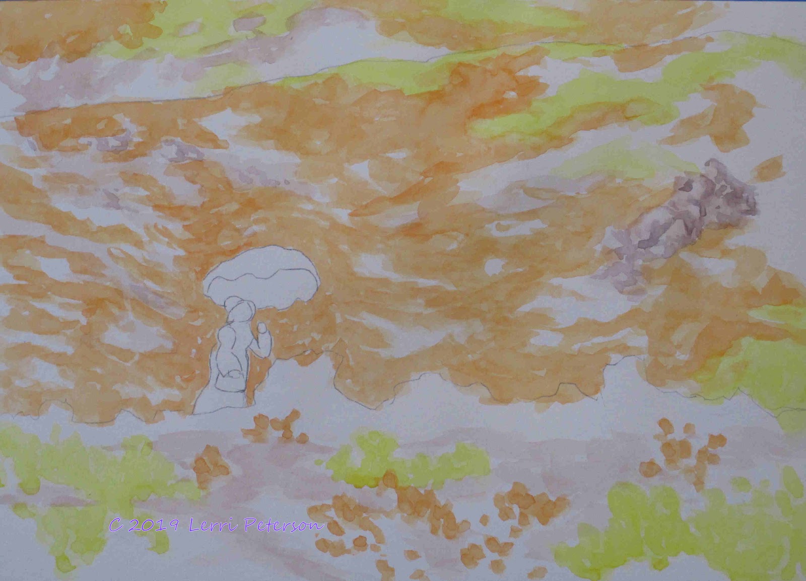
This is where the beginners can end, we did to a little work on the project in the Monday class, so I will cover that next.

This is actually a combination of both positive painting the branches and negative painting around the  trees in front. I was using my 1/2" angled shader, Hooker's green with blue to make a darker, cooler green, there will be another layer of darker colors next week. The tree trunks were blue and burnt sienna to make a dark color and I used the edge of my brush. Look at your reference photo often as you are painting these trees.

I added the red for the smaller house but to the napthol red I added a little burnt sienna to "age" the color a bit.

This is where we left off. Try to get the trees to this point for next time.

Keep painting and I will see you in class.

Saturday, September 21, 2019

Fall 2019 Watercolor Class

Project: Alaska Fishing Village Week 1


The first thing we needed to do was to get the design onto our paper. I showed various ways to do this including using a grid, transfer paper and using a light box. 

You can also draw direct onto your paper but be careful if you have to erase - this goes for using the grid system as well - because you can damage to surface of the watercolor paper causing problems when you go to paint. I recommend that if you are using the grid system to enlarge the image or if you are drawing it freehand, use drawing paper the size you want to work on then use either the light box or transfer paper to get your design on your paper so you don't damage it.

If you have a hard time using the grid to enlarge your design, there are programs that will enlarge them in your computer and print them out as a simple puzzle you tape together, I have two listed in the sidebar under the title of Lerri's Links, they are the Poster 8 for PCs and Razor Poster of Macs. If you have an image editor like PhotoShop, I understand it has an enlarger as well that will print on multiple sheets, you might check there first.

Having a good drawing of your design on your paper is important because it is our road map to our painting. Watercolor is a bit finicky and can be a challenge to fix something so having a good drawing will help keep those to a minimum. Use a pencil that has a dark enough lead (a #2B or #3B) that you can get your design on your paper without having to press too hard to see the design (again we don't want to damage the paper), but we don't want it so dark that it won't fade into the painting as we work. While have some pencil lines is okay, you don't want it to look like a cartoon with a bunch of dark lines showing after you put all that work into it.

Traditionally in watercolor, we use the white of the paper as our white so we have to work from light to dark. Always keep this in mind when you are working because it is opposite from working in other mediums. We build our watercolors with layers of color and value.

As I showed in class, there is nothing white in this photo we will be working from, if you have any doubts, find a sheet of white paper and lay it next to the frame of the door on the red house and you will see it is at least 1 or 2 shades darker than the white paper, it only looks like because of the dark values around it. I am mentioning this because in our first wash of color we will be going right over that house and I don't want anyone painting around it or using masking, bot are unnecessary.

Our first wash of color will be a very light blue/gray. I was using my large wash brush and mixed a sky color using ultramarine blue with a very tiny amount of burnt sienna in it to slightly gray the color. I wanted a color like the clouds are starting to burn off and some of the blue is showing through. On my paper, I just used water to wet the area from the top to the water's edge so that the paper was damp and my paint will flow. I have to work vertically so you can see what I am doing which is a challenge in watercolor but I do recommend that you slightly elevate the top of your paper with either a roll of tape or your purse or something that will give you at least a couple of inches off the table so that gravity will work with you otherwise, the paint just sits there causing problems.

Start at the top of the paper with your color and paint it about a third of the way down, rinse your brush and wipe off the excess then use just the water on the damp brush touching it to the paper just at the bottom of the color you just put on and let the paint flow into the wet area. This will give you a graded wash, just be sure you are working wet into wet. If you need to add more color, just repeat this step starting at the top with more color. This takes practice, the key is to not have your brush too wet at any time, it needs to be damp but not dripping and having the paper damp to begin with will keep your paint moving.

The water is painted the same way with just a bit more blue and can be a more solid color. Then let it all dry before doing the next step.


I forgot to take photos of the first wash but if you look in this photo you will see that the sky near the top is a bit darker than the houses. This is because of the graded wash in the first step.

With all painting regardless  of medium there is usually an under painting, this step is the under painting for the background trees but in the end becomes the highlights of the tree, remember light to dark. 

All of the trees in the above were painted the same way shown here: I use an angle brush but this will also work with a flat brush, using sap green with a touch of yellow and a lot of water to make a thin wash, I started with a line for the top of the tree with just a couple taps of the flat end of the brush to start the top. To start the branches I come down a bit from the top and with the corner of the brush and a little flick, I make the top short branches. The longer you drag the brush on the paper before you flick it up, the longer your branches will be.

Remember that these are not Christmas trees so they should not be perfect and don't lose all the spaces between trees at the top and make tall ones and shot one. Near the houses the  branches overlap so much is becomes a solid color.

The grasses were the same color as the trees with a little touch of orange in it. Remember not to get it too dark at this point, these are the highlights.

The water I added blue to the green and this time where the tree reflections are I just pulled straight down and used water to blend as soften. You can wet the area where the trees are first but try not to get too much in the building reflections.

This is where we left off in class we will finish up getting everything under painted in our next class.

Keep painting and I will see you in class.

Saturday, April 27, 2019

Spring 2019 Watercolor Class

Watercolor Plus Project: Pink Umbrella Week 1
(Monday Class's post will follow this post so scroll down.)

This week we started our version of the Pink Umbrella going step by step, one wash at a time.


Once we had the drawing on we added light washes of Yellow and Orange for the flowers and where there is going to be rocks or paths, a light wash of burnt sienna. Look at the photo for suggestions of the paths and rocks. I did move some rocks on the right of the photo into my design because they were outside the cropped area. I was "dabbing" with my brush rather than making long strokes and I was trying to follow the curves of the hills with my strokes to give texture and contours to my hills.


Second verse same as the first except on the rocks and paths. More orange and yellow to the flower ares to make them brighter and same kind of strokes. I need to get the value (darkness) of the hill behind the woman dark enough to make her stand out. This can take several layers to accomplish so don't try to rush the process because you can rush right past where you wanted to be.


I did a separate demo on creating rocks out of just a swath of color because the rocks on the hillside are rather small and would be hard for you to see.

Creating a pile of rocks so they don't look like a wall takes a bit of practice and studying rocks will help but the biggest thing is to vary your sizes and shapes.
It is very human to line everything up and make it all the same size and shape, Nature isn't like that. Things in Nature are chaotic/random, a pile of rocks can be an assortment of building sized boulders down to tiny pebbles, you as an artist need to be able to see this in Nature then picture it in your minds eye when painting. Fro this example I added some blue and crimson to the burnt sienna to create a cool, shadow rock color then decided the sun was coming from the left and shadows were on the right then tried to create a pile of rocks of various sizes, shapes and direction. This is also how I added the rocks into the painting (next photo) but with even less detail. Remember, suggestions are better in paintings rather than spelling it all out for your viewer.

All these rocks are is a suggestion. They are too far away for much detail and the shadows don't need to be any darker.


I added one more layer of color to the MIDDLE GROUND ONLY. The same orange, the same yellow and at about the same strength (mix or water to pigment). I didn't add any more to the far background to help give a sense of distance to my painting. I think that this is the last wash of color I will do on the middle ground flowers at this time, I will see how it looks when I"m a bit further on but at this point that is about where I want the value around the woman.

I also started added some of the green areas once I was done with the flower colors. The green is a mix of sap or Hooker's green and orange with water to thin the color to get an army green color. You can see the color where I painted over the white paper, those darker greens happen because I painted over orange areas with the green and the green became darker and browner, this is how watercolor works because it is a transparent medium, this is also what I wanted.

This is where we left off in class, we got a lot done, if you are still trying to get here don't worry we have time, just don't rush, take your time, speed comes with experience and with watercolor speed is a relative term.


Keep painting and I will see you in class
----------------------------------------------------------------------------------
Monday Watercolor Class Project:
Pink Umbrella Week 3 Final

This week turned out to be the final week for this project, no one more surprised than I was, thought it would be at least 4 or 5 weeks to complete but that gives you time to finish or start your own project.

To finish up this painting I focused on the detail in the foreground with the plants and flowers and then the woman.

Where I had big patches of just color (yellow orange or lavender) I mixed a dark green with the Hooker's and blue with a touch or sienna to make a dark, cool drab green, then I negative painted in shadow areas in those solid colors to suggest clumps or individual flowers. You need to get dark in and around these clumps so they will stand out.


On the lavender color I mixed a deeper blue color with ultramarine and crimson to suggest the deeper colors of the blue flowers as well as the above dark green to suggest the clumps of flowers.

The woman isn't as hard as you would think, the hardest part was finding the right color for the umbrella and none of the colors I normally use would work, so I looked in my bag of paints and found Thalo Crimson and it was just about perfect, if you have Opera, that is also a good color for her umbrella. If you need some thalo, ask me in class, it only takes a tiny amount.

The umbrella and purse were only mixed with water to lighten. On the umbrella I added an almost straight out of the tube color right along the outside edge of the back edge of the umbrella, then I rinsed my brush and with just the water on my brush (damp not dripping) I moved the color up towards the to of the umbrella. I rinsed my brush several times so I could get a graded color. The top of the umbrella I left white.

The shadows on her dress was the same color I used on the lavender flowers but with more water so it was very dilute. I was looking at the photo so see where the shadows were and left the white of the paper as the white of her dress. 

For her face I used the shadow color and added a touch of burnt sienna to it, it was still very dilute. For her hair and the dark ribbon on her hat it was a more concentrated mix of the sienna and blue to create a dark color.

Do not get too picky with painting her, she is too far away for much detail, you just need to suggest things and she will be there when you are done.

This is the finished painting. If you need more time to finish yours we still have a couple of weeks left, otherwise, you and I can work on something we want to paint for the rest of the semester. If you have questions or need me to demo something you are having problems with, let me know and I will do a demo for the class because I am sure you are not the only one with similar problems.

Keep painting and I will see you in class.