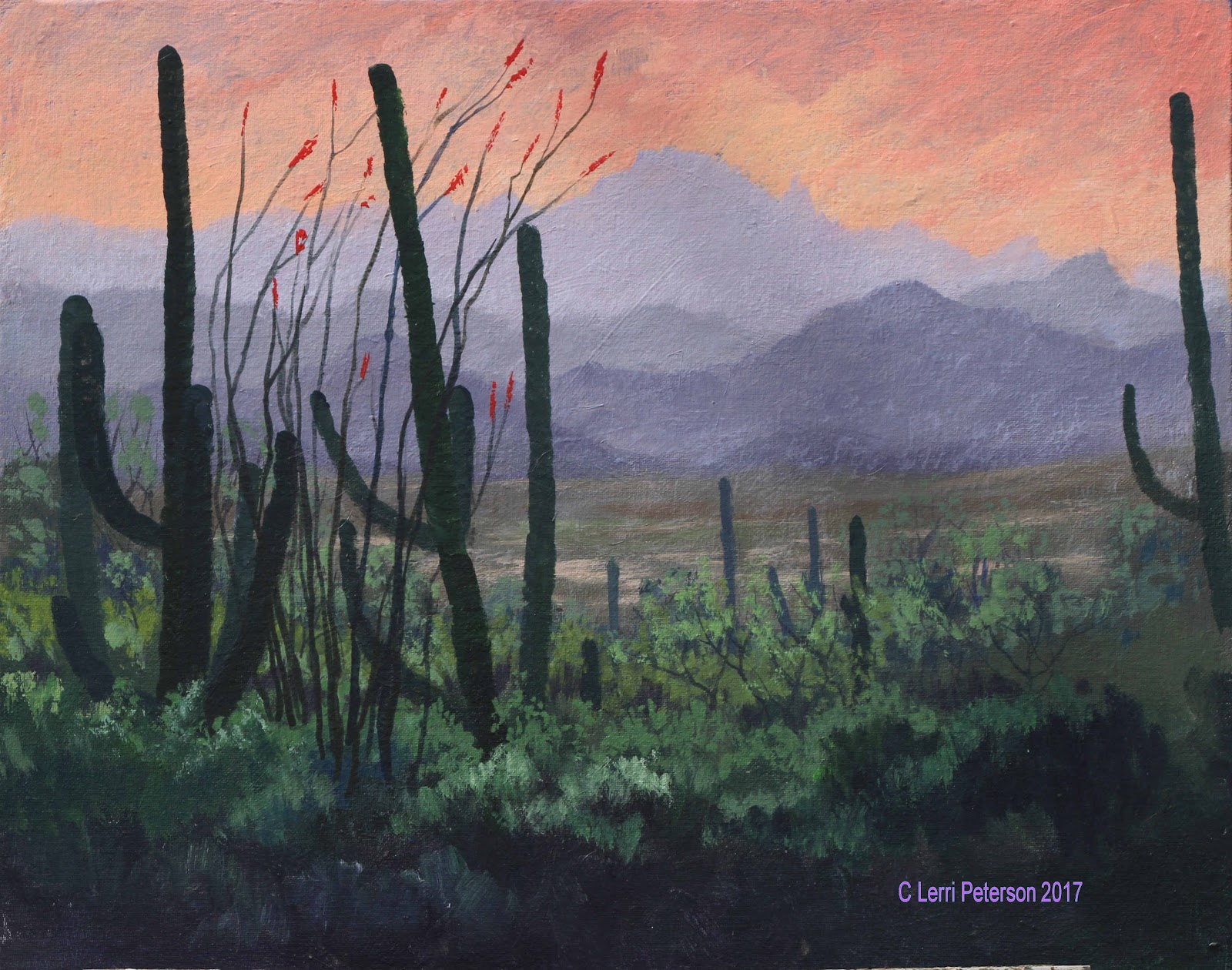
Acrylic Study: Desert Values
I started in the sky area covering almost 2/3s of the area first spritzing it with a little water then with a thin coat of gesso to help the colors blend. Since this was wet into wet you need to work quickly while the gesso is still wet to add your other colors and to blend. I was using my #12 flat bristle but you could also use your 2" blending brush.
I double loaded my brush with yellow and orange and started at the bottom of the gessoed area and with long flat "X" strokes blended these colors up about half way adding color as needed. Then I picked up some napthol red and blended this starting about an into the top of the previous color and blended this up about half of what was left of the area. Then I rinsed my brush. The reason I added red in this area is because I am going to use blue and purple next and depending on how strong your yellow or orange is you can mix green or brown in the transition area, if the blue or purple mix with red, you get a more violet color which looks more natural in the sky.
Still working quickly, I double loaded my brush with blue and a touch of purple and streaked these colors across the top of the canvas blending them in to the gesso and almost down to the warmer colors to where they are just touching, then rinse your brush again.
With a clean brush and VERY LIGHT long "X" strokes, start in the warmer area and blend up into the blue colors first then lightly blend down until that division line disappears.
A side note here: In theory, my distant mountains should be just a shade darker than the sky but when I got home I realized my sky was too dark to start, how I solved this problem is coming up. A problem can always be fixed in acrylic, first you have to figure out what it is.
I am still working wet into wet as I start making the distant mountains. Using some of that grey I made at the start of the semester (blue, senna and gesso), I added a bit more blue and a touch of sienna to slightly darken the color, it should be a light blue/gray. Still using the #12 bristle brush, I used the flat edge to shape the top edges of the mountain by pulling down, the interior of the mountain can be scumbled in, just don't paint a solid hard line for the top edge of the mountains.
Each mountain range was done the same way except each range was just a bit darker than the previous one - more blue and sienna. Be sure to give the tops of the mountains an interesting profile so it doesn't look like a bunch of "m's" marching across your canvas.
The desert valley was just a bit darker but this time I added a bit more sienna and a touch of Hooker's or sap green, also note that there is a dry wash which is sienna and a touch of that light gray and whatever mud is in your brush, it just needs to be a bit lighter.
I let the painting dry at this point before adding haze but I am skipping over the haze part until later since I had to do it again after my corrections.
The line of bushes starting at the back need to follow the same "rules" and the mountains which is: As things go into the distance they be come softer and grayer in color, lighter in value, closer together and less detail. Keeping that in mind and switching to a #10 bristle brush, I mixed a medium gray/green using the gray I have been using with green (sap or Hooker's) with a touch of sienna and/or purple in it, this is for the under painting of the bushes in the back. This isn't your darkest dark but it should be a bit darker than the desert valley. I used the corner of my brush to shape the top edges or the bushes and made sure to have a lot of ups and downs, sizes and shapes as I created each layer of brush. This isn't a bunch or manicured hedge rows so don't make them flat across the top.

Each layer of brush becomes more intense in color (less gray) and darker in value. This is just the under painting for the foreground so anything can and will be changed. This is where we stopped in class.
When I got home, I wasn't happy with what I saw, I thought it was the mountains and tried to correct them, but the more I fiddled with the mountains, the worse it got so I stopped and analyzed what was wrong.
Since this was supposed to be a lesson on value, I started there and right off the bat I realized that my sky had been too dark to start making the mountains look strange so I was trying to correct the wrong thing and had to rework starting with the sky. Since the sky is the furthest thing away from the viewer it is going to be lighter than any of the mountains so the following was what I did at home to fix what I didn't like.
I did not paint out the sky with gesso and start over, I just used gesso, yellow, orange and red and went over what was there and if I went over the mountains, so what? I had to fix them anyway. I worked my way down from the sky to the mountains (I shaped them better I think), even to the valley between. I liked it a lot better when I got done.
When that was dry I added the haze in the air which also helps to push the mountains back. This was a mix of gesso, blue and a touch of purple to make a light blue/violet color and I added enough water to it to make a thin glaze of color. Still using my #10 bristle brush and wiping out most of the moisture and paint, I use small circles and very light pressure on the brush and covered all of the desert valley and mountains with this haze. You can actually see it in the reference photo, it is just all the dust and stuff in the air that we see thought when we can look out over these kinds of distances.
You can see the haze a bit better in this image.
I sketched in the placement of my cactus with my vine charcoal so I could play with their placement if necessary, to erase something i don't like I use a wet paper towel and it is gone.
The cactus in the back area of the bushes need to be the same value as the rest of the bushes that are around them, I used blue, Hooker's green and that gray I still have to get the color and value I needed, I switched to a #4 flat SABLE brush to paint in the cactus because it gives me more control. Be sure not to get these distant cactus too fat.
As I came into the foreground, the cactus got darker and more intense in color so I could create distance in this closer area.
Note that even these closer cactus have different values so that one looks like it is closer than the other.
I made each arm of the cactus with a series of small "U" shapes using the #4 sable brush and pulling in from the side to create one side of the arm, then turned the canvas so it would be easier to add the other side to create the outside edges of the cactus and their width.
 In class, I added the last cactus and the occatillo to the foreground, nestling it into the brush in front of the cactus.
Even though they were in the photo, I added some red flowers to the tops of the branches of the occatillo, these were simple to make using red on my brush and just touching the canvas, nothing fancy.
I highlighted the bushes and added sticks and twigs.
The highlight colors are similar to the darker colors but I added either/or or both yellow and gesso to lighten and brighten and used my #6 bristle brush to create the layers of brush,leaving and sometimes adding more dark for the shadows and mid tones.
PLEASE, if you are working in a shadow area, you need to use blues and purple to make the shadow look like a shadow.
Unfortunately, we ran out of time in class for me to finish my painting but since it was a study and I think I have given you enough information, you can finish yours however you want. If I get time, I will try to finish mine and I will post it here.
Keep painting and I will see you in class.
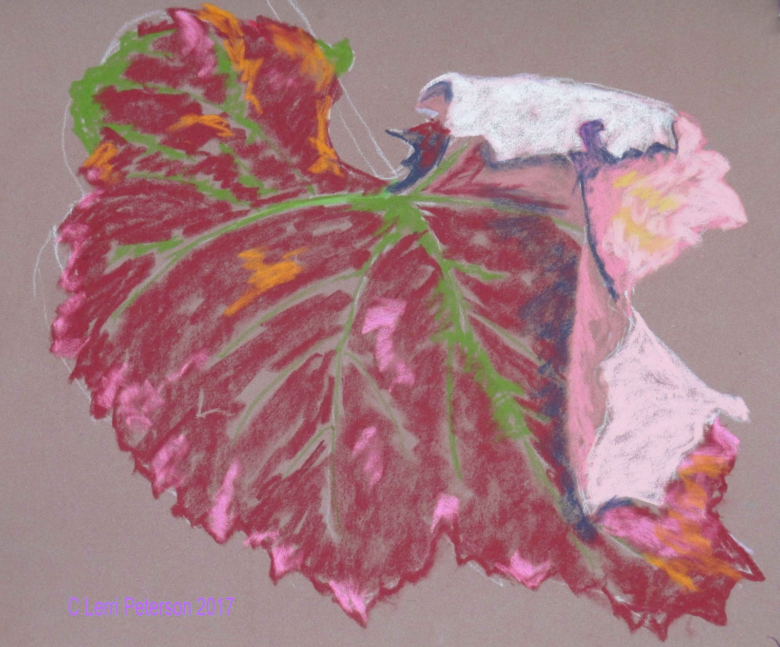
Pastel Leaf Study
Week 1 of the leaf study consisted of getting the drawing on the paper (I was using s tan, sanded paper) and basing in features like the veins and folds; light and dark areas to get the leaf under painted.
Note that I am not trying to finish anything at this point, I am just trying to get it to a point so I can see where I need to go, anything can be changed at this point.
I also started adding the background but forgot to take a photo, sorry.
Week 2 I was fleshing out the leaf and adding details and finishing up the back ground.
Once I had the red of the left blended, I added smudges of 2 colors of lavender one a warm, earthy lavender and the other a cool, blue lavender and lightly smudged these colors to create the "sheen" on the leaf.
I also went back into areas around the veins and some of the edges with two versions of light green: One a bit darker for the base of the veins and some of the smudges of green still left in the leaf and a lighter version for the veins themselves, finding an edge that would let me make fine lines.
Also note that some of the finishing of the leaf I used the blue/violet and my indigo to create some of the detail in the leaf, mostly just going around some of those smudges I made earlier.
The fold on the leaf was the critical part of the composition and I needed to create the sense of a third dimension and to accomplish that I had to use the contrast between light and dark.
I used my indigo for shadows and some of the rot forming on the leaf, the pink areas were a combination of several colors of pink, white and orange with a little bit of a light lavender in the shadow areas, blending as I put down each layer until I got the desired color and value.
I used white to suggest some of the veins and to lighten where the brightest light was hitting the fold.
Using the darker colors of the background in most places, I defined the edges of my leaf. The background really only needs to be random color and shapes to suggest other leaves. If you get too much detail in your background it detracts from your subject which is the single leaf.
Also, by keeping the colors in the background a bit muted by adding and blending complimentary color (red and green mostly) it grayed the background colors making the leaf colors look brighter.
Remember doing studies like this lets you experiment with color and techniques and teaches you to really look at your subject. Keep painting and I will see you in class.
Pastel Project: Creating Distance with Value
(This is a combination of 2 weeks worth of work on the project, FYI)
Now that I have the background in and the foreground brush based in, it was time to start adding the foreground cactus.
Remember that we need to keep in mind that even if things are closer they still need to follow the rule that in the distance they get smaller, softer and grayer in color so the tall saguaros in the back need to be a grayer lighter color than the ones up close to the viewer. If you have limited colors in your pastels, you may need to use either a gray or a blue/gray with your green to get the proper value.
Another thing to watch is where the bottoms of the cactus start. be sure that they all don't start at the same point or they will be visually all on the same plane (distance from the viewer) and you won't get the depth even if you are watching your values. It will look confusing to the eye.
Even these closer cactus have slight differences in value so you can get a sense of 3 dimensions otherwise they look flat.
I used my darker gray/green and my indigo to create the silhouettes of these closer cactus. I also used the indigo to make the branches of the occatillo which is slightly in front of the two saguaros.
The rim lighting was a pale yellow color but it is not a solid line, it is a series of short choppy strokes mostly pulling into the cactus to create that spiky look of the cactus.
I also did some highlighting and shaping of the bushes around the bottom of the cactus.
I used the contrast between the dark and the light to show off the prickly pear cactus. Again, I added the spiky look with a series of little marks, this time using a darker yellow or golden color.
Use contrast to your advantage whenever you can, it brings life to your painting.
This was where I ended the class two weeks ago.
In the last class, I finished my painting by adding the brush coming in from the right hand side, shaping my brush a bit better, adding grasses and weeds and all the little things I felt were needed to make this painting feel complete.
Be sure to have your reference photo in front of you as you finish up your painting.
To the occatillo I added the suggestion of the red flowers they have in the spring time even though they were not in the photo I just felt like adding them. If you don't want to add them you do not need to.
I just used a dark red color and made a few marks at the very ends of the branches. don't get carried away, these are just suggestions. I also went over some of the branches with a dark brown especially near the bottom to make them look darker.
The branches coming in from the side were what gave me the most concern because I was so happy with everything else, I was afraid to just start scribbling all over my paper but I took a deep breath and my indigo and started making branches first.
The trick is, when you make branches on trees or bushes, do a lot of them and don't make them all nice and smooth they are quite chaotic if you really look at them - which you should before you start to put them in you painting. They may have a general direction but they make lots of twists and turns to get there, they also over lap on another. Don't be afraid to cross over other branches and twigs and don't end them all at the same place, that is called a hedge and it means that a person has come and pruned the plant. Make irregular shapes they are more natural.
Once I had the branches in with the indigo - if you look at the photo you will see some brighter branches that are catching the light - I used a soft light gray to highlight some of the branches before I added the leaves. The leaves were just a series of marks with a yellow/green/gray. I made clusters and covered up parts of the branches but I also left open spaces, desert plants usually don't have tons of leaves, they are small, tend to be near the stems and branches and there are quite a few dead branches in them.
The cholla at the bottom right are probably the simplest thing in the whole painting, like making stick figures. I used a very dark brown and made a series of straight lines connecting or coming off of each other to create the general shape of the cholla then with a light pink I made the spines the same way I did on all the other cactus with small inward strokes.
Finally, I went through my brush and added more shape to them - even in the darker areas - added highlights and suggestions of branches and to help create that glow I put light against dark to make it look like the sun was shining through the grasses, weeds and leaves.
Finish this up to your own satisfaction, I will be starting something new in the next class, probably the curled grape leaf if you want to follow along. Until then, keep painting and I will see you in class.
Watercolor Class Studies: Leaf and Rock
When ever you are doing a watercolor with detail like the curl on this leaf, be sure that you have a good drawing before you start, it acts like a road map so you don't get too lost.
Once you have the major features of the leaf sketched in, you will want to wet the entire leaf with just water because this first under painting you will want the colors to blend and mix.
Once you paper is wet you will be adding the veins first with a mix of yellow and a touch of sap green. Use enough water with your paint so that it is very pale in value. Remember you need to to work from light to dark in watercolor so this first part will be very light.
I use an angled brush but a round brush will work well here. With the yellow-green on your brush barely touch the tip of the brush to the paper and go over the lines, they should spread out as you paint because of the wet paper. This is what you want it to do.
Once you have the veins in then start dripping or touching in other colors like orange, red or crimson even yellow to the main body of the leaf. Where you have the curl keep a paper towel handy and use mostly red or crimson with lots of water, this should just be a tint. If it is too dark, wipe it out while it is still wet what color is left will probably be about right.
The key here is wet paper and thin paint. Once that is done, let it dry completely before moving on.
When your paper has dried completely you can now start deepening the color and increasing the value. You will be working on dry paper this time so no need to wet it first.
You will be using the same colors as before for the red parts of the leaf but when you are in the shadow areas you will add ultramarine blue. the blue mixed with the red will give a purplish color which is perfect for the shadows.
Start in the areas which will be the darkest part of the leaf, paint in sections so you can avoid leaving hard lines. Lay down some of the darker color (this may not be the final color remember we work in thin layers) and as you move away from the dark area, use water to bleed the color out. What you should end up with is a graded color going from dark to lighter. Let it dry before trying to go over it again or you could be mixing mud.
Don't for get to leave the veins unpainted and tap your brush around them to leave some of the green.
The curl is painted much the same way but the shadows are a bit lighter (see above).
Because we have to wait for things to dry with watercolor we stretched this to another week. The first 2 examples were done on the first week, the next 2 will be what was done in the next class.
I continued to add layers of color to bring up the color and increase the value in the shadows just like I did in the previous demo. I also added a bit of dark blue behind the curl so I could see the contrast between the light of the leaf and what is behind it.
When it was dry, I added details to the upper part of the curl using very light washes to show some texture in the leaf.
I also went around the edges with a darker color and sharpened the edges of the leaf and well as using the dry brush technique - little water and little paint on the brush - and lightly skimming the surface of the paper with my brush to add color and texture to the leaf.
I also used my liner brush to add some suggestions of lines around the veins so they would stand out but I did not outline the veins, more like dots and dashes.
Keeping in mind that this is only a study I really didn't need to do much more to the leaf so this is where I stopped.
One of the things about doing a study like this is you get to find out what works and what doesn't. If I were to do this again for real, I think there are different techniques I would use such as using masking out the veins for instance. Studies are not a waste of time because you can learn so much from them and you can practice techniques you might otherwise be afraid to try if you were working on your "masterpiece".
The Rock
The Rock was started much the same way as the leaf: I wet the whole area of the rock with clear water then added in very thin washes of color. The colors this time are yellow, touches or orange and sienna. In the shadow areas a gray which was a mix of blue and sienna. You can see my test of the gray along the side and the bottom and note that the actual color may very a little bit, I am looking for the value.
 Once you have this under painting done you must let it dry. This is one of the hardest things for the novice watercolor student to learn: Letting the paper dry before adding more layers but it is an important lesson to learn.
Once the paper has dried it is time for the next layer of color, however, you will need to leave the areas that are the lightest value alone because what you have now is that lightest value.
The color AND the value will be the same as before because watercolor is transparent the color you just put on will affect the next layer by making in darker in value and more intense in color.
I used the sienna and yellow with the occasional touch of orange and worked in sections. I put down the color, rinsed my brush, then with the damp brush I went around the edges of the area I painted to soften and blend.
This rock has a lot of texture so don't be afraid to be a bit more patchy with you paint. That doesn't mean making it look like a patchwork quilt, it means not worrying about totally blending areas together or having dark, light or even different color patches, it will add to your rock's character.
The gray for the shadows is the same and the same value as before but now you start defining some of the structures in the shadows by painting around them with this next layer
leaving the previous color as the lighter areas within the shadows.
Your brush is your multi-tool, once you learn how to use it to your best advantage you will be amazed what it can do and studies like this will let you have the freedom to experiment. by tapping with the side or using the thin edge (angle or flat brushes) or the very tip of a round brush, you can create all kinds of texture.
Remember to let things dry before adding more layers and if you want you can use a liner brush to put in the cracks. I think that I will stop here for now, if I have time next class I may do some more but this is only a study so I may just leave it like this and call it good.
Next time I think we will be working on skies and maybe getting started on the final study which will be the desert scene where we will use value to create distance in a landscape. Keep painting and I will see you in class.
Acrylic Class Projects: Leaf and Rock
I first under painted where I wanted the veins to be using sap green with yellow and the side of my bristle brush. I DID NOT PAINT LINES, instead I made a wide mark along the vein lines. Look at the photo and you will see that near the veins the green is still present as blotches and patches, I will make the lines smaller as I add the red leaf color but I will end up leaving some of the green.
When the green dried, I under painted the red of the leaf using a mix or alizarin crimson, touch of orange and burnt sienna. I did not mix this completely and much of the time I picked up paint and mixed it on my canvas so the color was more mottled then a solid color and looked more natural. I scumbled the color on using the side of my brush and when I was near the green veins I lessened the pressure on my brush so some of the green would show through. Press harder to cover better.
I did pick up colors and added them as I was painting such as orange, yellow or red where the light might be hitting or crimson and blue under the curl-back to establish the shadow. Remember that this is a study you do not need to be precise, you are just "getting a feel" for the leaf.
The curled part of the leaf was done in the same colors as the main part of the leaf but with white/gesso added to change the value.
Again, really look at the photo so find the details, it is not a solid color but it changes from light to lighter because of the wrinkles in the leaf or where it is turning back on itself.
There is a bluish color on the surface of the leaf which is blue, a touch of crimson and white to lighten, then using the dry brush technique (very little paint or water on your brush) and with very little pressure on the side of your brush, lightly glaze the leaf. You should be able to see a lot of the red when you do this If you can't you either have too much paint, water, pressing too hard or all of the above. Studies are a good way to practice a technique in a practical way.
This gets you the basic leaf painted in from this point you need to finish it with as much or as little detail as you wish. I added a background using all my colors and just suggesting leaf shapes in the background but not making actual leaves, it makes the study leaf stand out.
The Rock
Rocks always seem to make even veteran artists quiver in their boots, why? I don't know as I have always loved to do rocks, so breaking it down and doing a study of a rock will help lessen the fear of rocks because they are really quite interesting to paint.
The first thing I did, using the gray I had mixed when we were doing the flower (yes it is still good and it is ultramarine blue, burnt sienna and gesso, in case you need to mix more) I took some of that gray and mixed in a touch of yellow, sienna and a tiny touch of purple to gray the color then I scumbled this color into my rock shape on my canvas. You want a medium light color but you don't need to be exact.
As I demonstrated in class, I picked up some green to show that even if you accidentally pick up a different color, it is okay. Just blend it in and pretend like you meant to do it, it isn't wrong. Rocks have lots of other colors in them if you just look and as I mentioned before, I like to blend my colors on the canvas so I get streaks of different colors. I did this when painting in the shadow areas, I just picked up some blue and a tiny touch of purple along with the light yellow gray I was using to make a darker, cooler color and it lets me make softer blends where the warmer and cooler colors come together so I avoid hard edges.
Once this under painting was dry, I mixed a similar color with the light gray as the base with the yellow, sienna and orange but this time I added more white to it so I could start the highlighting process.
Using the side of my bristle brush with very little paint on it, I scrubbed and scumbled the lighter areas of the rock. Look at the reference photo and you will see that there are lighter areas mostly along the edges and top parts of the rock. Follow the direction of the rock surface with your brush strokes. Remember: the more pressure you use the more paint come off, the less pressure you use less paint comes off. Again, the study is a good place to try these techniques.
The shadows are done the same way but with a different color: Add blue and sienna to the color you are using, even a touch of purple just be careful to just use a touch, and look at the photo so you know where to add the shadows and where to use it to create shapes in the shadows.
 Here I used the darker color to created all the little shapes in the shadow, leaving the original under painting as the lighter color. This is called negative painting, you are painting the area around the subject as opposed to paint the subject itself. Watercolorists use this technique all the time, it is a good one to know.
Lastly, to add the cracks and detail to the rocks I used my liner brush and a mix of blue, sienna and purple - no white this time - and enough water to make the paint the consistency of ink. As always, I looked at my photo to see where the cracks were and what directions they were going. these are not straight lines and you will notice when they go from the top to going down the side, they change directions, this is one of the ways to help give your rock dimension.
Here I used the darker color to created all the little shapes in the shadow, leaving the original under painting as the lighter color. This is called negative painting, you are painting the area around the subject as opposed to paint the subject itself. Watercolorists use this technique all the time, it is a good one to know.
Lastly, to add the cracks and detail to the rocks I used my liner brush and a mix of blue, sienna and purple - no white this time - and enough water to make the paint the consistency of ink. As always, I looked at my photo to see where the cracks were and what directions they were going. these are not straight lines and you will notice when they go from the top to going down the side, they change directions, this is one of the ways to help give your rock dimension.
I did paint in the background so the rock would stand out but it is not necessary since this is only a study.
Next time we will be working on skies and maybe getting started on the final study of using value to create distance in a landscape. Keep painting and I will see you in class.
Watercolor class project: Flower Study
I want to remind everyone that what we are doing this semester are studies, not complete paintings. Studies are something an artist should do to learn about the subjects they are painting, By only focusing on one thing, you get a better sense of what it is about and it is not strange territory when you go to paint it in your painting. Studies also helps you learn to see what is really in front of you because your brain will lie to you as in this instance, you brain tells you you are painting a white flower and it will balk when you start painting in shades of gray but it is those shades of gray that give the flower its texture and its depth otherwise, all we would need to do is paint around the outside and paint a center in and it would be perfect. Just doesn't work like that and you need to train yourself to see these subtle changes in value.
First off have the photo and your gray scale in front of you at all times, this is your road map to the flower without it you are lost.
Look for the whitest white on each petal. Those areas are along the edges going towards the center, the rest of the petal is some shade of gray: blue gray or lavender gray, I went with a more blue gray. This goes for any time you are painting white: white, in watercolor, is the white of the paper and the shadows are blues and purples.
Use your value scale and lay in about in the middle of one of the petals, then squint your eyes as you move the scale across the petal slowly. When the hole in the middle of the shade of gray disappears, that is the value of gray you need to mix.
My basic mix for gray is ultramarine blue and burnt sienna using water to thin the mixture to make it lighter. I do not use white because it clouds up the color and black is a color killer. It is better to mix to a dark color because you have more control of the hue that you get.
Have a sheet of test paper or test it along the side of your paper, since this is a study you won't hurt anything but you do need to test the color for value and hue (color) you want a blue gray.
Most of the petals have white next to the petal next to them so you can paint around the flower, sometimes you have to skip over petals so that wet areas do not flow into other wet areas creating a bloom or back run.
Once you have your medium blue gray (no darker than a 3 on the value scale, start near the center of the flower on the first petal and paint that color at the bottom, up the sides and part way up the center of the petal. Rinse your brush and with just a damp brush, pull that color up and over the rest of the petal. The color should become lighter as you go. If you need to get more color go back to the darker area and get more color or add more color to the darker area and repeat. Do not paint in the areas that should remain white.
What you should get is what is called a graded wash: Dark at the bottom and lighter as you go up. Do this on all the petals but please check your photo before you paint anything.
You may need to repeat this a couple of times because watercolor dries a bit lighter but each time you start, start where it is darkest and work up. Also, leave some of the previous color to create the ridges and wrinkles of the petals. Use the end of your brush if you are using a flat or angle brush or the tip of a round brush to create the darker part of the ridges, just remember they are not straight but curved and fad them out towards the end of the petal or it will take on a more variegated look.
The center is stippled (lots of dots) in using a more concentrated mix of yellow with a touch of orange (more orange in the center). Don't cover up all of the lighter yellow you put in, this becomes highlights. The darker dots were ultramarine blue and burnt sienna.
To define the outside edges of the flower use a darker color like blue, green or some other color that will get a dark version (I was using the ultramarine blue and a touch of purple), then use this dark color to create the ridges on the ends of the petals and the couple of spaces in between the petals near the center. It is the contrast between the dark and the light that makes the flower look like a white flower even though you know from painting it that it is a mostly gray flower.
Everything you used to paint this flower holds true for any other light or white thing you will paint, this is not exclusive to this one flower alone, another good thing about studies.
Next time we will be doing the leaf so please have your line drawing on your paper so we can get started painting when we come to class.
Keep painting and I will see you in class.
Since I know that some of you look on your phones for the photos and I have not linked the photo page to a blog yet, I thought I had better post the images on this first blog so you can have access to them if you can't find the picture page (the link was at the bottom of the email).
We will not have class on Monday so you should have time to do a drawing. Good luck, see you on the 23rd.
https://goo.gl/photos/1CvMMdNFkNUTU1S1A





 In class, I added the last cactus and the occatillo to the foreground, nestling it into the brush in front of the cactus.