


I double loaded my brush with yellow and orange and started at the bottom of the gessoed area and with long flat "X" strokes blended these colors up about half way adding color as needed. Then I picked up some napthol red and blended this starting about an into the top of the previous color and blended this up about half of what was left of the area. Then I rinsed my brush. The reason I added red in this area is because I am going to use blue and purple next and depending on how strong your yellow or orange is you can mix green or brown in the transition area, if the blue or purple mix with red, you get a more violet color which looks more natural in the sky.
Still working quickly, I double loaded my brush with blue and a touch of purple and streaked these colors across the top of the canvas blending them in to the gesso and almost down to the warmer colors to where they are just touching, then rinse your brush again.
With a clean brush and VERY LIGHT long "X" strokes, start in the warmer area and blend up into the blue colors first then lightly blend down until that division line disappears.
A side note here: In theory, my distant mountains should be just a shade darker than the sky but when I got home I realized my sky was too dark to start, how I solved this problem is coming up. A problem can always be fixed in acrylic, first you have to figure out what it is.

Each mountain range was done the same way except each range was just a bit darker than the previous one - more blue and sienna. Be sure to give the tops of the mountains an interesting profile so it doesn't look like a bunch of "m's" marching across your canvas.
The desert valley was just a bit darker but this time I added a bit more sienna and a touch of Hooker's or sap green, also note that there is a dry wash which is sienna and a touch of that light gray and whatever mud is in your brush, it just needs to be a bit lighter.

The line of bushes starting at the back need to follow the same "rules" and the mountains which is: As things go into the distance they be come softer and grayer in color, lighter in value, closer together and less detail. Keeping that in mind and switching to a #10 bristle brush, I mixed a medium gray/green using the gray I have been using with green (sap or Hooker's) with a touch of sienna and/or purple in it, this is for the under painting of the bushes in the back. This isn't your darkest dark but it should be a bit darker than the desert valley. I used the corner of my brush to shape the top edges or the bushes and made sure to have a lot of ups and downs, sizes and shapes as I created each layer of brush. This isn't a bunch or manicured hedge rows so don't make them flat across the top.

When I got home, I wasn't happy with what I saw, I thought it was the mountains and tried to correct them, but the more I fiddled with the mountains, the worse it got so I stopped and analyzed what was wrong.
Since this was supposed to be a lesson on value, I started there and right off the bat I realized that my sky had been too dark to start making the mountains look strange so I was trying to correct the wrong thing and had to rework starting with the sky. Since the sky is the furthest thing away from the viewer it is going to be lighter than any of the mountains so the following was what I did at home to fix what I didn't like.


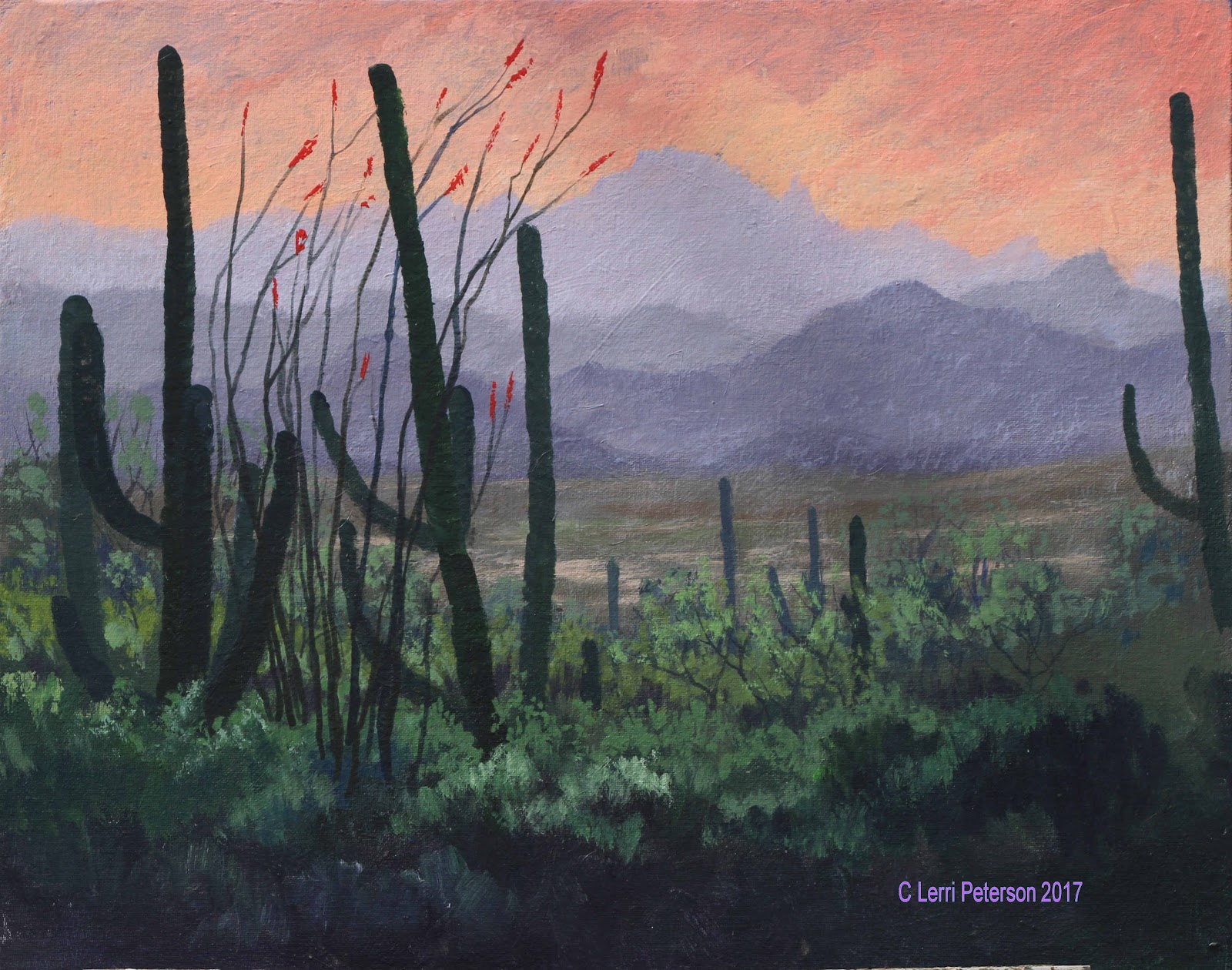
I sketched in the placement of my cactus with my vine charcoal so I could play with their placement if necessary, to erase something i don't like I use a wet paper towel and it is gone.


I made each arm of the cactus with a series of small "U" shapes using the #4 sable brush and pulling in from the side to create one side of the arm, then turned the canvas so it would be easier to add the other side to create the outside edges of the cactus and their width.

 In class, I added the last cactus and the occatillo to the foreground, nestling it into the brush in front of the cactus.
Even though they were in the photo, I added some red flowers to the tops of the branches of the occatillo, these were simple to make using red on my brush and just touching the canvas, nothing fancy.

The highlight colors are similar to the darker colors but I added either/or or both yellow and gesso to lighten and brighten and used my #6 bristle brush to create the layers of brush,leaving and sometimes adding more dark for the shadows and mid tones.
PLEASE, if you are working in a shadow area, you need to use blues and purple to make the shadow look like a shadow.
Keep painting and I will see you in class.
No comments:
Post a Comment