

Note that I am not trying to finish anything at this point, I am just trying to get it to a point so I can see where I need to go, anything can be changed at this point.
I also started adding the background but forgot to take a photo, sorry.

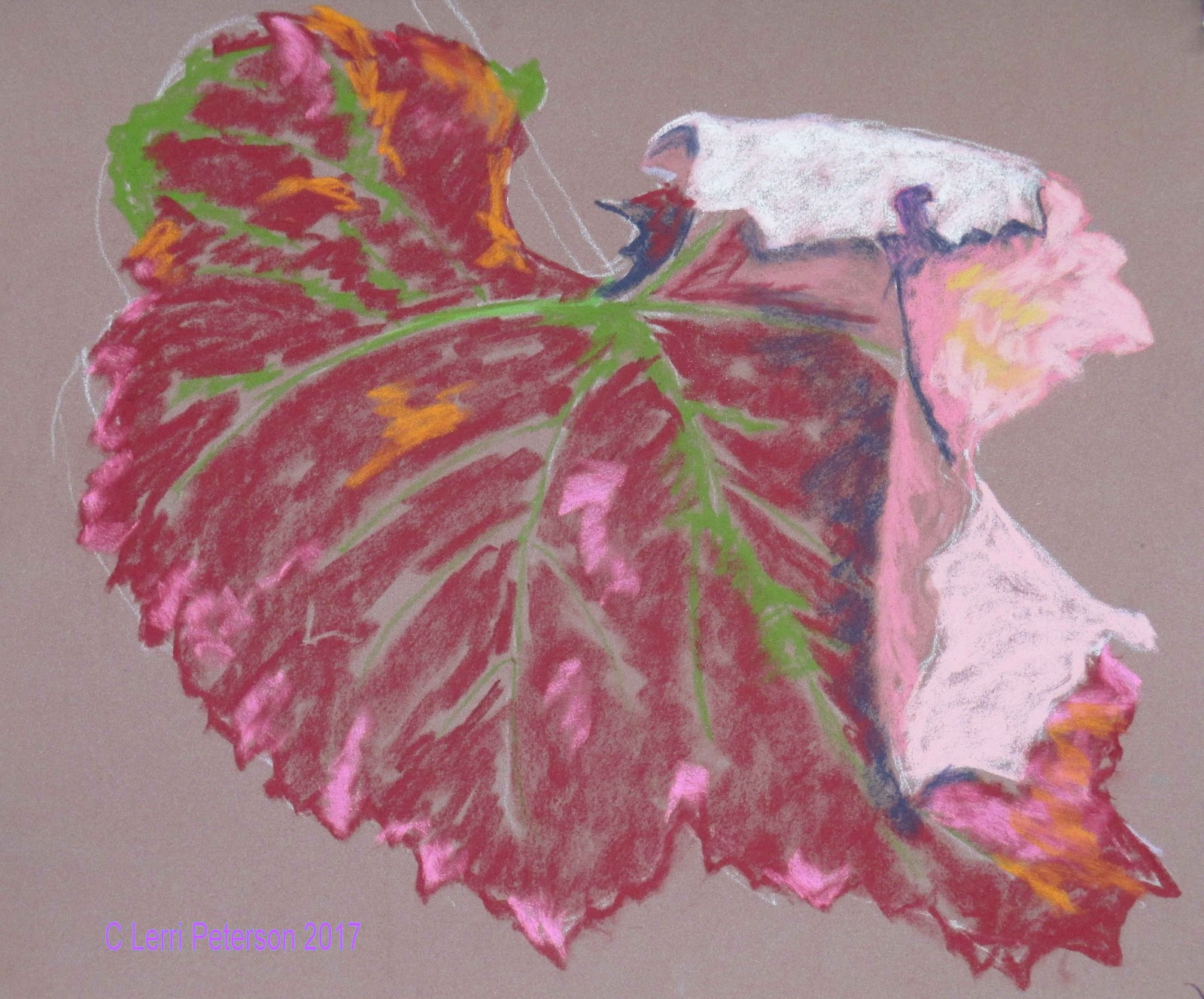
Once I had the red of the left blended, I added smudges of 2 colors of lavender one a warm, earthy lavender and the other a cool, blue lavender and lightly smudged these colors to create the "sheen" on the leaf.

Also note that some of the finishing of the leaf I used the blue/violet and my indigo to create some of the detail in the leaf, mostly just going around some of those smudges I made earlier.

I used my indigo for shadows and some of the rot forming on the leaf, the pink areas were a combination of several colors of pink, white and orange with a little bit of a light lavender in the shadow areas, blending as I put down each layer until I got the desired color and value.
I used white to suggest some of the veins and to lighten where the brightest light was hitting the fold.

Also, by keeping the colors in the background a bit muted by adding and blending complimentary color (red and green mostly) it grayed the background colors making the leaf colors look brighter.
Remember doing studies like this lets you experiment with color and techniques and teaches you to really look at your subject. Keep painting and I will see you in class.
No comments:
Post a Comment