Sunday, April 13, 2014

SPRING 2014 WATERCOLOR CLASS
Week 1: Project – From My Garden
 
My original painting.
The project we will be working on in class is based on a watercolor painting I did 20 years ago, I did change it up a bit but it is basically the same arrangement. If you want to do something of your own, please feel free to do so, the techniques will be very much the same, just be sure that you have good reference material to work from.


New version class project
I did not have time to get my drawing onto my paper before class so I had to approach my project a bit different than I had planned. I know just how much my students panic when colors run into other colors so I had originally planned to mask out the veggies with masking fluid before I got to class but with all kinds of chaos happening in my life, I just didn’t get the chance so I used a different approach, which in some ways might be better because it will show you that watercolor is a lot more versatile than most of you think. You don’t need to have a drawing on your paper to start with but it is helpful.

I did manage to get my drawing on and mask out the highlights for the demo. The masking fluid takes about 15 – 20 minutes to dry completely depending on how thick you put it on. If you are going to mask out the fruit you only need to go around the outside edges and put down about a half to an inch stripe all along the outside and let it dry, the rest will be exactly what I am going to do except you do not paint in the veggie area while the masking will let you paint the background right up to the edges and not worry about “ruining” your veggies.

In the PV class I didn’t put any masking on until I had painted my under painting. The reason for this is I had several people ask how they were going to get color into the highlight thinking that the highlight should have some of the color of the veggie it is on. Well, yes and no. a lot of the time it will depend on the fruit or veggie in question, if it has a matte surface like a melon or
Torrance background.
squash, the highlight may have a bit of color. On the other hand, if it is something shinny like an apple or tomato or even peppers, the highlight can look very white as it bounces off the surface. But what it really boils down to is: What do you as an artist want? Remember this is art so the choice is yours, since it doesn’t matter to me and I think it would be good to see what the difference really is, on the Torrance painting my highlights will be the paper white on the PV project they will be slightly tinted from the first under painting I do, then you can see the difference and make your own choice.

The background color choice is also up to you. If you think you might want to put this up in a certain room when you are done and a different color would make the décor better please feel free to change it, I have done green in Torrance and reds in PV but the technique is the same no matter the color.
 
PV version
I have always liked dramatic light and this first step will be the foundation for that light. The idea here is you have brought in the bounty of your garden (there were actual veggies from my own garden at the time) and they are sitting on the table when light from the window shines down on them maybe from a crack in the curtains but it acts like a spotlight on the bounty.

I start by wetting the whole paper with my large 2” wash brush. Remember, I am not worried about getting color into my veggies, if you have masked out your veggies, just put water on the background area for now, but it needs to be wet. I then pick up some yellow on the same brush and starting in the area behind the yellow zucchini and pumpkin I create my sunlight area (you will just make an arch in that area with your color), then I pick up some green and just outside the yellow area I apply the green to get the color on the paper, then rinse my brush, wipe it dry and blend the green into the yellow or lighter color. Don’t go all the way into the lighter color, just enough to create a graded blend of the two. This takes practice but it is easier in watercolor than other mediums. Pick up some more green or whatever color you are using but add some darker color like blue and/or purple to it, start in the corners and blend to the lighter green and repeat what you did before to blend the colors.

It is very easy to over blend and get one solid color, the trick is to stop before you go too far into the previous color. This take practice but it is a wonderful background for all sorts of subjects and a great way to start many different kinds of paintings where you want a dramatic light.

Where the veggies are sitting on the table if you want them on a table cloth instead of wood that is fine but you will still need to create the light and dark even if it is a solid color or patterned. I was painting over my veggies for this but I did have a paper towel in my hand to wipe off paint if I didn’t want it as dark but you will probably need to wet the bottom part of your paper and the process is very similar to the above just with different colors. For me it was still yellow in the sunlit area then sienna with a touch of orange just outside the light area then sienna, purple and blue in the corners (see the pict to get a better idea of my washes).

Then this has to dry completely especially if you used masking fluid to protect the edges. Be sure to feel in places where water may have pooled around the masking fluid such as dips or “V” shaped areas because if there is any moisture when you go to peal the masking off, you run the risk of tearing your paper. Just to be on the safe side pull towards an area that you know is dry or in other words, away for what was a wet area. Be sure that you put masking on any highlights before you start the next step and that it is dry before you begin.

Everything under painted
When your highlight masking is dry, we will now under paint the veggies. Most will be some form of yellow or yellow with orange or sienna, the two that have a bit different color in my painting are the peppers and the garlic. The garlic is a yellow base but has a touch of purple in it to gray the color, the peppers were a very watery purple with just a touch of blue.

Because there are so many pieces to this puzzle, you can work around your painting so you are always working in a dry area with dry areas around it but you need to choose wisely. If you start with the big yellow zucchini, you will want to avoid a lot of things like the peppers, garlic, tomato, melon, squash and pumpkin because they all touch the yellow, however, if you start with the pumpkin you can then do the peppers, then the tomatoes (big and cherry), the squash, the onion, back to the melon, then to the green zucchs and finally the yellow zucch.

The reason for all the yellow at this point is because it is the under color for almost all of the veggies on the table, including the green zucchs and the almost black acorn squash so it needs to be there. The only thing that is almost purely yellow is the one zucch, the pumpkin and acorn squash have a bit of orange in it, the melon has orange and green, the onion has a bit of sienna, the tomatoes have a touch of orange and red, the green zucchs have yellow and green but they are all very light at this point so be sure to add enough water to your paint.

This is your underpainting, do not take off the masking for the highlights just yet, but please be sure that you do not leave your painting in a hot car or where the sun will shine on it and bake the masking into the paper, if you can avoid that, you can leave the masking on for a few weeks and there should be no problem.


I hope you can all get your painting to this point by the next class because we will be moving forward. See you soon.

Wednesday, February 5, 2014

WINTER 2014 WATERCOLOR CLASSES


Torrance students the previous posts will give you the information that was covered in class and what will be covered in the next sessions.

PV Class, even though we have basically finished with our class project, one of my Torrance students asked why she couldn’t paint the tree color in first. A good question and the answer is “Yes, you can.” It isn’t going to get you out of having to negative paint the dark background in but if you want to intensify the yellow and oranges of the trees and make a rough shape of the tree first it is perfectly okay to do so, just remember to let the tree dry before adding the dark next to it or you will get bleeds and back runs into your light area. You can use the dark to shape your tree better, just be careful it can get to feeling so good, next thing you know there are no leaves left on your tree.

Since we have finished the project, I like to do request demos so I can address specific needs of students as they start their own projects and they experiment with different techniques. This past class was a question about a rose that was done on the cover of a Cheap Joe’s catalog. To a novice when looking at someone else’s painting it can look very confusing and overwhelming, however, as you learn more and more about watercolor you will be able to look at paintings and figure out just how they accomplished their work.


The rose in question was done very wet into wet but it was done in sections. If you want to be a good watercolorist, you will need to brush up on your drawing skills because a good painting comes from a good drawing and in this case it was a fairly detailed line drawing. You need the detail to know where each element (petal) is on the flower. This is the same for the rose, which is a complicated flower, or a poppy or daisies, which are simpler flowers because you need to know where you are going to paint.

You paint in sections and you skip around so that you aren’t painting next to a wet section. You can start out by painting the area with water first, in this case a single petal. While the area is still wet, you add in your colors and you let the watercolor do its thing. Add two or more colors into an area and let them blend naturally, you can guide the color by putting it in one part of the area or another but let the mixing happen when the 2 colors meet on the pre-wet paper. Find a new space away from the one you just painted and repeat the process on each petal and stem until you have worked your way around the rose.

This is a very loose and free way to paint and one of the things I love about watercolor, if you don’t fight it watercolor will do some amazing things on its own, but remember, if you fight the watercolor, the watercolor will win. See you all in class.


Friday, January 31, 2014

Watercolor Class Project: Arizona Color
Week 3

Torrance class
Torrance students you will need to go back a couple of posts to the start of this project. Everything is basically the same to everything we did in class so you shouldn’t have any problems getting started.

In our last class I put the finishing touches on my painting, depending on how far along you are with your painting you may or may not be to the finishing point on yours yet but feel free to continue working on it in class if you want, there is no rush.

One thing I do want to say, and I say it in almost every semester, is if you tell yourself you can’t do something, you have already set up a road block in your mind and chances are you will have a self-fulfilling prophecy. You won’t be able to do it because you have already told yourself you can’t, then you will set out to prove your point. You weren’t born with this knowledge or skill it is something you have to learn, these classes are here for you to learn and every class you are learning a lot more than you realize for every stroke you put down on your paper there are a hundred things going through you head, you are not painting, you are thinking and it is going to take time and patience with yourself to get past that point of thinking about every move you make to just worrying about what you will paint next. Think of each new technique you learn in class as a challenge or a puzzle you need to figure out and you will see improvement each time you paint and look for the things in your painting you like, you may not like all of it but you probably find something you do like. Concentrate your mind on those areas and congratulate yourself on getting something you like, celebrate the small victories and ignore the rest, it will get there you just need to cut yourself some slack. Most artists are their own worst critic but chances are other people will be impressed with your efforts, they know watercolor is a challenging medium and applaud you for your efforts; you need to do the same.

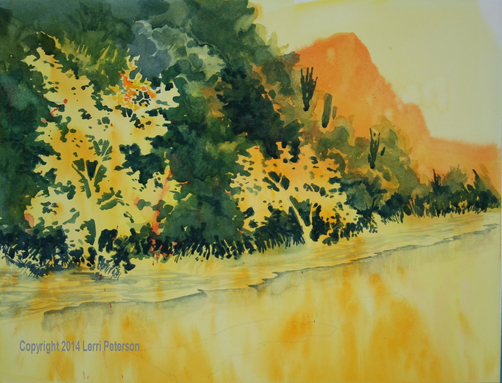
I started the finishing process by adding some color to the bank along the river and to the sandbars out in the water using burnt sienna and putting a wash of color over the areas. A wash is a weak mixture of pigment and water and can be used to build up the value and/or the intensity of a color using the transparent nature of watercolor to do the job. There were some gray strokes along the bank, when I put the wash over them they become shadows in the texture of the dirt.


Next I started the reflections in the water. A “rule of thumb” when it comes to reflections is you measure from the top to the bottom of an object – I usually just measure with my finger and thumb making a space between – moving that measurement so the top point is now at the bottom and the bottom point should be somewhere in the water, that point is where your reflection will end so some things in the distance may not show up in your water at all. Reflections in the water are not like a mirror reflection, they are reflecting what is directly above them as if the mirror was on the floor.

The strokes you use for reflections can be basically simple: straight down andstraight across (vertical and horizontal), as you grow as an artist you will want to see how other artists handle reflections because there are other techniques out there but this one is simple and effective.

I started with my yellow and orange finding where my tree will reflect in the water then pulling the color down, this is almost a dry brush technique using more pigment and less water on my brush, be sure to dry your brush before you start your stroke. When I have done some of the color on my paper, I lightly go across the color, your stroke should be parallel to the top and bottom of your paper (straight down, straight across). Repeat until you have a basic shape for your tree. Next, I mixed a dark green color using my Hooker’s green and/or sap green, blue a touch of purple whatever is on my palette to make the dark green then I did the same strokes with the green as I did with the yellow: Straight down and straight across. When I got to the places where the green and the yellow touched, I rinsed and dried my brush and lightly went over the yellow using a horizontal stroke to drag some of the yellow into the green, then reversed the process to drag some of the green into the yellow. Because the water is moving you will see this happen in real life so recreating this in you painting is a good thing. Practice this before you try it because it can start to feel good and the next thing you know you have mud.


I wanted to have a couple of large rocks down in the corner but I had painted over where they were supposed to go. No problem, I just lifted the color out of the area using a damp brush, clean water and a paper towel and lifted off enough color to create the highlight on the rocks. It won’t get back to paper white, but that is okay, just be sure not to scrub too much or too hard so you don’t damage the paper.

While the rocks were drying, I added the trunks and branches to my trees with myliner brush. The liner is a challenging little brush but once you get the hang of it you will be able to create all kinds of things from trees to grasses to fence lines to hair to boat rigging… not to mention detail, please take the time to practice with this brush before you get to your painting, you will have a lot more success if you do.

The first thing you need to do with this brush is get the paint mixture correct, it should be like ink in consistency, enough water to flow off your brush but enough pigment so your lines aren’t too light. The color for the tree trunks is sienna, blue and purple which will create a very dark, almost black, color, test it on some scrap paper to be sure it is dark and not light enough to see which color is dominant. Load the brush by rolling the entire length of the bristles in the color, then lift and roll your brush as you take it off you palette. Then holding the brush by the end of the handle and starting at the bottom of the tree or branch, press, pull up and lift the brush until you are on the end of the bristles. A little shake is a good thing when you are doing branches and trees so don’t worry about the little glitches along the stroke, with your next stroke you can use those to “branch off” another branch but start the new branch by starting your stroke within what is there then change directions. Be sure to skip areas in the trees because the branches go being clumps of leaves, they aren’t all in the front. Please practice this.

The shadows on my rocks were basically a watered down version of the tree color, leaving some of the lifted area as the highlight on the rocks. I did several washes to get deeper shadows. I also used some of the dark tree trunk color to suggest some reflections in the water, wiggling my brush as I went.

The last couple things I did was I used pure color straight from my palette so it was fairly thick to add some leaf and leaf clumps to my trees. Yellow, orange even touches of red or green will work here just don’t do dot, dot, dot it is more like dot-dot-dot-dot dot-dot dot-dot-dot-dot dot with lots of over lapping dots. Leave some of the lighter color around the edges because those are your highlights in your trees.

Finally, just using a light mix of green and orange I suggest a distant cactus to act as an eye stopper, it could also be another tree or something to keep the eye from wandering out of the painting. This is where I stopped, I may or may not work on it some more to refine things but that becomes an individual choice, for teaching purposes it is done, you will have to decide for yourself just how much detail you want to put in or move on to something else, which brings me to the point where I am turning you lose to start on your own projects, I will be doing demos that will help not only you, but also your classmates, so bring something you want to work on to class or you can finish up the class project if you want to. I will see you all in class.


Friday, January 24, 2014


Watercolor Project: Az. Fall
Week 2

Most of what we did in class this week was to continue negative painting around our trees. When you are doing something you are new to doing or unsure of you naturally go slower and that is fine, speed will come in time and practice. It is better to slow down and think about what you are doing than to rush ahead and end up with big problems. However, if you do run across a problem or you want to change things, all is not lost. Regardless of what some might think, you can make changes in watercolor, it might be a bit more challenging than in other mediums but it can be done and you should know how to fix problems because as a painter – watercolor or otherwise – there is always something you see that you want to fix or change in almost every painting you do. Do not be afraid to make these changes, because they happen and they will continue to happen as long as you paint.

Where we stopped in class.

A couple of the students made the mistake of positive painting the trees with the hillside color. Negative painting is not a natural way of doing things so when you are learning it is easy enough to switch from the negative to the positive – painting the “thing” and not the space around the thing. We all do it at some point or another no matter how experienced we are, what experience give you is the knowledge on how to fix a problem so you don’t panic and make it worse.

There are several ways to fix a problem like the above and I covered 2 ways to fix the problem. The first way was to “lift” the color off the paper. Lifting is a fun thing to do in watercolor, in can add texture, highlights, leaf veins and countless other things to make you painting interesting and it can also take enough color off an area that you either mistakenly painted over or want to change. You just need a brush, water, a clean paper towel and a bit of time.

First you wet your brush and lightly dry it with your paper towel so that it isn’t dripping, it can still be on the wet-side, then paint the area with the water lightly going over the area to reactivate the pigment on the paper. Blot your brush on the towel frequently, rinse it out to get off any color that came up and repeat the process. You can also blot the paper to lift up even more color, the one thing you do need to be careful of is damaging the paper. If you go over an area too much and it gets too wet or if you scrub too hard with your brush or both, you run the risk of damaging the surface of the paper. If you do damage the paper, it will not take the color the same way and you may get dark blotchy areas when you tried to lift. It is best if you do a little lifting, then let the paper dry and try again if it needs it. Remember that when the pigment and the paper are wet they will be darker than when they are dry so once it dries, it might be light enough for you to go ahead with whatever changes you wanted to do.

The other method I showed was a fairly recent addition to our watercolor tool box, and that is the use of the “Magic Eraser” by Mr. Clean. It is a soft sponge which is filled with a cleaner that doesn’t seem to harm the paper. It comes in a box with 2 sponges and I just cut mine into 1” or so squares that are easy to throw in my art box and it is easier to use than a big sponge. There are times when you have a bigger area you need to take the color off of or you have used a staining color that won’t lift easily, it is those times that the Magic Eraser does work its magic. It might not get the paper back down to paper white, but it will get enough of it out that unless you point it out to people, they will never know so don’t tell them! You don’t need to use them dripping with water, just a bit damp and, again, be careful not to work the area too long or too hard because you could damage the surface of the paper.

The other thing we did in class is to start working on the water’s edge. The thing to keep in
mind here is the edge is not a straight line. Because the water follows over and around rocks and other obstacles the (geology is another class) the edge of most natural bodies of water will meander in and out, to make your river bank look natural you need to create the same type of meandering. Study the reference photo of the water I included for this painting, note all the edges and how they wander, also note that the water looks flat even though the photo was taken from an elevated angle. The reason it looks flat is because as the water goes away from my camera lens those meandering edges become “foreshortened”. What that means is the camera is seeing it from
an edge the further away it is and not seeing the entire surface. You can experience this yourself with a round lid: If you look at the top of the lid straight on, the lid will look round, now tilt the lid so that the back edge if further away from you than the front. Is it still round? No, it has become an “ellipse”, this is called “foreshortening” in art terms and it is a very common occurrence when you want to create distance. What this means is when you are sketching in the edge of your water those meanders need to stay flat and you do this using flatter lines and shallow angles especially as they move away from you or when making the parts that stick out or the inlets, keep them flat and narrower when they are in the distance. Again, this will come with practice and observation, this has been very hard to describe. Practice or do some drawings before you get to your paper, these rules apply to all the 2D art.

Once you get your sketch on your paper we are now going to add the start ofreflections down into the water. There is usually a dark edge and it is probably best if you do this in sections. I used my ½” angle brush and the color I used was a mix of blue with a touch of sienna and a tiny touch of purple to create a shadow color which I loaded onto the tip of my brush. If you use a round brush just load the tip and if you use a flat brush, just load a corner, be sure to rinse your brush before you load it. Putting the tip of my brush where I want to start the edge and the rest of the brush on the paper, I pulled the color along the edge of my water. I just did a few inches, then I rinsed and dried my brush then with the damp, clean brush, I pulled that color I just put
down, straight down and faded it out. Then I did another section and repeated the process. Be sure to pull the color STRAIGHT down because of the nature of reflections the images from the reflections in water will have a combination of vertical and horizontal components, the horizontal coming from the movement of the water, so after you pull straight down, wipe out your brush and lightly pull straight ACROSS, you brush should be parallel to the top and bottom of your paper. We will be using this technique as we work on the water so again, you might want to practice before you get to your painting.

I also used that color was on my brush to create the shadows in the dirt alongthe shoreline. Again, my strokes were fairly flat because the dirt was flat. We will work more on the dirt and the water in our next class. Try to get your painting to this point, remember the more you do something the easier it becomes the next time so get some card or divide a practice paper up into sections and practice your techniques, also become more observant of your surroundings, don’t just “look” at things, really try to “see” the world around you, it will make you a better artist. See you next time.


Saturday, January 18, 2014

Winter 2014 Watercolor
Project: Arizona River

(Torrance students, this will be the blog you will reference when we get started on the project after the MLK break. We may have a few different things but most of it will be the same, just a couple weeks behind.)

This week we got started on the class project, I hope that you will continue to practice your negative painting at home whenever you can because the more you do it the more it will make sense to you, I still saw people struggling and that’s okay, it is not an easy thing to do to see things differently but if you want to work in watercolor is is important that you do learn to see the areas of negative space because you will never get away from it, it is an important aspect of the medium.

The first thing you usually want to do is to put your design on your paper. This is not a hard and fast rule because everyone finds what works best for themselves and sometimes the subject will dictate what needs to be done first, but, for beginners, having a drawing on your paper will help. Use at least a #2B drawing pencil or a #3B so you can see your design even after the drawing has gotten wet. I waited to draw my design on because I had a good idea of what needed to be where, but I did have my reference photo handy as all of you should.

When I come into class, I open my paints and I wet them, this is a very important step. Your paints need to be ready to go and you won’t be able to get enough paint off a dry lump of pigment with your brush to get the intensity you need. I know having a wet palette to take home isn’t fun, but if you dry the excess when your are cleaning up and put some paper towels in the palette before you close it up, any leakage will be minimal, but your paints need to be wet or you will struggle to get more than just pastel colors and you will never get and dark values or intense colors.

Have your paper on an incline. Put a roll of tape under the top of your support (and you should all have either a support or a watercolor block to work on) so you have at least an inch or more elevation to your work area. Gravity is your friend in watercolor, working flat is not. You can have all sorts of problems when you work flat from mud to blooms to distortions in your painting, so find a way to elevate your support.

When I started this painting, I wet the paper with my big brush. You can use your sprayer and a big brush to make sure the surface is completely wet, whatever is the quickest for you, the paper needs to be wet for this first round of paint.

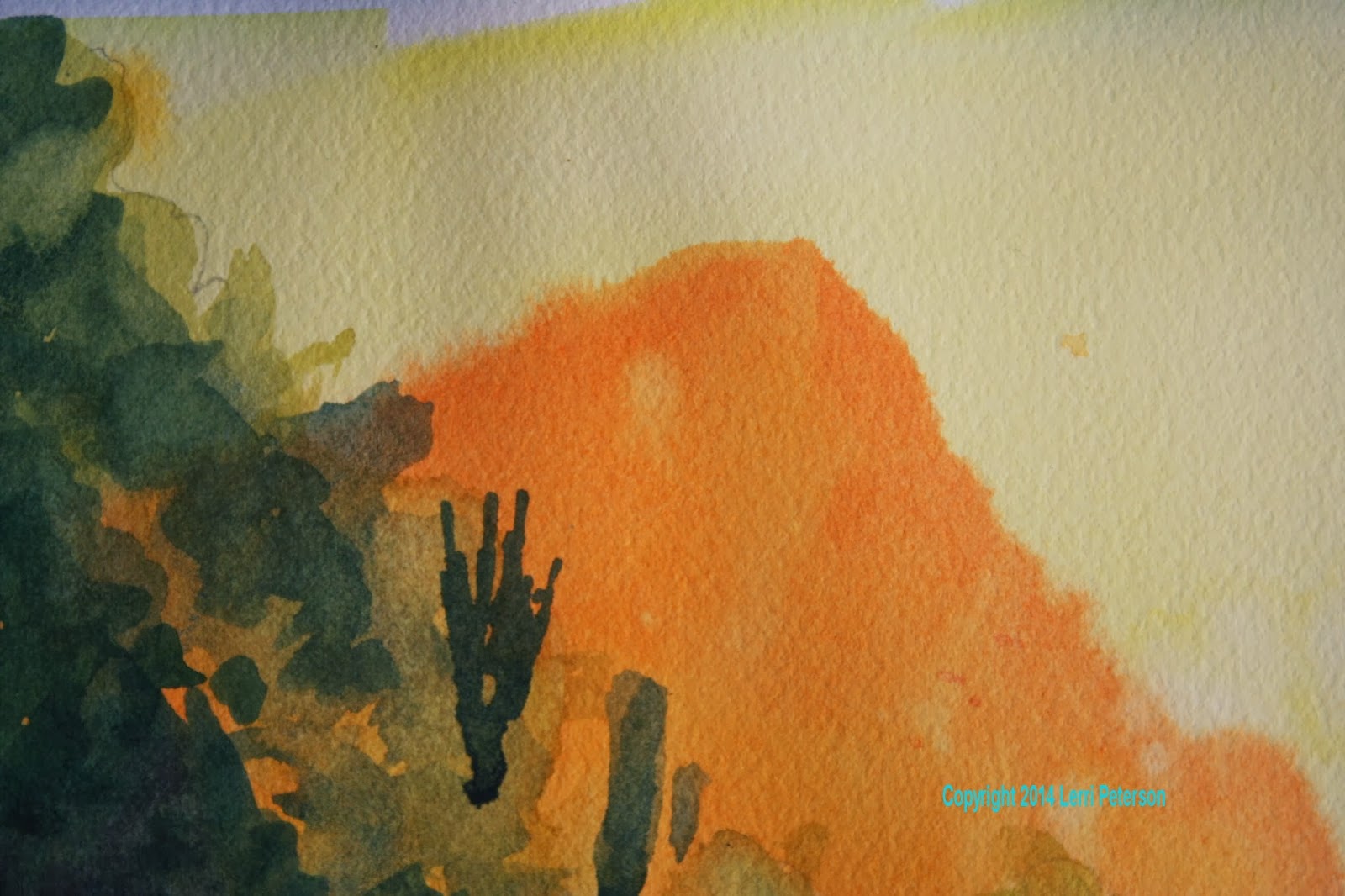
On the wet paper I took my cad yellow light and went over the whole paper. This was a fairly intense yellow so I had more pigment than water on my brush and let the wetness of the paper help me to spread it out. Start at the top and work down and work quickly. While it was still wet I literally dropped or splattered cad orange into the wet yellow WHERE MY HILLSIDE AND WATER WILL BE. Try to avoid the sky but just drop the paint, don’t try to control it. I saw some of you brushing the orange across and now what you have is a dark yellow solid color when what you want is a spotted, drippy orange on yellow background. I know this is hard to do because as humans we want to control everything, but it will not work with watercolor, you need to trust it and let it do its own thing.


This next part is a bit tricky and you might want to practice it on a separate sheet of paper to figure it out and this is where if you are working flat you will get into trouble because you will have pockets of dry paper next to pools of wet paper causing all sort of havoc so be patient with yourself, you probably won’t do this the first time of the tenth time or even the hundredth time, but it will come the trick is the dampness of the paper. If you have your paper on an incline, the water will run down to the bottom leaving the top to dry a bit. You want the paper to be slightly damp to the touch. If you test it with the back of your hand, it will feel a bit cool and almost dry, that is perfect. We want the next wash of paint to slightly blur along the edges but not take off across the paper in a giant bloom. If your paper feels physically wet, give in a minute or so and check it again.

On this damp paper we are going to put in the distant mountain. I am taking artistic license here because in the photo the mountain looks a blue/gray but that color doesn’t appear in any of the rest of our painting and I want to keep the colors in harmony with each other, so I used orange to repeat a color I have already used. I was still using my big brush to cover the area quickly and to cover enough to be sure that it will go behind the edge of my closer hillside, paint just below your sketch for the darker hillside, please do not try to paint around it, it is darker and will cover the orange, It will save you a lot of work. When you are done with the distant mountain, you must let the paper dry completely. Letting paper dry is probably the hardest thing to do in watercolor but it is important if you don’t want to mix mud. You can use a hair dryer to speed the process if you want.


This next step is where all your negative painting skills will be put to the test so take your time and think about what you are doing, speed will come when you are more familiar with the process and you will be able to go back and forth between positive and negative painting without even thinking about it, but that is just going to take time and patience with yourself so work at a pace that is comfortable for you and stop frequently to be sure you are negative painting and not positive painting, I did see some of you getting the two confused, when you are learning it is easy enough to do.

I switched to my ¾” angle brush but you can use a flat or round brush, just don’t break out the small brushes yet or this will take a lot longer than it should.

I mixed a bit of sap green and yellow with a touch or orange and water to make a light grayish green color. I used this color to make the edge of the closer hillside creating interesting shapes as I went. This is a wild hillside not a manicured hedge so it will have lots of ups and downs and jagged edges. I painted the rest of the hillside with this color but be careful when you get to your trees, you might want to go over your pencil lines so you can see them because you are going to have to negative paint around your tree areas to keep the trees yellow. This is important, this is where you will need to stop and think before you proceed or you will paint over your trees and they then become spring or summer trees not late fall trees.

When I am painting an area, I am thinking about what I am painting. This area is a bunch of brush, cactus, rocks and whatnot, it is not a glass smooth panel, it has texture and substance so I am dabbing, and adding touches of other colors like blue or red or sienna along with the light green and also water to make things lighter or darker. I am twisting and turning my brush in my hand, rolling it from the tip to the full side and back again. I just do this as a matter of course, I don’t even think about it as I am doing it. My brushes are my multi-tools they are not a single purpose tool, the more you use and experiment with your brushes the better you will be able to make them do what you want them to do. We aren’t painting walls, we are creating art a whole different animal.

You need to let this dry again before doing the next wash of color.

This next layer of wash is very similar to the last but it is going to be darker and you are going to leave some of the last color in places which becomes highlights on the tops of some of the brush on the hillside. Yes, more negative painting, you will get lots of practice.

This color is similar to the last I think I even just added color in the same area in my palette which I often do, so to my color I added more green, you can add Hooker’s green if you want, blue and sienna to make a dark blue/green that is slightly gray. Don’t use too much water because that will thin the paint and weaken the color, you want this fairly dark, not black but a medium dark color.


Paint around some of the areas of the lighter green to suggest light hitting the tops of some of the hillside brush, again, think of what you are painting and dab and smear shapes. It doesn’t need to be an exact replication of something but just add shapes and texture so suggest to your viewer that there is something going on in all that darkness. Also use this dark color to really define the trees. Put dots and dashes of this dark color in the tree shapes to suggest holes through the trees or to make the outer leaves look lacy. Look at the reference photo and see how many holes there really are in the trees, this is what will make your trees look more believable than solid masses of yellow. You can even suggest some lighter grasses at the bottom of the hillside, just take your time and think about what you are painting. You will need the contrast between the dark hillside and the trees to make the trees glow so don’t be afraid of the dark especially when you are near the trees.


This is where we stopped try to get you painting to this point so we can move on, if you are having trouble or need more time we can review in class. See you soon.

Friday, October 18, 2013

Watercolor Project: Water Lily Week 4

Torrance class the information regarding the negative painting of the flower petals is near the end of last week’s blog because I started the process at PV the previous week, so look there for reference.

Theyellow center area is probably the trickiest because there is a combination of grayish shadows on some of it and a reddish orange on the rest, this is where really looking at the photo is going to be important because I simply cannot do more than give you general areas here, please have you photos out and look at them often BEFORE you start this process.


The gray color is going to be yellow with a touch of purple and a lot of water. It should look gray and not purple and on a value scale of 1 – 10, 1 being white, this should be no more than a 2. This color goes on the yellow stamens/pistils that are in the back also there is a bit in the center and along the front behind the petal. The orange color is orange with a touch of red and it goes in between some of the front structures. Be sure to check the angles and shapes before you start putting on color. There are also some dark parts that seem to be on the sides of some of these structures, I just took my small angle brush and put some dark color from my palette and just touched the full edge of the brush to form a line. When in doubt, practice it first.

There are a couple of the petals that have some green stripes on them, this is very easy if you slightly wet the petal first – you want it damp not dripping – and either with a liner or the edges of a flat/angle brush, draw the lines in with sap green but be sure you follow the couture of the petal, they are not flat, they are curved. As the green mingles with the dampness of the paper it will slightly fuss out, if it disappears altogether, your paper was too wet, if it doesn’t fuzz out at all your paper was too dry. Again practice it first. This is the same thing I did to add the pink tips to some of the petals, I wet the tip and down a bit on the petal the just put color at the tip and let it spread down through the damp paper, guiding it sometimes with a damp brush with just water.

(From here on is what we did different at PV and what we will be doing at Torrance next class.)

The petal that goes under water also has a bit of a shadow falling across the middle of it but the lower part is going to need a light wash of blue. If you have a blue on the mixing part of your palette just add some water and lightly go over the bottom of the petal or use a tiny amount of a color similar to you water, you just want to tint the petal. If you did what I did at PV and painted too heavy over the petal and need to lift some color off to shape the petal that is under the water, just use the color you are lifting in one area and tint the other area with what is on your brush.

The shadows under the flower are very dark but you can see a bit of detail in them. Do not worry about that detail at this point it will look better if you go in later and lift out a bit of color than to worry about it as you are trying to paint the shadow in.

I started my shadows with just a mix of blue and purple, keeping it on the blue side. To be honest, once I got it home and could see it in better light, I am not completely happy with it so I will be tweaking it in our next class. I think I need some green and some sienna to gray up the color a bit and I do need it darker right under the flower, it isn’t dark enough.


I free-handed my shadow, if you need to draw it in that is okay too but when you are lifting out detail also take a damp brush and go across the edges of the shadow horizontally to soften the edges just a bit, then finish up anything you may have missed.

The PV class should be done with this project and students should be bringing in something that they want to paint for class. Torrance students we will probably finish up the project at our next class and you might want to start looking for your own projects as well. I will see you all in class.


Saturday, October 12, 2013

WATERCOLOR PROJECT: Water Lily Week 3


After removing the masking fluid, the first thing we did was to under paint the lily pads. Contrary to what you might think, the under painting for the leaves is not pink or brown, it is green. When you are planning your painting, you look for the lightest colors to paint first and in this case it is the light green you see in the pads. The light green is a mix of cad yellow light with a touch of sap green and I painted over all of the bigger leaves the two yellow leaves have a bit more yellow in them. This will have to dry before you can start the next phase of the pads but while you are waiting you can paint in the center of the lily.
 
Front pad color is the under
 painting for the lily pad.
The center of the lily is made up of a lot of spiky stamens and pistils and some of them have white tips, remember this so you paint around some of the ends. I used cad yellow light and water to paint this area, leaving some of the ends unpainted. While it was still wet, I took a thin mix of orange and water and right at the base of the yellow in front I touched this area with the orange to make it a bit darker, it will now have to dry.

If there is one thing I wish I could get my students to do that would help them immensely and that is to be more observant. Many of you don’t even have your photos out let alone look at the to see what I am talking about, unless you can see what I am talking about it won’t matter what I say, you will still be confused so learn to study your subject BEFORE you start to paint whether it is the photo you are working from or when you are out and about, learn to SEE what you are looking at. Break down the shapes of light and shadow, color and form, if you have your camera or phone with camera take more than one photo. Do overall photos of the subject then take detail photos for reference later, the smallest thing can make a big difference in your painting but you need to see it and understand it, sketch it or do small studies of the parts, whatever it take for you to get the job done, it will make you a better painter in the long run. That said, look at your photo before you start this next part.

There are a couple of things I want you to notice, the first being that while, from above, these pads may be almost round, we are looking at them from the side so they become ellipses (flat ovals). The other thing I want you to notice is the edges of the pads have ridges and dips in
them, these ridges go back to a central vein however, they come back at an angle they do not come back straight. The further away from that “sail” structure in the back the more angled the ridges become. If you make those ridges too straight in to the vein, your pad will look like it is standing on its edge. If you need to visually see this before you start painting you can do either a pencil sketch or a small study so you know what you need to do when you get to your painting.

The bronze color for the pads is a mix of burnt sienna and purple, keeping it to the sienna side. To make it darker use less water, to make it lighter add more water, simple as that but many of you struggle with this. Looking at the reference photo, see where the brown areas are don’t be afraid to use water to soften one color into the other because that is what is happening on the pads naturally. The darker colors will be where there are dips and veins, the down sides of ridges but you need to look to see them. You can also add in greens if you need to and you need to figure this out because there is no real formula other than what I have stated here. All the answers are in the photo, you just need to look for them.

The “sail” structure on the back of the pad is in shadow so both the bronze color and the green will be darker than on the flat of the pads themselves.

Once you are done with your pads, now you need to work on the water. In a few places the water actually comes up on the pads and this is where lifting will work its magic. Locate these areas on your lily pads, sketch them in again if you need to but before you start painting, really
LOOK at the photo so you can see the why and the how of these areas. You will see dark shadows under the lip of the water and you will see highlights along the edges of the water but note that neither of these is a constant line around the pad, they are broken and different sizes and in some places you can see through them. Please see these before you start and again, if you need to do a pencil sketch or small studies before you start on your painting.

The shadow color is blue with a touch of purple, if you need it dark use less water, more water to lighten it either on your palette or, better, on your brush to soften edges. There are also dark areas under the front edges of the pads and where the “sail” is. To lift out the highlights, just use plain water, wet the area with your brush, lift a little with your brush but do not scrub the area, then pat it with a clean part of your paper towel. Make them different sizes and lengths, keep looking at the photo.

Torrance students this next part we did not get to in class the last time but we will cover it when we meet again so don’t panic, you will see a demo on this.

PV students we did get started on the flower and this is where the negative painting study we did at the start of class comes into effect. To get the light areas to stand out you need to negative paint around them. The other thing to keep in mind is this is a white flower so most of our shading it going to be on the light side you don’t want to get too dark with a couple exceptions that I will cover and no, we have not done the shadows under the flower – yet.


If you keep a dirty palette like I do you may not have to mix a color for the shading of the lily, one of the reasons I do keep a dirty palette is I have colors I have been using and if I need just a little bit of color it is already on my palette but if you are neat and need to mix again the color is going to be mostly blue with tiny touches of purple maybe even a tiny amount of sienna, you want a light blue/gray color.

The darkest area of each petal is going to be near its base as it goes behind other petals or the center area, it will lighten as it comes to the outside edges of the petal so start at the bottom with your color, paint up a bit then rinse your brush and with just the water move the color up the petal. You may need to add a bit more color but start at the bottom and work up. Skip petals so you are not painting next to a wet petal and work around your flower. Look at thephoto to see what you are doing we will continue this in our next class.

This should get you caught up on 2 weeks’ worth of blogs. See you in class.