

Winter
2014 Watercolor
Project:
Arizona River
(Torrance students,
this will be the blog you will reference when we get started on the project
after the MLK break. We may have a few different things but most of it will be
the same, just a couple weeks behind.)
This
week we got started on the class project, I hope that you will continue to
practice your negative painting at home whenever you can because the more you
do it the more it will make sense to you, I still saw people struggling and
that’s okay, it is not an easy thing to do to see things differently but if you
want to work in watercolor is is important that you do learn to see the areas
of negative space because you will never get away from it, it is an important
aspect of the medium.
The
first thing you usually want to do is to put your design on your paper. This is
not a hard and fast rule because everyone finds what works best for themselves
and sometimes the subject will dictate what needs to be done first, but, for
beginners, having a drawing on your paper will help. Use at least a #2B drawing
pencil or a #3B so you can see your design even after the drawing has gotten
wet. I waited to draw my design on because I had a good idea of what needed to
be where, but I did have my reference photo handy as all of you should.
When
I come into class, I open my paints and I wet them, this is a very important
step. Your paints need to be ready to go and you won’t be able to get enough
paint off a dry lump of pigment with your brush to get the intensity you need.
I know having a wet palette to take home isn’t fun, but if you dry the excess
when your are cleaning up and put some paper towels in the palette before you
close it up, any leakage will be minimal, but your paints need to be wet or you
will struggle to get more than just pastel colors and you will never get and
dark values or intense colors.
Have
your paper on an incline. Put a roll of tape under the top of your support (and
you should all have either a support or a watercolor block to work on) so you
have at least an inch or more elevation to your work area. Gravity is your
friend in watercolor, working flat is not. You can have all sorts of problems
when you work flat from mud to blooms to distortions in your painting, so find
a way to elevate your support.
When
I started this painting, I wet the paper with my big brush. You can use your
sprayer and a big brush to make sure the surface is completely wet, whatever is
the quickest for you, the paper needs to be wet for this first round of paint.
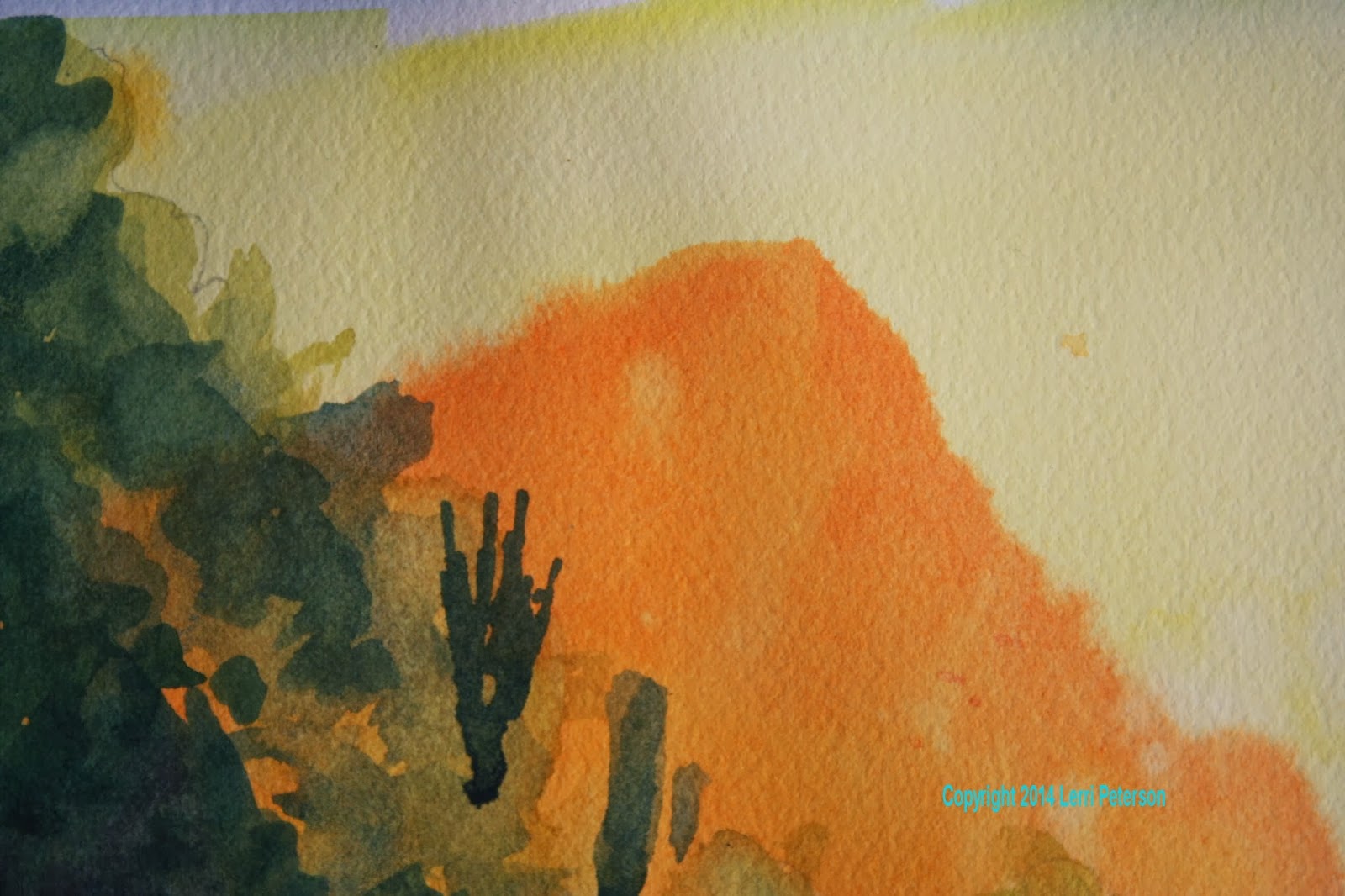
On
the wet paper I took my cad yellow light and went over the whole paper. This
was a fairly intense yellow so I had more pigment than water on my brush and
let the wetness of the paper help me to spread it out. Start at the top and
work down and work quickly. While it was still wet I literally dropped or
splattered cad orange into the wet yellow WHERE MY HILLSIDE AND WATER WILL BE.
Try to avoid the sky but just drop the paint, don’t try to control it. I saw
some of you brushing the orange across and now what you have is a dark yellow
solid color when what you want is a spotted, drippy orange on yellow
background. I know this is hard to do because as humans we want to control
everything, but it will not work with watercolor, you need to trust it and let
it do its own thing.
This
next part is a bit tricky and you might want to practice it on a separate sheet
of paper to figure it out and this is where if you are working flat you will
get into trouble because you will have pockets of dry paper next to pools of
wet paper causing all sort of havoc so be patient with yourself, you probably
won’t do this the first time of the tenth time or even the hundredth time, but
it will come the trick is the dampness of the paper. If you have your paper on
an incline, the water will run down to the bottom leaving the top to dry a bit.
You want the paper to be slightly damp to the touch. If you test it with the
back of your hand, it will feel a bit cool and almost dry, that is perfect. We
want the next wash of paint to slightly blur along the edges but not take off
across the paper in a giant bloom. If your paper feels physically wet, give in
a minute or so and check it again.
On
this damp paper we are going to put in the distant mountain. I am taking
artistic license here because in the photo the mountain looks a blue/gray but
that color doesn’t appear in any of the rest of our painting and I want to keep
the colors in harmony with each other, so I used orange to repeat a color I
have already used. I was still using my big brush to cover the area quickly and
to cover enough to be sure that it will go behind the edge of my closer
hillside, paint just below your sketch for the darker hillside, please do not
try to paint around it, it is darker and will cover the orange, It will save
you a lot of work. When you are done with the distant mountain, you must let
the paper dry completely. Letting paper dry is probably the hardest thing to do
in watercolor but it is important if you don’t want to mix mud. You can use a
hair dryer to speed the process if you want.

This
next step is where all your negative painting skills will be put to the test so
take your time and think about what you are doing, speed will come when you are
more familiar with the process and you will be able to go back and forth
between positive and negative painting without even thinking about it, but that
is just going to take time and patience with yourself so work at a pace that is
comfortable for you and stop frequently to be sure you are negative painting
and not positive painting, I did see some of you getting the two confused, when
you are learning it is easy enough to do.
I
switched to my ¾” angle brush but you can use a flat or round brush, just don’t
break out the small brushes yet or this will take a lot longer than it should.
I
mixed a bit of sap green and yellow with a touch or orange and water to make a
light grayish green color. I used this color to make the edge of the closer
hillside creating interesting shapes as I went. This is a wild hillside not a
manicured hedge so it will have lots of ups and downs and jagged edges. I
painted the rest of the hillside with this color but be careful when you get to
your trees, you might want to go over your pencil lines so you can see them
because you are going to have to negative paint around your tree areas to keep
the trees yellow. This is important, this is where you will need to stop and
think before you proceed or you will paint over your trees and they then become
spring or summer trees not late fall trees.

When
I am painting an area, I am thinking about what I am painting. This area is a
bunch of brush, cactus, rocks and whatnot, it is not a glass smooth panel, it
has texture and substance so I am dabbing, and adding touches of other colors
like blue or red or sienna along with the light green and also water to make
things lighter or darker. I am twisting and turning my brush in my hand,
rolling it from the tip to the full side and back again. I just do this as a
matter of course, I don’t even think about it as I am doing it. My brushes are
my multi-tools they are not a single purpose tool, the more you use and
experiment with your brushes the better you will be able to make them do what
you want them to do. We aren’t painting walls, we are creating art a whole
different animal.
You
need to let this dry again before doing the next wash of color.
This
next layer of wash is very similar to the last but it is going to be darker and
you are going to leave some of the last color in places which becomes
highlights on the tops of some of the brush on the hillside. Yes, more negative
painting, you will get lots of practice.
This
color is similar to the last I think I even just added color in the same area
in my palette which I often do, so to my color I added more green, you can add
Hooker’s green if you want, blue and sienna to make a dark blue/green that is
slightly gray. Don’t use too much water because that will thin the paint and
weaken the color, you want this fairly dark, not black but a medium dark color.

Paint
around some of the areas of the lighter green to suggest light hitting the tops
of some of the hillside brush, again, think of what you are painting and dab
and smear shapes. It doesn’t need to be an exact replication of something but
just add shapes and texture so suggest to your viewer that there is something
going on in all that darkness. Also use this dark color to really define the
trees. Put dots and dashes of this dark color in the tree shapes to suggest
holes through the trees or to make the outer leaves look lacy. Look at the
reference photo and see how many holes there really are in the trees, this is
what will make your trees look more believable than solid masses of yellow. You
can even suggest some lighter grasses at the bottom of the hillside, just take
your time and think about what you are painting. You will need the contrast
between the dark hillside and the trees to make the trees glow so don’t be
afraid of the dark especially when you are near the trees.
This
is where we stopped try to get you painting to this point so we can move on, if
you are having trouble or need more time we can review in class. See you soon.
No comments:
Post a Comment