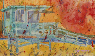
Watercolor Project: Summer Fun Week 2
In our last class I started the under painting for the lifeguard tower and the sand.
Remember that in watercolor we work from light to dark so if we need something to be light we need to save it.
The first thing I did was to paint the entire tower, except for the windows, with a light wash of color. I didn't paint around any of the posts or railings, I painted EVERYTHING in this first color. This will be come highlights if I need them. (I used my Cheap Joe's color of Andrew's Turquoise you can use any blue or add a touch of green to the blue if you want.)
When this wash was dry, I added some purple to my color and this time I painted around the railings and other light areas and put a wash of color over everything that is darker or in shadow. I may do this several more times to bring up not only the value (light vs dark) but also to increase the intensity of the color or its vividness. Watercolor dries lighter so getting the right amount of intensity can take several layers and it is better to sneak up on the color rather than trying to get it in one shot because you end up putting the color on too thick and lose the watercolor look in your painting.
The windows are done in a couple of steps. the first step are the window frames. Because they are in shadow they are not white or we could leave the white of the paper. I mixed a gray of ultramarine blue and a touch of burnt sienna with a lot of water to make a tint of gray and covered the whole area and let it dry. I re-wet just the window pane areas with water and wend over with a light wash of blue, let it dry for just a second or two, then took a stronger mix of blue with a touch of purple (very little purple or you can use a touch of alizarin) then just made some shapes in the window. Look at the photo and all you will see inside the tower are dark shapes, that is all you are creating.
The flag is pretty simple, the thing you need to remember is the top and bottom stripes are red and the stripe under the blue is white. With my small angled shader, I used my ultramarine blue and just dabbed it in where the blue should be leaving a few white spots showing. You do not need to do all 50 stars, just suggest them. Same with the stripes. Because the flag is waving the stripes are not straight and may disappear or you only see parts of them. Don't over think it, keep it simple.
I will be continuing from this point in class, I hope you can get your paintings to this point for class.
Keep painting and I will see you in class,
Sunday, July 16, 2017
Subscribe to:
Post Comments (Atom)


No comments:
Post a Comment