Sunday, July 9, 2017

Watercolor Class Summer 2017

Watercolor Project: Summer Fun Week 1

There are times as artists we need to get out of our comfort zone and try new things just to expand our skills, our knowledge and to face our fears - yes fears. We are so afraid of making "mistakes" we forget that art is suppose to be fun, and I often fall into that category my self. I will see the rut I am in from the bottom looking up and realize I am just going through the motions and I need to find something that really challenges me and that is how I got into splattering.

I was in a rut reading one of my watercolor magazines when I came across an article on a woman artist and she started all her watercolors by splattering. It looked interesting and really wasn't in my comfort zone but if I didn't like it all I was out was a bit of time and a piece of paper. I had so much fun I started looking for more subjects where I could use splattering.

I find it works best if you have a simple subject but I have used it very effectively with more complicated subjects, I just think it brings a sparkle and a bit of fun when used in a simple setting.

I took the photo of the life guard tower and thought what fun this would be to add a bit of summer fun with splattering. I used my warmer colors (red, orange and yellow) in the sky but didn't sweat it if they went everywhere, same with the cooler colors (blue, purple and green) I used in the land area. It just doesn't matter. What does matter is to know when to stop. It can feel really good to just throw paint then next thing you know you have a pool of mud on your paper. You can always add more.


I also used plain water when I splattered and where paint and water touched, it created a bloom or back run a fun thing when doing this kind of thing. Then I let it dry completely when it was where I liked it.

I had already put my drawing on the paper so I now needed to start working on the back ground.

Notice how the negative painting makes the tower stand out.

The color you choose is up to you for your sky, I wanted it to say "California Sun" so I started with my yellow around the tower moving it out from the tower and the top of PV. While it was still wet, I went right into my orange and started the orange just inside the yellow and let the watercolor blend itself (the yellow needs to be wet for this to happen). I repeated this with my red but as I moved the red out towards the edges of the paper, I rinsed my brush often and used just water to move the red until it faded out. Rinsing your brush often is key to this technique.

The PV cliff were done using burnt sienna, a touch of blue and water to thin the color, the green trees I added Hooker's green to the sienna color to gray the green.


The water was my ultramarine blue with water and touches of thin purple.


Don't forget to paint the water and the cliffs behind the railings of the tower. This is called negative painting when you paint around an area and in watercolor it is important to remember this technique.

Try to have your paintings to this point when we meet again in class. I will be continuing from this point.


Sunday, May 28, 2017

Spring 2017 Watercolor Class

Watercolor Class Project: Farmers' Market

This is the final on the Farmers' Market project. I hope that you learned that but taking it one step at a time even the most complicated subject can be fun and challenging. You can only paint it one stroke at a time regardless of whether it is simple or intricate so don't let the subject scare you away.

Here are some of the final things I did to complete this project:

The grating on the front of the fruit stands does not need to be  detailed out board for board. I suggested the cross hatched panels by using a light grey (ultramarine blue a touch of sienna and lots of water) and using the dry brush technique (very little water or paint on the brush) with my 1/4" angle brush, I did a series of //////// strokes, then I did the reverse the same way only \\\\\\\\\, so it looks like vague "Xs" . Then I added some darker gray in a few spots to suggest you could see behind the grate to the darkness under the stand. All that matters is that is suggests the grate, it doesn't need to hit you over the head with it.

The fruit in the stand needs to look like it is going into the distance to create depth in the painting, so remember that as things go into the distance they become less intense in color, closer together, and less detailed. The fruit that is closer can have more detail and that tells the viewer what they are looking at in you painting. Even the little lady is just a suggestion as are the figures in the door way but it is enough of a suggestion to suggest people.


This was a happy accident. I hadn't planned to make the oranges as big as they turned out but because I did they look like they are on a stand closer to the viewer than the apples behind them, I am good with that, gives a bit more depth. Notice the difference between the detail in the pineapple and oranges and the apples and peaches behind. The peaches are just basically shapes of color yet it says peaches.


The signs and price tags do not need to be detailed either. All you need are a couple of them that show some believable word then the rest of them are just marks that suggest words. Let your viewer do some of the work.


The lights and the string lights were pretty simple. for the big ceiling lights after I removed the masking I did a bit of lifting right around the area that was masked. If some of the color remains, that is okay, it just needs to be a bit lighter not paper white. While it was still wet, I flooded the area with a mix of yellow and orange to create a golden color, when it was dry I suggested the fixtures. Don't get nit picky with this or it will look over worked. The string lights I just took a dark color on my 1/4" angle brush and just touched the chiseled end to - once again - suggest the wire holding the lights.

While this was a complicated scene once we broke it down into manageable pieces it came together quite well. 

Finish this to whatever degree of detail you want for your needs but all in all everyone did a great job and I hope to see you all next class. 

Keep painting.

Thursday, May 11, 2017

Watercolor Spring 2017

Class Project: Farmer's Market Week 5

Because this project has so many little areas to paint, it takes time. It also teaches you to work in, around and through your painting because it can cause problems painting next to a wet area without worrying about getting back runs or blooms. It is also rewarding because you can continue to paint skipping around the painting while waiting for things to dry before you go back in to increase value and/or color intensity.

The first thing I did in the last class was I put masking fluid back on the string lights behind the counter. I really needed it to be darker so not only would the lights show up better but also so that the plastic bags in the front would also show. Remember that you heed to use contrast - light against dark - to create a sense of depth. After the masking dried, I went back over the area - the entire area - with a thin mix of blue and a touch of crimson. Now you can see how the plastic bags stand out against the darker background.

I started the pineapple and finished the oranges.

The pineapple is interesting because the two sides of it's leaves are different. the under side has a stripy variegated look to it almost like chevrons in a pale blue/green color and the top of the leaves is more a solid green. 

While I hadn't intended it to happen, once I got my oranges painted in I realized that because I had made them bigger than the apples by quite a lot, the oranges appear to be on a closer table than the apples, not wrong just a happy accident because it gives more depth to the painting.

Everyone was curious about what I was going to do with those blank tags in the fruit in the front and the tags in the back, well, write on them of course!

Here's the trick when putting written words in a painting especially if they are very small: Find one of the closer tags and write all or part of an actual word or number (see the peaches tag in the front?) then the rest of the smaller tags in the back only need to suggest letters and numbers, the viewer will fill in the rest.


I still have work to do on my painting so I will continue bring my painting up in color and value, adding detail...I probably have a week or two before I am finished.

Keep painting and I will see you in class.

Sunday, May 7, 2017

Spring 2017 Watercolor

Watercolor Class Project: Farmers Market Week 4

The next couple of weeks will be rather repetitive because you will be working around your painting bringing up the intensity (color) and value (darkness) in select areas, as well as adding detail in the foreground.

This is an important thing to understand as an artist: By creating things that have more detail in the foreground, you only need to suggest things in the background. The viewer will see oranges and apples then shapes and color and will assume that you have a whole market full of fruit, when all it really is is shapes and color.

I took a bit more time with the oranges using, napthol red with cad orange for the shadow parts of the orange, then adding yellow to the orange for the light areas leaving some of the very light first wash as the highlights. You can work the oranges without stopping by choosing oranges that aren't next to each other so they won't bleed into each other, though it wouldn't be wrong if it did.

I did the apples the same way using the napthol and crimson and made just general shapes or apples.

The plastic wrap is just light and shadow in don't make it any more complicated than it is, just look at the values and shapes before you start to paint.

Saturday, April 29, 2017

Spring 2017 Watercolor Class

Class Project: Farmer's Market Week 3

One thing I don't mention often enough is composition, and it is one of the most important things to a pleasing painting.  This painting has very simple composition with strong perspective lines leading you into the painting. Also, things are placed in critical areas such as the worker and the purple flowers, they are on or near the "thirds" of the painting and with the pineapple in the corner for a triangle keeping you in the painting. Yes, I was thinking this as I was taking the photo, good composition is just as important in photography as it is in painting and many cameras have a thirds grid that you can use when you are composing a photo, use it rather then the center focus circle when you are taking photos and you will see an improvement in your photos and your art.

One of the things about a painting like this is because there are so many elements involved, you can move around the painting so that one area can dry while you work on another area in that way you bring it all up to the same level as you paint. Don't get stuck in one place not only will it look over worked but you will also create mud.

When I did the lettering I did break out my 1/4" angle brush but the letters are not hard to do. Using the sharp edge of the brush, I just touched the paper, gave a tiny side pull then moved on to the next letter and let them dry before adding the outline done the same way without the pull. The art work that looks like oranges on the end are just round orange circles I let dry then added some green leafy marks. Don't sweat the small stuff, just suggest the letters and shapes your viewer will do the rest.

The floor was painted with water first then starting with the light color (yellow and a touch of orange), I covered the floor area. While it was still wet, I picked up sienna and orange, starting about his foot, applied that color on the lower part of the floor and finally, I added blue to the sienna for the very foreground to suggest sunlight and shadows. Because watercolor dries lighter, I may have to do this again.


If you have under painted the flowers with light colors as you should have, creating the impression of a bunch or mums is simple. Again I used my  1/4" angle brush (you can use a small round or flat brush) mixing first a slightly darker purple (purple with a tiny touch of blue and water) and once again using the edge of the brush, I just touched the paper to give the suggestion of petals, leaving some of the lighter color for the centers. Look at the photo before you start this, even practice on a separate piece of paper if you have to it is very easy once you figure it out but it will take practice. The dark purple is the same colors less water. The leaves are done the same way, same brush just use green.


We have at least another week or two on this painting, do what you can and I will see you in class.
  

Saturday, April 22, 2017

Spring 2017 Watercolor Class

Watercolor Class Project: Farmer's Market Week 2

When I started class I continued to add value to areas I needed darker and where I wanted it a bit more finished before I took off the masking. When I was satisfied that I had my values dark enough, I let my painting dry and then removed the masking (arrows). Notice how each layer of values looks compared to the white paper that was under the masking, this is how you create light in a painting using the contrast rule.


Detail of the areas that were covered in masking.


Area where the lights will be. In after thought, I probably should have made this area even a bit darker before taking off the masking but it will be okay.


Now with the masking off my painting I can see how areas look and where I need to add more shadow and contrast, for now, however, I started adding some suggested detail. I want you to note that there are no defined shapes in these background subjects, they are just color that suggests something there. don't make a bunch of circles, make overlapping circular shapes leaving some of the under color for highlights and contrast. Save detail for the foreground, only suggestions in the back ground.

I darkened the hair of the worker and did a bit of work on the apron. The dark color is a mix of ultramarine blue and either burnt umber or burnt sienna, the apron was a mix of crimson, napthol red and some blue to darken, I also used this color on the apples and plums in the background.

I also wanted it to look like some light is coming in from the door in the back ground so I added a mix or yellow and burnt sienna to make a golden color that I put on the floor.


This is where I left off in class. While I am now getting into the detail of the painting I am not fussing with it, save the one haired brushes for the final accents but at this point I am still at the suggestion stage. Take your time but don't sit in one place in your painting. Work around and through your painting bringing all of it up at the same time to the same point, otherwise you can run the risk of overworking your painting.

Keep painting and I will see you in class.

Sunday, April 16, 2017

Spring 2017 Watercolor Class

Watercolor Project: Farmer's Market Week 1

The first thing I did after I had my drawing on my paper was to protect the areas I wanted to leave white with masking fluid (blue arrows). This will allow me to do washes and work with a bigger brush and not worry about painting around areas I want left white. I will remove it after I am mostly done working in that area and not worried about accidentally going over my white areas.

Only the protected part of the paper will be left white, everything else and be brought down in value.


Next I applied several washes of a neutral gray to tint the rest of the paper. I used what I call "palette gray" made by mixing all the leftover paint in the cool area of my palette, but if you need to mix the color, my standard gray is ultramarine blue and burnt sienna, remember to use lots of water so it is only a tint.

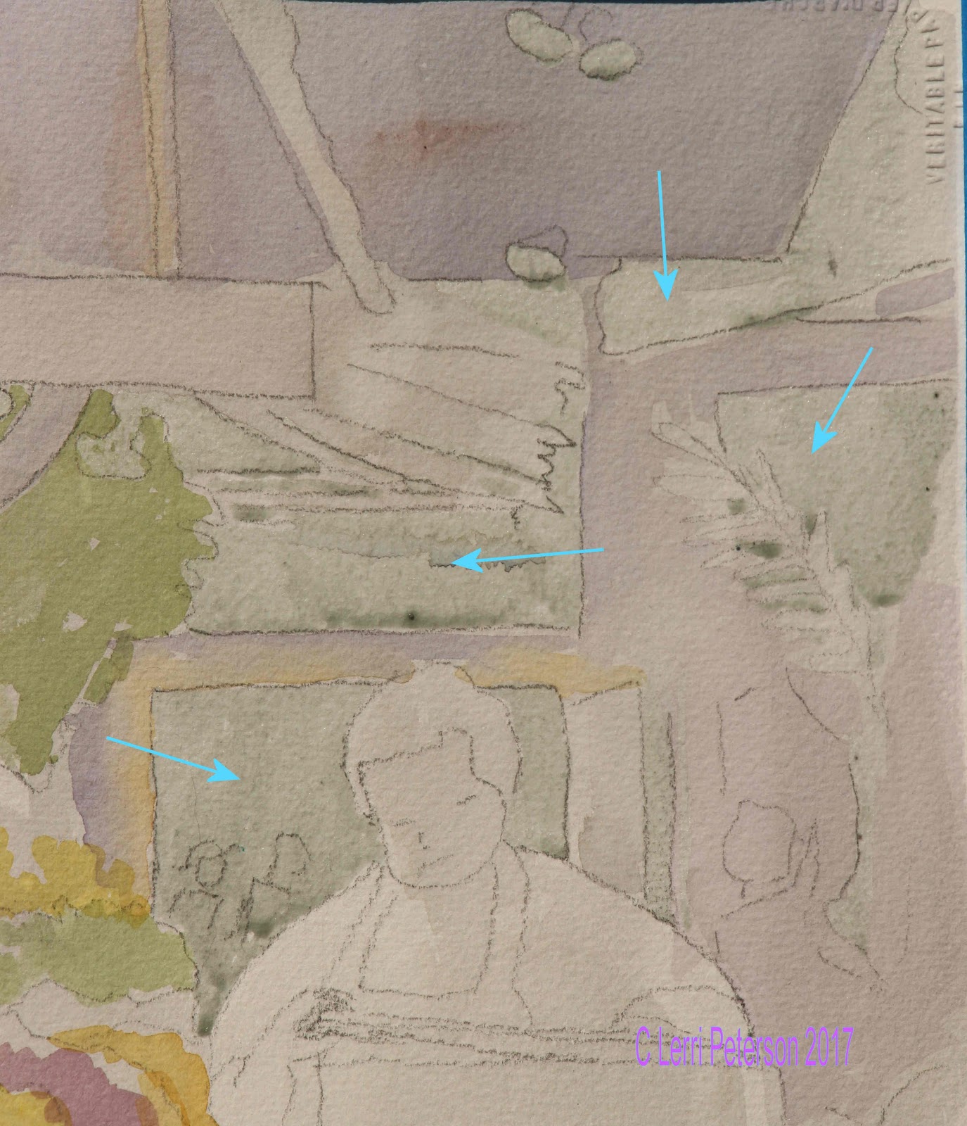
Look at the arrows in this second image and you will see 3 layers of this gray I added (arrows) The top of his head is the value of the first wash, I let it dry. I then went over all of the next darkest areas (see the wall arrow) with another layer of gray leaving lighter areas unpainted, I let it dry before adding yet another layer of value to even darker areas of my painting leaving lighter areas unpainted.

Please note: You do not need to make darker and darker mixtures of gray, you use the same value you started with when you did the first light wash. Because watercolor is transparent, if you let it dry first before adding the next layer, the layer(s) underneath will make the new layer look darker because of the previous layer(s) will show through.

You should have your reference photo in front of you so you can refer to it as you paint these layers of value. See where the light hits the worker's shoulders then moves into shadows on his chest and face? Paint around these areas with the next layer of tint, this will work to your advantage as you progress.


After I did several layers of the gray tint, I started adding color into areas where the fruit will be. Note that it is just a mass of color, not individual pieces of fruit and also not that the tint is light, remember that in watercolor you work from light to dark so this first color represents the lightest colors you will see.

The 2 toned patch in the foreground is done wet into wet. Either add a second color into the first while it is wet by just touching areas with the new color or if you have let it dry, re-wet the area then touch the area with the new color. Let the paint do most of the work, just drop and touch in the wet and the paint will do the rest.

Also, I had protected the mini-lights with masking at the start of the painting as well (see arrows). They should be dots close together in the background and more like dashes as they come forward and spaced further apart.

This is as far as I got in our first class. Do not be intimidated by the complexity of a subject, you can only paint it one brush stroke at a time, so relax and take your time, think about what you are painting and why breaking it down to one brush stroke at a time then even the most complicated of paintings will come together in the end. Be patient with yourself and the process.

Keep painting and I will see you in class.