Sunday, July 19, 2015

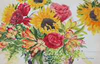
Watercolor Project: TJs Bouquet Week 3

I hope that everyone has been working on their flowers so that this week you can start putting in the background. This dark background is what will make these flowers pop, you so you will see dramatic changes once you start putting in your background.


You will need to have your reference photo in front of you to paint this background. There will be a lot of negative painting so you will need to see where it is so you can leave unpainted areas when you get to them. You also need to choose a background color for the area you painting, I don't care what color it is, I chose a blue/green, though it will eventually get dark as it goes to the corners. Have a color near the flowers that will compliment to the colors of the bouquet. There are yellows and reds and greens so you can choose those colors that are the complementary colors too red green and yellow, you could choose a color that will fit into the color of the room you might hang the finished painting, but remember it is going to get dark towards the corners.

I was using my Hooker’s green with a little touch of blue and water for the lighter value that was around my flowers and the basket. I went over the entire background twice with variations of this color making it darker I added more green and blue and less water and when I got further away from the flowers towards the corners, it was mostly my blue and
purple to make it very dark in the corners

One thing to look at when you are studying your picture before you start painting around the flowers is they have a glow about them. This is because the petals and the leaves are being backlit by the sun. To recreate the glow, as you paint in the background leave little bits of the lighter areas around the edges of some of the petals and leaves to create little halos of light. Don't do this all over but just in specific
areas mostly near the top where you want it to be lighter and look like a glow. Look at the reference photo.

When you get to an area that has the ferns in it, the ferns are very easy to negative paint they are mostly dots and dashes.You will have to pay attention to their shape so look at the ferns before you start painting them and just use the point of your brush if you're using an angle brush, if you're using a round brush will just be using the tip to create a little fuzzy edges of the ferns. It does not need to look exactly like the photo you are just suggesting ferns.
 
Remember that when you are near the base where the basket is there is light coming in from behind so remember to use plenty of water to fade your shadows into the light area and leave it very light right at the base of the basket & where the shadow starts. Use the same dark color that you were using for the shadow of the basket.

As I said before, I went around my flowers twice with this dark color increasing the intensity and the value of my dark color because it is the darkness behind these flowers that makes them glow, if your color isn't a darker value than your leaves and petals this won't work, you have to not be afraid of the dark. Once you do this you're going to see drastic changes to this painting. If you have to go back and put another layer on do so, as always, it is better to sneak up on the dark then it is to try and go straight to the dark but the dark is necessary.


I have a little bit more to do on my ferns and some of the flowers so I will be finishing this up in our next class but basically this is done so you need to start looking for what you want to paint when you finish your project so we can finish out the rest of the semester working on our own projects and I will be doing demos on demand depending on what is needed as you start to paint your own projects keep painting and I will see you in class.

PV Week 2 Images:


Saturday, July 11, 2015

Summer 2015 Watercolor Week 2

Watercolor Project: TJ'sBouquet Week 2

PV students your class the previous week so please refer to it before moving on to this one we will get there probably next week do the best you can to get caught up to where we left off in class and we will proceed from there you should have your flowers in your basket under painted.


To continue with the watercolor project and the Torrance class, I started working on the basket and then I after that I started putting in the detail for the flowers and leaves.

You should all have your reference photos in front of you when you are painting your project, it has all the information you need to paint this painting, I'm constantly looking back at my photo as I am painting and you should get into this same habit. There is an area of
dark rust at the bottom of the basket and where the paint has chipped off, that color was a deep dark brown a mix of burnt sienna, ultramarine blue and a touch of purple, you want to keep your color to the warm side or the brown side, and if you have to you need to draw a line - more specifically an irregular shape - to indicate where the paint stops and the rusted metal begins before you start to paint, do it before you start to paint. Remember that you have ferns that come down in front of the pot and you will need to paint in between the branches of the fern (negative painting).

Next I started working on the sunflowers by intensifying the color and adding the shading for the sunflowers. Yellow is a bit tricky because the shadows aren't necessarily or traditional blues and purples, they are more in the reds and oranges so those are the colors I was using in the sunflower shadows. I used my cad yellow with a little touch of orange to go over some of the deeper colored pedals to intensify the color as well as adding in the shadows
and contours. You don't need to paint everything you just need to suggest pedals and the depth between pedals and curves. All I did was just suggest some shapes with my colors, but I was constantly going back to my reference photo and looking to see where I needed to put the reds and oranges and their general shapes. The reds will be your deepest colors in the sunflowers you will also shape your flowers a bit with these colors more shaping will come later as we work into darker colors.

For the roses you are going to need to add dark reds for the flower detail and shadows, the color that you painted before will be your highlight color. You will be using alizarin crimson for the medium dark and alizarin crimson with a touch of blue in it for you darkest colors. Be sure that you are looking at your photograph before you start painting so that you can see where and what you are painting. Remember, the roses look in all directions. as do the sunflowers. and this is what you want to try and create in your painting you want to get the darkest colors in interesting shapes in your roses to suggest the inside pedals, they are all folded up from the inside and the petals open from the outside, so look at the photograph and see where your darkest colors are and paint your shapes accordingly, that's the best advice I can give you, remember to save your light under painting for your highlights.

I also worked on the leaves. These leaves need to have some medium and dark greens put into them. The medium colors I used SAP green with a touch of orange to dull it and maybe the occasional touch of blue for a deeper color. For the darker green I used Hooker's green with ultramarine blue to darken it, again look at your photograph and see where the dark colors are, these dark colors are how you're going to shape your flowers look at them between the smaller yellow and red flowers and put the darks in to shape your flowers in the sunflowers you'll see in several of them there are some darker green that go in between and behind the petals use the darker color to shape the outside edges of the petals this is what we do in watercolor you can also use the medium color much the same way but don't lose all of your lightest lights we will get to those probably next week.


On the little yellow and red flowers I was using my little angle brush to create the red fringed edges of these flowers. First I rinsed my brush well then when I loaded my brush I only loaded the tip of my brush. I then placed the whole end of the brush on my paper with the loaded tip at the end of the flowers where the reds are and pulled down and around to create that lacey blended look. This takes practice but it is worth it.


This is where I stopped for the day so try to get your paintings as far along to this point as you can, we are going to start working on the background next week - yes we are that far along - so keep painting and I will see you in class.

Friday, July 3, 2015

Summer 2015 Watercolor

Watercolor Project: TJ’s Bouquet Week 1

I started out showing the new students how to transfer a design onto my paper using graphite transfer paper. There are many ways to get a design on your paper, this was just one of them.

I wanted my design on the paper so I knew where to start my under painting. The lightest area is coming from behind and above to “back light” the arrangementso my lightest area will be slightly above center and to the right.

First I wet my entire paper with clean water. I do this so my paint will spread and it will also lighten it a bit. With a big brush – I used my 2” wash brush – so I could cover a lot of ground in a few strokes and so the paper will still be wet as I change colors. You should all have at least a 2” – 3” wash or hake brush for big areas, it will save you a lot of extra work.

Still using my wash brush, I picked up some of my cad yellow light and mixed in a lot of water, I just want a light yellow tint, and I painted a ring around the center of my bright spot. I rinsed my brush and lightly guided the yellow into the center of the ring and blotted with a paper towel so it didn’t get too much color. Moving quickly, to the yellow on my palette I added a little orange then on the outside of the yellow ring, I added an orange ring. You want the colors to blend where they meet so be sure that your paper is still wet. Keep moving and add some red or crimson to the orange color on you palette and add a red ring to the outside of the orange ring and finally, with either a touch of blue or purple and water, add another ring that covers the corners and goes across the top and bottom of your paper. Let this dry completely before starting the next step.

When the paper was dry I started adding the next layer of color. Remember that in watercolor you work from light to dark so again, I do not want to get too dark with these next colors I want to be able to have some “wiggle room” when bringing up the values, I don’t want to get there too quick.

I started with the metal basket and while it looks “white”, it isn’t, it is a cool, sienna color so the colors I used were sienna, a little blue, a little purple, this is my base color for the basket. When I applied this color I was using my ½” shader and started in the middle of the basket and I did leave some areas unpainted for the leaves and ferns that hang over. Look at the photo. You will notice that to the left side of the basket it gets a bit darker and to the right it gets a bit lighter and warmer, keep that in mind as you paint. On the left side add a little bit more blue and/or purple and to the right side use a bit more water to thin the color and add touches of orange to warm it. Rust has some very orange undertones rather than red so use orange and sienna for your rust. The lighter warmer version of this color is used to under paint the handle just don’t make the color a continuous line because the handle goes in and out of the flowers and leaves, look at your reference photo if you have a question on where it might show.

The rest of the class I spent under painting the flowers and the leaves. The sunflowers and smaller flowers I used my cad yellow light with a touch of orange in it, keep it thin you don’t want too much color too soon, the roses I used my napthal red with water to thin it to base the colors in. I DID NOT do any detail color on the small flowers that have red edges, which will come later.

The leaves I did pay a bit more attention to because as they go in and out of light, their color changes from a blue green to almost yellow so please look at the photo as you are painting and be aware of where you are painting so you change your color as you paint. Again, keep it light in value for now so for the darker green areas I used sap green and a touch of blue with water and the lighter greens were sap with yellow and water or just yellow with water. LOOK AT YOUR REFERENCE PHOTO and fill in these lighter colors we will do more detail as we progress.


Keep painting and I will see you in class.