WINTER
2013 WATERCOLOR CLASS
Project:
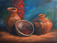
Clay Pots and Chilies – Torrance edition
As
promised, I did a variation of a theme with the Torrance version of the pots
and chilies. In many ways it is very similar to what I did at PV because you
always work from light to dark but in this version rather than working with
shades of grey, I worked with color and established my center of interest with
a first wash that looked something like a spot light in the fog rather than a
wash of grey over the whole paper. Everything else is basically the same, using
layers of thin washes to create value and intensify color.
First
off, I did use a bit of masking fluid to protect my brightest highlights on my
chilies, a spot on the rim of the tallest vase and a few spots on the frayed
ends of the knot, that was all because EVERYTHING ELSE will be a part of the
color wash I will put on once the masking is dry.
 |
| Under paint light with color. |
It
is easier to do this technique if you wet the paper first either by spraying
and/or with your big wash or hake brush so you can work wet into wet. Use
enough water so that your paper is good and damp but you shouldn’t have any
pools of standing water, elevating the top even a couple of inches will help
here. Because I have to work vertically, I worked wet on dry the results are
similar but you need to work much faster.
I
first had to decide where I wanted my viewer to look when they are looking at
my painting and for me with my design and where I was standing, it was the
tallest vase that will be where I want people to focus. Starting in that area I
took a thin mix of cad yellow and applied it in a rough circle working from the
center out and inch or two in diameter. I use just water along the outside
edges to soften them but if you have wet your paper this step should not be
necessary, however, if you see a hard line forming you may need to use a bit of
water to prevent it from forming.
The
next color I used was cad orange that I mixed into what was left of the yellow
on my palette. Again I used a lot of water to thin the color before I applied
it to my paper. Starting just outside the yellow color, I applied the orange
color about an inch wide all around the yellow, like target rings, then I
rinsed my brush and with just a damp brush I blended the two areas together. If
your paper was wet they may have already started to blend and that is a good
thing, just help them along. Each successive ring of color will be done in this
manner, working to the darker corners. My next mix of colors are as follows: to
the orange I added a touch of red again lots of water. The next mix I added
burnt sienna to the mix and lots of water and finally, in the corners I added
purple to my burnt sienna and lots of water.
 |
| Paint your subject as you normally would. |
When
you are done your whole paper should be covered in this colorful under tone,
let it dry completely and then forget it is there and paint as you usually do with
thin layers of color or you can do value washes, just paint as usual. Most of
this will get covered but it will influence the layers above it.
I
also need to add that you can do this with any colors you choose, the key is to
go from light where you want people to look, to dark around the edges to focus
them in on your subject. You can use it on your whole paper or just in certain
areas, experiment with it and combine it with other techniques to suit your
needs.
Please
try to have your drawing on your paper and if possible this first wash of color
for next time when we will continue working on our project. See you in class.


