

WATERCOLOR CLASS – Week 5
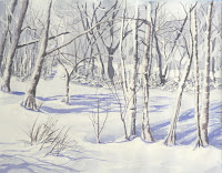
Torrance class, we finished up the snow picture so please be ready to do the poppy on Monday. Download and print the reference picture NOT my painting of it, for reference.
PVAC class – We started a water picture using a photo I took along the PV cliffs near

Since this was a demo on water, I will focus on the water aspect more so than the rest of the painting but will do some brief descriptions of what I did in those areas.
The first thing I did was to mask out any areas that I need to be white at the end, it has to dry completely before you can put wet next to it but you can do the sky. The sky area was first painted in just clear water, this will help the paint to move on its own. Next I picked up a little blue and a touch of sienna (if you have cerulean blue that is a good sky color on its own) and water to make a light gray/blue on my palette then I just touched this color along the top part of the sky and a few places lower and let the wet paper and paint work their magic. This will work better if you work at a slight angle so gravity can help out, if you are working flat, you may have to coax the paint along thru this whole process. The water will be painted exactly like this – wet into wet – so the elevation of your paper will only help you.
You might want to let the sky dry before you start on the water so you don't get any "blooms" into your sky though they could look like clouds later on.
Starting at the horizon, I wet the water area with clean water, again to help the paint move on my paper. With that same gray/blue color I just used in the sky, I touched my brush along the horizon. I want to keep my strokes horizontal just touching the paper as I go back and forth. As I come forward, I pick up more blue but I need to keep it light so add water if you need to. Just past the point of the bluff I finished wetting the paper then started adding touches of Hooker's green into my blue mix, touching this color along the base of the bluffs and along the sides of the paper leaving that sandy area getting greener as I came closer to shore. In the sandy area I picked up sienna and water and added it into a corner of the green color on my palette, just enough of the green to slightly gray the color. I touched this warm color to the wet paper and let the tow colors blend together on the paper by themselves. If your paper has dried, you may need to re-wet before you do this, or use some water on your brush and touch the areas between the green water and the sand. Do not worry about the blooms if they happen, they add texture to the under painting.
Please keep this step very light. These are just tints, if you get too dark too soon it could be hard to get the highlights you will need later.
While the water is drying, if you want to paint the cliffs and the shore sand, now is a good time. On the cliffs I used sienna with touches of orange for the dirt areas, please note that the dirt is sliding down at different angles so make your strokes follow the angles. Leave spaces for the trees and bushes which I painted in first with a mix of sap green and yellow very lightly and detailed them darker later.
The sand on the shore is a mix of yellow, a tiny touch of purple to gray the color (purple is the compliment to yellow) and a lot of water, this too is just a tint.
When the water is dry, again starting at the horizon with the flat edge of my angle brush (a flat brush or round will work, practice with it first) and using a slightly darker version of the gray/blue (blue with a touch sienna and water), I touch the end of my brush to the dry paper keeping my brush parallel to the top and bottom of the paper, this will keep my strokes horizontal. As I touch the paper, I will leave some areas the show the under painting, this is good, it acts like sparkles on the water.
Just like I did in the first step, I add blue as I come forward, still using the same technique of touching though I was tilting it a bit so I could use more of the side of the brush switching to the Hooker's green in the foreground. Also, my strokes got further apart as I came forward as well as longer – think wave swells.
Rule of thumb for distance: Things that are closer to you are larger, further apart, more detailed and more intense in color, as things go off into the distance they become smaller, closer together, less detailed and softer and grayer in color. This works for everything.
There is some reflection and shadows in the water, I do want you to notice that the reflection has a broken edge caused by the action of the waves so when you paint these colors onto your paper, paint them just the same way as you have been painting the swells with the blues and greens just use a darker green/blue and sienna with a touch of blue where the dirt reflects.
I should state at this point that if you want more intense colors and darker values, you will need to repeat this step several times. I only did this once through so you can get an idea of how to paint water because of time constraints. If I was to do this for myself – and I might finish this at home – I would definitely intensify the values and the colors. That doesn't mean that I would cover up everything I did, it would mean that I would add more color and more detail especially to the foreground, leaving some of the existing color to indicate waves of different sizes and shapes, it could take a couple more hours to finish this the way I feel it should be finished.
Along the shore where I have my masking fluid saving the foam, I want to be sure that I get some darker color around the masked off areas whether you are using the blue or the green, be sure that you get that color in so your waves will show up when we take the mask off. There are also some rocks along the shore that will help define the foam along the shore, the rocks are a mix of sienna and blue to make a dark color and when you add the rocks to the point of the bluff they should be lighter (see Rule of Thumb above), smaller less detailed than the ones near the foreground. This same color with a bit more blue and water can be used for the dark shapes in the water just remember to rinse your brush and use the damp brush to soften the edges of these shapes. When the paper is totally dry you can remove the masking.
The cliffs and trees can be finished by adding more washes of color, remember that the light colors are your highlights so don't paint them all out. You can add shadows, intensify the color, how ever you want to finish it. Enjoy the process, don't be in such a hurry to get a painting done as you gain experience you will also gain speed but really it is the journey you take when painting that should be the most enjoyable aspect, the rest is frosting.
The next class I will be going over brush strokes so there is no photo to down load just have some paper to work on.
No comments:
Post a Comment