Sunday, October 6, 2019

Fall 2019 Watercolor Class

Project: Alaskan Fishing Village Week 3
Note: The beginning class has started a version of this project I will post their review first then the intermediate class's review, however, some of what we did in the Monday class was also done by the Wednesday class so I did direct the Monday class back up into the beginning review so I wasn't repeating what I just wrote.

In watercolor you must start with your lightest colors first and work your way to the dark and I like to work with what is furthest away first as well. The furthest thing in most landscapes is the sky to paint the sky I started with a mix of ultramarine blue with a tiny hint of burnt sienna just to slightly gray the blue and water to thin (lighten) the color. Remember, watercolor is transparent and white is the white of the paper so a thin wash of color will give you a light finished color.

I was using my 3/4" angled brush to get my paper covered and so I could easily paint around the treetops  and other things in my design, my rule of thumb is to used the biggest brush for the size of your paper you have so you can get the paper covered, especially when you are painting big areas, save the smaller brushes for later.

I painted the sky with this color as well as the house and the water, let this dry before you move on to the trees and grass.

The trees and grass were painted with sap green and a tiny, very tiny, touch of orange to mute the color. Green can be too GREEN so you need to tone it down with some form of red, I like orange or burnt sienna because using straight red can easily turn to mud and both those colors have some red in them. Use plenty of water to make a thin wash for the trees and grass. I did add more yellow and a touch more orange when I was painting the grass but it isn't really necessary.

I also went back to the blue and sienna color I used in the sky and building and added a bit more of both to ass to the reflection in the water. The one thing to keep in mind when painting a reflection is the water is moving which breaks up the straight lines and the shapes that it is reflecting so pull your brush straight across and/or straight down to suggest that water movement. Let this dry.

(This is where it is the same for both beginners and intermediate classes in what we did in class last week.)

Starting the under painting of the house, this is going to be a bit different: the brush will be dryer and you need to pay attention to the direction of the angles in the building.

The roof slopes at an angle, the side facing us has boards that are horizontal, the front of the building has boards that are both vertical (the bottom) and horizontal (the top) these distinctions are important to recreate the idea of old wood.

If you need to go to a smaller brush, this is the place you can switch brushes, still, don't break out the one haired brushes just yet.

The roof was painted with a mix of yellow and burnt sienna with lots of water to make an ocher-ish tint that I used across the roof following the angle of the roof. My brush was damp but not dripping with paint I also went back into that color and added tiny mounts of burnt sienna to add some color in the back part of the roof (look at the reference photo to see all the colors in the roof).

The gray for the front and side of the building is again the blue and burnt sienna but not so much water this time and you will need to have a dry brush. Use a paper towel to lightly squeeze the back of the brush after you have loaded your paint, this will remove some of the water and also fan out the bristles of the brush. With very little pressure on the brush, drag it across you paper in the direction of the wooden boards. You can repeat it a couple times but then let it dry a a minute or the paper gets wet and you lose the "grain" you just added. You can add some straight burnt sienna in the same way.

On the lower part of the building, I made the paint a bit darker using less water in the paint. I also under painted the door - I think it is a service door - with the same color as the roof but with a bit more or the two colors and less water.


You can repeat the door color in the water, remember the moving water.

We also managed to start the water reflections, this was a wet into wet technique.

First you need to wet the paper where the water is around the building reflection, WHILE THE AREA IS STILL WET you will add the green you used from the trees but use it a bit stronger - less water -  by just touching your brush to the paper and letting the watercolor do its magic. Your paper needs to be at an angle to that gravity can help you or it will just sit there. To that green you can also touch the paper with blue and yellow to create streaks. Don't get too carried away because it feels so good or your colors will become muddy and loose the idea of the reflections. We can do this again if we feel we need to later but let it dry for now. Also notice how I cut into the building with horizontal marks into the building, nothing is straight.

This is as far as we got and I was amazed you all did so much ans so well. We will start where we left off when we met again. 

Intermediate version

In our last class we worked on the reflections in the water and the buildings. The techniques are the same as I have just written for the beginner class so you can scroll up to review the process, the one thing we did in the Monday class was to add more color to the water. Same process as above: wet the paper and drop color onto the wet paper and let it run. You can use a bit more intense color but let the watercolor do most of the work. 

The houses are painted using the dry brush technique and following the way the direction of the way the wood or roof is going. I also used a mix of blue and burnt sienna with little water to make a dark color for the  shadows under the eves, around the windows, the gap by the yellow door and to negative paint the area under the buildings. I used a lighter wash of the same color to start the boats as well.

The red of the little building is napthol or cad red light with a touch of burnt sienna in it. I also used this color in the water.

However, when I was painting in the water to make it look like reflections all of this I either painted straight across or straight down with a wiggle of mu brush. Remember it is moving water,nothing will be straight or definite.


This is where we left off in class, next class we will be getting into detail and finishing up this project so bring your little brushes and your liners, I will see you in class.

Sunday, September 29, 2019

Fall 2019 Watercolor Class

Project: Alaskan Fishing Village Week 2


In the beginning class we did a couple things that are important for all students so the first part of this is for everyone and the last part will be for the Monday class.

One of the things I try to explain is the transparent nature of watercolor, that all the layers that are already on the paper will affect the next layer you put on top of it. In the above exercise, I started with yellow for the round shape and red for the cube-ish shape (hard to draw from the side), when the paint was dry, I used ultramarine blue on both to add shadows. However, the blue not only adds shadows but it also changes the color. The yellow ball is now greenish and the red cube is more purple.

If you want to know how colors will interact on your paper, do this experiment letting the first color dry before adding the second.

Next we went over negative painting and again we will be counting on the fact that a previous layer will have an influence on the following layers so we can "build" up darkness (value)


Each time I added a layer of paint, I left out certain of the posts but painted EVERYTHING ELSE or, in other words,  the negative space around the ones I was leaving. I did not positive paint the posts, I painted everything that I wasn't leaving the lighter value. This is important. In watercolor we work from light to dark with white being the white of the paper and if you look at the bottom of the paper, you will see that most of my layers are close to the same value except the last two which were just a little darker.

If you are going to be a watercolor artist, this negative painting is going to be your bread and butter, you use it in everything including the trees in the project. This lesson was for everyone, not just the beginners because I see how even people who have been with me for years struggle figuring this out so if you didn't do it, you might want to do it at home so you can get a better understanding of the process.

This is where the beginners can end, we did to a little work on the project in the Monday class, so I will cover that next.

This is actually a combination of both positive painting the branches and negative painting around the  trees in front. I was using my 1/2" angled shader, Hooker's green with blue to make a darker, cooler green, there will be another layer of darker colors next week. The tree trunks were blue and burnt sienna to make a dark color and I used the edge of my brush. Look at your reference photo often as you are painting these trees.

I added the red for the smaller house but to the napthol red I added a little burnt sienna to "age" the color a bit.

This is where we left off. Try to get the trees to this point for next time.

Keep painting and I will see you in class.

Saturday, September 21, 2019

Fall 2019 Watercolor Class

Project: Alaska Fishing Village Week 1


The first thing we needed to do was to get the design onto our paper. I showed various ways to do this including using a grid, transfer paper and using a light box. 

You can also draw direct onto your paper but be careful if you have to erase - this goes for using the grid system as well - because you can damage to surface of the watercolor paper causing problems when you go to paint. I recommend that if you are using the grid system to enlarge the image or if you are drawing it freehand, use drawing paper the size you want to work on then use either the light box or transfer paper to get your design on your paper so you don't damage it.

If you have a hard time using the grid to enlarge your design, there are programs that will enlarge them in your computer and print them out as a simple puzzle you tape together, I have two listed in the sidebar under the title of Lerri's Links, they are the Poster 8 for PCs and Razor Poster of Macs. If you have an image editor like PhotoShop, I understand it has an enlarger as well that will print on multiple sheets, you might check there first.

Having a good drawing of your design on your paper is important because it is our road map to our painting. Watercolor is a bit finicky and can be a challenge to fix something so having a good drawing will help keep those to a minimum. Use a pencil that has a dark enough lead (a #2B or #3B) that you can get your design on your paper without having to press too hard to see the design (again we don't want to damage the paper), but we don't want it so dark that it won't fade into the painting as we work. While have some pencil lines is okay, you don't want it to look like a cartoon with a bunch of dark lines showing after you put all that work into it.

Traditionally in watercolor, we use the white of the paper as our white so we have to work from light to dark. Always keep this in mind when you are working because it is opposite from working in other mediums. We build our watercolors with layers of color and value.

As I showed in class, there is nothing white in this photo we will be working from, if you have any doubts, find a sheet of white paper and lay it next to the frame of the door on the red house and you will see it is at least 1 or 2 shades darker than the white paper, it only looks like because of the dark values around it. I am mentioning this because in our first wash of color we will be going right over that house and I don't want anyone painting around it or using masking, bot are unnecessary.

Our first wash of color will be a very light blue/gray. I was using my large wash brush and mixed a sky color using ultramarine blue with a very tiny amount of burnt sienna in it to slightly gray the color. I wanted a color like the clouds are starting to burn off and some of the blue is showing through. On my paper, I just used water to wet the area from the top to the water's edge so that the paper was damp and my paint will flow. I have to work vertically so you can see what I am doing which is a challenge in watercolor but I do recommend that you slightly elevate the top of your paper with either a roll of tape or your purse or something that will give you at least a couple of inches off the table so that gravity will work with you otherwise, the paint just sits there causing problems.

Start at the top of the paper with your color and paint it about a third of the way down, rinse your brush and wipe off the excess then use just the water on the damp brush touching it to the paper just at the bottom of the color you just put on and let the paint flow into the wet area. This will give you a graded wash, just be sure you are working wet into wet. If you need to add more color, just repeat this step starting at the top with more color. This takes practice, the key is to not have your brush too wet at any time, it needs to be damp but not dripping and having the paper damp to begin with will keep your paint moving.

The water is painted the same way with just a bit more blue and can be a more solid color. Then let it all dry before doing the next step.


I forgot to take photos of the first wash but if you look in this photo you will see that the sky near the top is a bit darker than the houses. This is because of the graded wash in the first step.

With all painting regardless  of medium there is usually an under painting, this step is the under painting for the background trees but in the end becomes the highlights of the tree, remember light to dark. 

All of the trees in the above were painted the same way shown here: I use an angle brush but this will also work with a flat brush, using sap green with a touch of yellow and a lot of water to make a thin wash, I started with a line for the top of the tree with just a couple taps of the flat end of the brush to start the top. To start the branches I come down a bit from the top and with the corner of the brush and a little flick, I make the top short branches. The longer you drag the brush on the paper before you flick it up, the longer your branches will be.

Remember that these are not Christmas trees so they should not be perfect and don't lose all the spaces between trees at the top and make tall ones and shot one. Near the houses the  branches overlap so much is becomes a solid color.

The grasses were the same color as the trees with a little touch of orange in it. Remember not to get it too dark at this point, these are the highlights.

The water I added blue to the green and this time where the tree reflections are I just pulled straight down and used water to blend as soften. You can wet the area where the trees are first but try not to get too much in the building reflections.

This is where we left off in class we will finish up getting everything under painted in our next class.

Keep painting and I will see you in class.

Saturday, April 27, 2019

Spring 2019 Watercolor Class

Watercolor Plus Project: Pink Umbrella Week 1
(Monday Class's post will follow this post so scroll down.)

This week we started our version of the Pink Umbrella going step by step, one wash at a time.


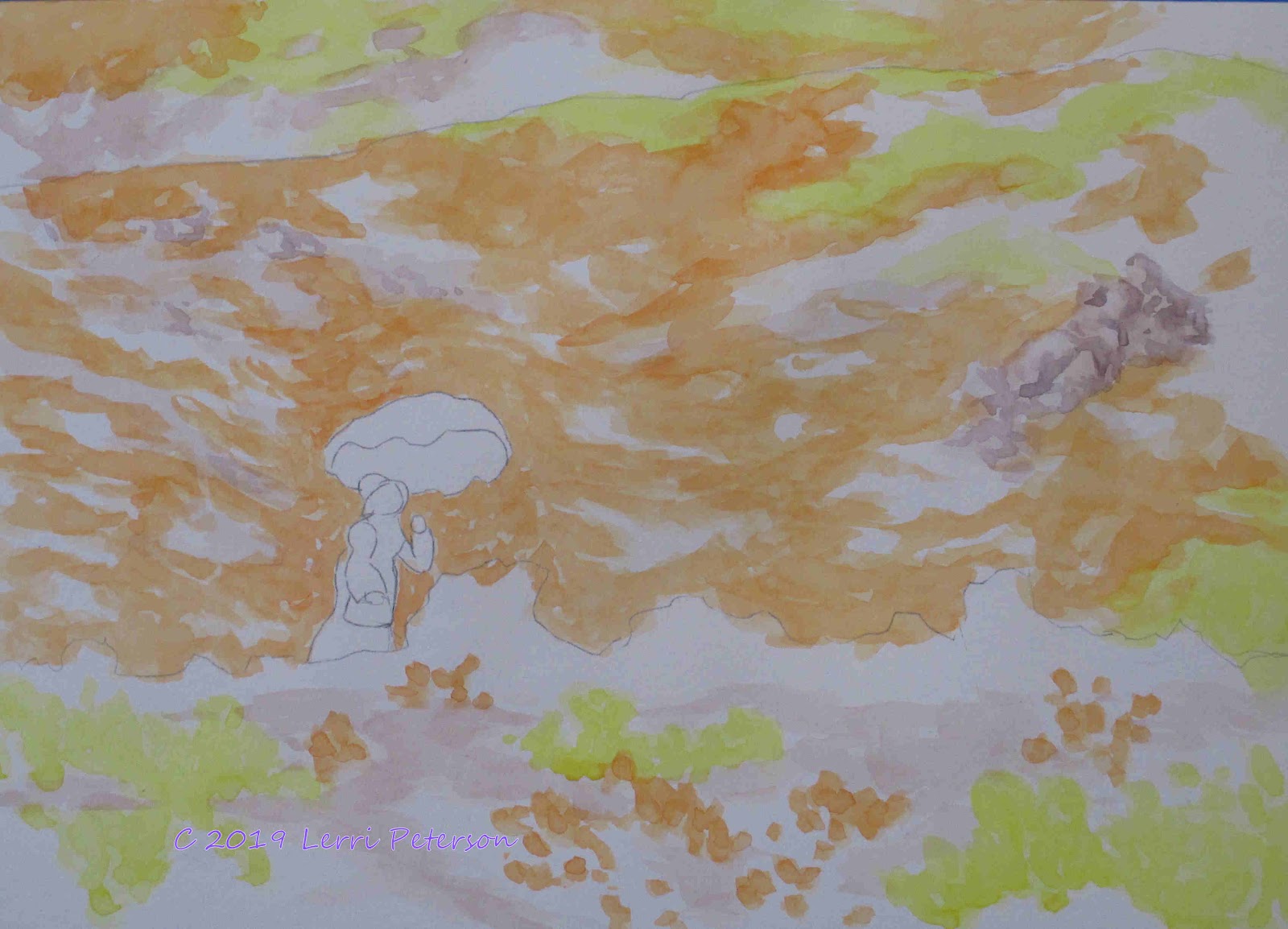
Once we had the drawing on we added light washes of Yellow and Orange for the flowers and where there is going to be rocks or paths, a light wash of burnt sienna. Look at the photo for suggestions of the paths and rocks. I did move some rocks on the right of the photo into my design because they were outside the cropped area. I was "dabbing" with my brush rather than making long strokes and I was trying to follow the curves of the hills with my strokes to give texture and contours to my hills.


Second verse same as the first except on the rocks and paths. More orange and yellow to the flower ares to make them brighter and same kind of strokes. I need to get the value (darkness) of the hill behind the woman dark enough to make her stand out. This can take several layers to accomplish so don't try to rush the process because you can rush right past where you wanted to be.


I did a separate demo on creating rocks out of just a swath of color because the rocks on the hillside are rather small and would be hard for you to see.

Creating a pile of rocks so they don't look like a wall takes a bit of practice and studying rocks will help but the biggest thing is to vary your sizes and shapes.
It is very human to line everything up and make it all the same size and shape, Nature isn't like that. Things in Nature are chaotic/random, a pile of rocks can be an assortment of building sized boulders down to tiny pebbles, you as an artist need to be able to see this in Nature then picture it in your minds eye when painting. Fro this example I added some blue and crimson to the burnt sienna to create a cool, shadow rock color then decided the sun was coming from the left and shadows were on the right then tried to create a pile of rocks of various sizes, shapes and direction. This is also how I added the rocks into the painting (next photo) but with even less detail. Remember, suggestions are better in paintings rather than spelling it all out for your viewer.

All these rocks are is a suggestion. They are too far away for much detail and the shadows don't need to be any darker.


I added one more layer of color to the MIDDLE GROUND ONLY. The same orange, the same yellow and at about the same strength (mix or water to pigment). I didn't add any more to the far background to help give a sense of distance to my painting. I think that this is the last wash of color I will do on the middle ground flowers at this time, I will see how it looks when I"m a bit further on but at this point that is about where I want the value around the woman.

I also started added some of the green areas once I was done with the flower colors. The green is a mix of sap or Hooker's green and orange with water to thin the color to get an army green color. You can see the color where I painted over the white paper, those darker greens happen because I painted over orange areas with the green and the green became darker and browner, this is how watercolor works because it is a transparent medium, this is also what I wanted.

This is where we left off in class, we got a lot done, if you are still trying to get here don't worry we have time, just don't rush, take your time, speed comes with experience and with watercolor speed is a relative term.


Keep painting and I will see you in class
----------------------------------------------------------------------------------
Monday Watercolor Class Project:
Pink Umbrella Week 3 Final

This week turned out to be the final week for this project, no one more surprised than I was, thought it would be at least 4 or 5 weeks to complete but that gives you time to finish or start your own project.

To finish up this painting I focused on the detail in the foreground with the plants and flowers and then the woman.

Where I had big patches of just color (yellow orange or lavender) I mixed a dark green with the Hooker's and blue with a touch or sienna to make a dark, cool drab green, then I negative painted in shadow areas in those solid colors to suggest clumps or individual flowers. You need to get dark in and around these clumps so they will stand out.


On the lavender color I mixed a deeper blue color with ultramarine and crimson to suggest the deeper colors of the blue flowers as well as the above dark green to suggest the clumps of flowers.

The woman isn't as hard as you would think, the hardest part was finding the right color for the umbrella and none of the colors I normally use would work, so I looked in my bag of paints and found Thalo Crimson and it was just about perfect, if you have Opera, that is also a good color for her umbrella. If you need some thalo, ask me in class, it only takes a tiny amount.

The umbrella and purse were only mixed with water to lighten. On the umbrella I added an almost straight out of the tube color right along the outside edge of the back edge of the umbrella, then I rinsed my brush and with just the water on my brush (damp not dripping) I moved the color up towards the to of the umbrella. I rinsed my brush several times so I could get a graded color. The top of the umbrella I left white.

The shadows on her dress was the same color I used on the lavender flowers but with more water so it was very dilute. I was looking at the photo so see where the shadows were and left the white of the paper as the white of her dress. 

For her face I used the shadow color and added a touch of burnt sienna to it, it was still very dilute. For her hair and the dark ribbon on her hat it was a more concentrated mix of the sienna and blue to create a dark color.

Do not get too picky with painting her, she is too far away for much detail, you just need to suggest things and she will be there when you are done.

This is the finished painting. If you need more time to finish yours we still have a couple of weeks left, otherwise, you and I can work on something we want to paint for the rest of the semester. If you have questions or need me to demo something you are having problems with, let me know and I will do a demo for the class because I am sure you are not the only one with similar problems.

Keep painting and I will see you in class.


Saturday, April 20, 2019

Spring 2019 Watercolor Class

Watercolor Project: Pink Umbrella Week 2
(Watercolor Plus students we just went over brush strokes last class and if you look in the side bar, I have a page just for brush strokes so I won't have a post use the page for reference.)

Starting on the distant mountain, I added the SUGGESTION of rocks and patches of green in the fields of flowers. Look at the photo. While there are rocks, it is because you assume they are rocks because of your experience and from rocks closer to you, yet they really are just shapes of light and dark.

Because this is in the distance I am keeping my colors lighter even the shadows. This is important to remember when you are trying to create distance in a painting: Things in the distance are softer and grayer in tone (color) and values (light and dark) and less detail. If you look at the "rocks" you will see all I did was use my shadow color (ultramarine blue, burnt sienna and a touch of alizarin crimson and water) and where I had white paper showing from the dry brush I did with the green last week, I made a few little strokes to suggest outcroppings of rocks. While I was aware of the slope I was painting on I didn't spend a lot of time worrying about rocks, just a variety of shapes going down a slope. Same with the green I added into the flowers to suggest patches of bushes (Hooker's green and orange and water). I wasn't trying to paint a "bush" I was painting the "suggestion" of bushes growing up and down slopes.

On the middle ridge behind the lady I added another wash of orange and yellows as well as adding the first suggestions of bushes, again being very aware of the contours of the ridge.

Even though orange and yellow seem light in value  and never get to a dark dark, they do get up into the mid rage on the value scale, and become more intense in color, the orange more than the yellow. I need all of the darker valued I can get behind the woman so when I take the masking off her white dress will show up against the intensity of the color behind her. If it is too light, she and her umbrella will not show up the way I need them to.

In the foreground I under painted with a light tan made with sienna, blue and lots of water. Because I have masked out areas that I want to keep white for now (the blue gray) I don't have to worry about painting right over the masking, same will go when you paint the bushes, just paint right over the masking.

Every plant has a unique growth pattern, learning how to create those patterns will improve your landscape paintings. It doesn't need to be anything fancy, again, all you are doing is suggesting how a plant grows. 

Many of the low growing shrubs in these desert and woodlands grow from a central area and send branches out from that area near the ground so they make little mounds with a fan-like shape (see image above). Other plants will grow more like a tree and create branches up the stem creating a more varied outline. I use my angle brush but you can use a flat or round brush and I suggest you practice first. 

The strokes of the fan shaped bush come back down to a central point on the ground. I used a series of over lapping strokes with the edge of my angle brush. The taller, more random shaped bush I created with the same brush but I was tapping the corner and working from the center line of the bush to the outside edge trying to create an interesting edge.

I left paths through the foreground bushes but I did try to connect patches of the bushes so I didn't have a series of brown stripes going across my paper.

This is where I left off in class. I have a bit more to do in the middle ground and maybe a few more rocks in the background but then I think I will be removing the masking so I can start finishing up this painting.

So keep painting and I will see you in class.


Saturday, April 13, 2019

Spring 2019 Watercolor Class

(I will be posting the beginning watercolor class blog first followed by the project we are doing in the intermediate class. Use is as a review of basics.)

Watercolor Plus: Creating Depths and Values with Washes

I for got to take photos of what we ere doing in class but since I have done this before with a similar pattern, I will be using those images for this post and will include the image from what we did in our last class.

When I did these photos I also numbered the leaves so you would know which order I left unpainted as I applied washes.

As you can see, after I did a wet into wet under painting, I left the top leaf unpainted EVERYTHING ELSE will get a wash of color. Just paint over  EVERYTHING with a light wash and let it dry before going to the next layer.


This is what it looked like after the first wash of a neutral gray (ultramarine blue and burnt sienna and lots of water). I painted EVERYTHING except the top leaf. When dry I added another wash of the SAME EXACT COLOR.
This is after the second wash or the same exact color. You can see that I left the 2 leaves to the side of the top leaf but EVERYTHING ELSE got  wash of color. The reason it looks darker is because watercolor is transparent and what is underneath a wash of color with influence the new layer of wash. You do need to work dry paper or you run the risk of stirring up the previous colors and creating mud. Let this dry.


This is the third wash of EXACTLY THE SAME COLOR. There is just one more leaf that I added to the ones I didn't paint to the left side of the top leaf, EVERYTHING ELSE GOT PAINTED.
This was the final wash of color and I added the remaining leaf to the ones I didn't paint.

Notice how dark the wash color had become just by adding layers but it is still transparent. If you look closely you will be able to see the original wet into wet under painting.
 From that last wash of color you can now finish the leaves any way you want adding more color (remember to keep the color transparent) or and bug holes or torn parts. The first part of this exercise was to get to here, this is how you build a watercolor working from light to dark and keeping the transparency of your watercolor. 
This is the study we did in class. I ran out of time to do more.

Practice this because when you are new,it doesn't make sense until you actually see it work but it will make all the difference in the world to your own paintings.

Keep painting.

Monday Watercolor Class: Project Pink Umbrella Week 1

You need a road map when you are doing watercolor even if it is just a simple one like we have this time, because it lets your know where things change.

After I got my sketch on, I used masking fluid to protect areas I wanted to keep either white because they are white or I wanted them to be unpainted so when I do add color the color will be cleaner and more vivid. You will see a blue/gray in the next image and that is the masking fluid.

This is just the under painting for the distant and middle ground of this painting, there is still more work to do with detail and color, I was looking for value and establishing the different color areas.

For the poppies I used cad orange as my base but to that I added a little burnt sienna and a touch of napthol red for shadowed areas, this is one of the exceptions to the rules: If I had put in blue or purple into the orange it would have muddied the color and I wanted to keep the color clean. This is also true for yellow keep that in mind when using those colors and you don't want muddy colors.

The sunnier areas of the poppies I added cad yellow light to the orange to keep the color bright but to also make it look more sun lit. There are some areas of mustard which are just the yellow. Do these in layers and build up the value and the intensity of the color using the layers (See the above post).

The green was a mix of Hooker's green and a touch of sienna. You want a light army green. I painted it on using the dry brush technique (little water or paint on the brush, then skim the paper's surface with the edge of your brush to leave white paper showing) so I have areas of dirt and rocks I will work on later.


There are also some lavender flowers usually where there is a slide area on the hill. That color is either a little purple with a touch or blue and sienna or if you don't have purple, the ultramarine blue, crimson and a little sienna to gray the color.

As always, paint in the direction of the shape of what you are painting. If is it rounded your strokes should be rounded. If it is angled your strokes should follow that angle. This isn't a wall don't paint it like one.

I will continue from here in our next class so keep painting.

Thursday, April 4, 2019

Spring 2019 Watercolor Class

Value Paints the Picture

This is the quick little value study we did in the Wednesday beginning watercolor class but it is good review for all beginning and intermediate students because it might seem simple at first glance but is one of the areas were all students struggle when they start to paint or draw.

Value - or the lightness or darkness of an object or a painting - is the most important aspect of your painting because it gives your painting a third dimensional and/or dramatic look even if you are a more impressionistic painter. Learning to use a full range of values from light to dark will make your painting more exciting and interesting.

Keep the saying in mind: Value paints the picture, color gets all the credit.

To create the shape of an object you must have a light side, a dark side and the middle tones. Start paying more attention to these things in our surroundings you will see what I am talking about.

I start with an apple because it is more interesting than just a plain sphere but you can use any simple object to do this exercise. It is best to find a place to work with one light source like a window or a table lamp (not an overhead light because it will give you "flat" light on your subject). Look at your subject and study it before you paint it. Where is the highlight? where is the darkest shadow? How does the light transition from the light to the dark. Learning to "see" is an important skill to have as an artist.

Since I can do this in my sleep, I don't need to have something in front of me to know if light strikes on one side the shadows are on the lower, opposite side and an apple is pretty simple to draw.

To start my value under painting I used a mix of ultramarine blue and burnt sienna to make a gray using a bit more of the blue to keep the color on the cool side. Starting in the darkest area with my gray, I established my shadow Please note where the shadow is on the apple. It is on the lower right side away from the highlight and it does not go all the way up to the top of the apple because that part is in the light. It also goes op a little bit on the left side because the apple is round and the wide part of the apple is blocking the light from the very bottom of the apple. This is why you study the subject first before you start painting.

Once I established the shadow, I quickly rinsed my brush and with a series of tapping and dragging type strokes right along the inside edge of the shadow, I started moving paint put the apple to "grade" the color and soften the edge of the shadow. Each time I had moved a bit up the apple, I would rinse the brush and with a damp brush, go back into the area I just painted, again along the edge, and move paint up the apple until there was very little paint to move. I let this dry then repeated this process several times until I got the apple and its values where I wanted them. The example above is 4 or 5 washes of color and it is better to do several washes (layers) then try to get there in one shot because you will put the paint on too thick and will loose the transparency of the watercolor.

With my values established and my painting completely dry, I add my first wash of color which was a mix of cad yellow with a touch of orange and a lot of water. I went over the entire apple including the shadow areas. 

Try not to go over your apple more than once if you can help it because each time you run your brush over an already painted area you run the risk of stirring up the paint underneath and creating mud on your paper. I will be putting a wash of a similar color on later when the apple is dry, keep reading.

I like gala apples especially to paint. I used reds and oranges to create the stripes on the apple - reds more in the shadows and orange or orange with yellow in the sunnier, warmer areas and the apple was still a little damp from the yellow overall wash I had just put on.


I waited for the apple to dry before giving it a final wash of color. 

Watercolor always dries lighter so it is important to let it dry completely before assessing where you are in a painting. I thought my apple was a bit pale so I used a mix or the yellow and orange and went over the entire apple again to intensify the color of the apple.

This works with everything you do in watercolor. You must work through layers or washes to create values and intense colors but even if it may seem tedious doing layer after layer, by working in layers of washes you keep the transparency of the watercolor which is what most people are looking for when they view a watercolor and you will be happier with your own work as well.

Watercolor is a challenging medium but I think it is also the most rewarding once you understand how it works, so keep painting and I will see you in class.